This website is loaded with useful tips on photography that will help you get familiar with your camera settings. You will learn how to take good pictures and how to photograph like a pro using our photography tips.
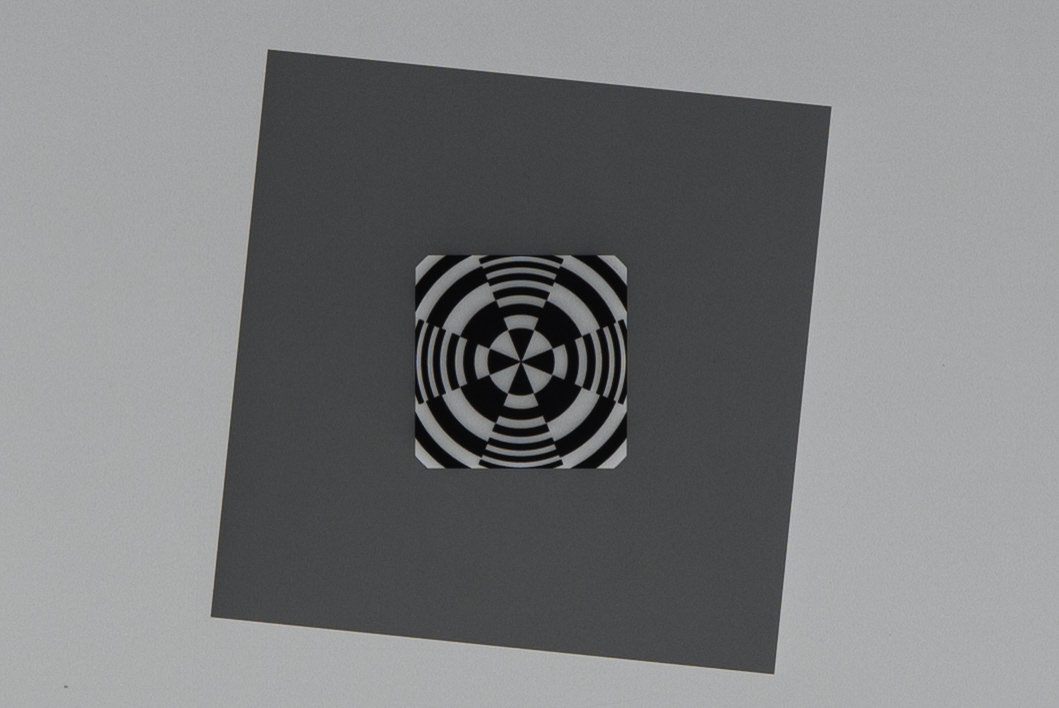
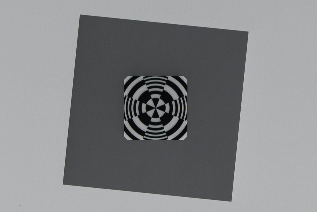
Landscape photographers often deal with the dilemma of choosing between different types and brands of neutral density and graduated neutral density filters for use in high-contrast situations such as sunrise and sunset, where their cameras might not have enough dynamic range to be able to capture the entire scene. While we are not going to go over each and every brand to see which one performs better, we do want to show the difference in sharpness between glass and resin filters. For this particular test, we used three 0.6 (2 stop) filters from three different manufacturers – NiSi (glass filter), Lee (resin) and HiTech (resin). The latter two are probably the two brands that are used the most among photographers in the field.
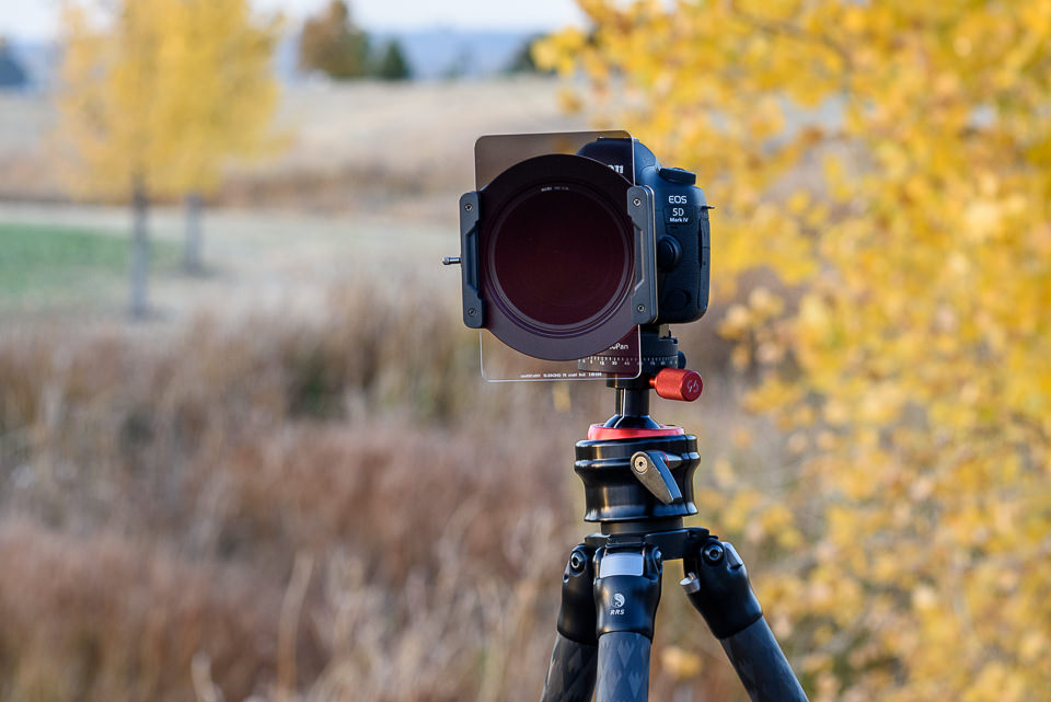
For the sharpness test, we used the Nikon 105mm f/1.4E ED, which we are in the process of evaluating for an upcoming review. The lens was mounted on the Nikon D810 and shot in Mirror Lock Up mode, with EFCS (Electronic Front Curtain Shutter) enabled, as detailed in our how to reduce camera shake on a tripod article. While the numbers are not yet final (only one sample was tested with a high-resolution chart at a very close distance, which can skew mid-frame and corner numbers), you can see that the lens looks absolutely amazing, almost Zeiss Otus-like in terms of center sharpness – definitely one of the sharpest Nikon prime lenses we have ever tested.
We stopped down the lens to f/5.6 to yield maximum sharpness (although MTF numbers at f/4 look even more impressive in some cases) and we used a few different focusing techniques to yield the best possible performance without any filters, while a NiSi filter holder was already attached to the lens. Once maximum resolution numbers were achieved, we mounted one filter at a time, without touching the focusing ring.
2 Stop GND Filters – Glass vs Resin
Below are the results from Imatest software, showcasing MTF numbers for the 2 stop GND filters:
As you can see, there is no difference between using a lens with or without a glass filter. And we have shown before in our clear filter tests, if one uses high quality glass in front of a filter, there is no impact on the lens’ resolving power. So it looks like if one uses glass filters similar to the ones from NiSi, one can get maximum sharpness from the camera + lens setup.
At the same time, take a look at what happens when a resin filter is mounted on the camera. I have been using Lee and HiTech filters for years and previously, I never really noticed much loss of sharpness in my images when using lower resolution cameras. After I started using high-resolution cameras such as the Nikon D810, Sony A7R II and Canon 5DS R, I did start noticing differences in sharpness in my images. Not to the point that would make me not want to use filters, but definitely to the point where I started wondering if perhaps my filters needed to be replaced.
The graphs above show a very typical situation when using resin filters – there is a definite and visible drop in sharpness on high-resolution cameras, even at 36 MP. As you can see, Lee’s two stop 0.6 GND (Graduated Neutral Density) filter had a pretty dramatic drop of sharpness, almost 17.5% lower in center sharpness compared to not using a filter and around 15.8% lower in center sharpness compared to NiSi’s glass filter.
Actually, the numbers were even lower when I initially mounted resin filters. Due to changes in optical path when using resin filters, I actually had to refocus my setup and see if I can get better numbers. I was able to get higher numbers in the center of the frame and due to the change of plane of focus, the change did affect mid-frame numbers as well, which is why they show up a little higher in comparison to not using a filter at all.
After testing out my Lee filter, I decided to mount HiTech’s 0.6 GND as well and see what it would yield. As you can see, although its performance looks a tad better, overall, it is really not much different compared to Lee. Center performance drops by roughly 15%, which is certainly not a small number – that’s practically worse than using a cheap circular filter in front of your lens.
Now you might be wondering, can these differences be seen in images? Let’s take a look at two crops taken from the above-mentioned tests:
Keep in mind that these tests were performed with a 36 MP camera. If I were to show you difference with 42 or 50 MP cameras, the differences would be even more apparent. Please don’t try to view these images on a small mobile device / tablet, or a large super high-resolution screen, since pixels would be packed too closely together and you would never see any differences. 15% does not look like a big number for sure, but if you look closely at edge detail, the differences are definitely there. Now if those differences are too small for you to care about, then by all means, forget about the existence of this article! However, if you do want the best edge detail your camera can provide for landscape or architectural photography needs, you might want to re-evaluate your setup and potentially look into getting resin filters replaced with glass filters.
10 Stop ND Filters – Glass vs Resin
We also decided to run another test to compare two 10 Stop ND filters from NiSi (glass) and HiTech (resin). Aside from serious color cast issues pointed out in our NiSi Filter System review, we saw a pretty dramatic drop in sharpness when comparing NiSi to HiTech filters. Take a look at the MTF numbers below:
As you can see, the NiSi 10 stop ND filter performed really well compared to the HiTech resin filter, which actually caused quite a bit of damage – practically a 30% drop in sharpness! So keep this in mind if you want to do long exposure photography. Looks like glass is the way to go not only if you want to preserve original colors (no color cast), but also if you want to keep the resolving power of your lens.
Summary
Resin filters definitely have their own advantages – they handle great in the field and if you drop them on a hard surface, they do not break like glass does. They don’t shatter under pressure, since they have the flexibility to bend. However, they are quite prone to scratches and even moderate use of resin filters can introduce small scratches all over the filter. While scratches don’t do additional damage to your images in terms of sharpness, they certainly can reduce contrast and potentially introduce more artifacts to your images when shooting against bright sources of light (in the form of ghosting and flare).
In comparison, glass filters are obviously superior in sharpness and they are less prone to scratching. However, they do require better handling in the field, so you must be able to provide good protection for them not only while transporting, but also while using. If you drop a glass filter, unless it lands on grass, you will have to look for a replacement.
Personally, I am planning to start using glass filters from now on. However, in case I do lose a filter in the field, I am planning to bring my Lee filters along, just in case 🙂
What types of filters do you personally use? Resin or glass? Have you tried both to see what is practical in the field? Would love to hear your thoughts in the comments section below!
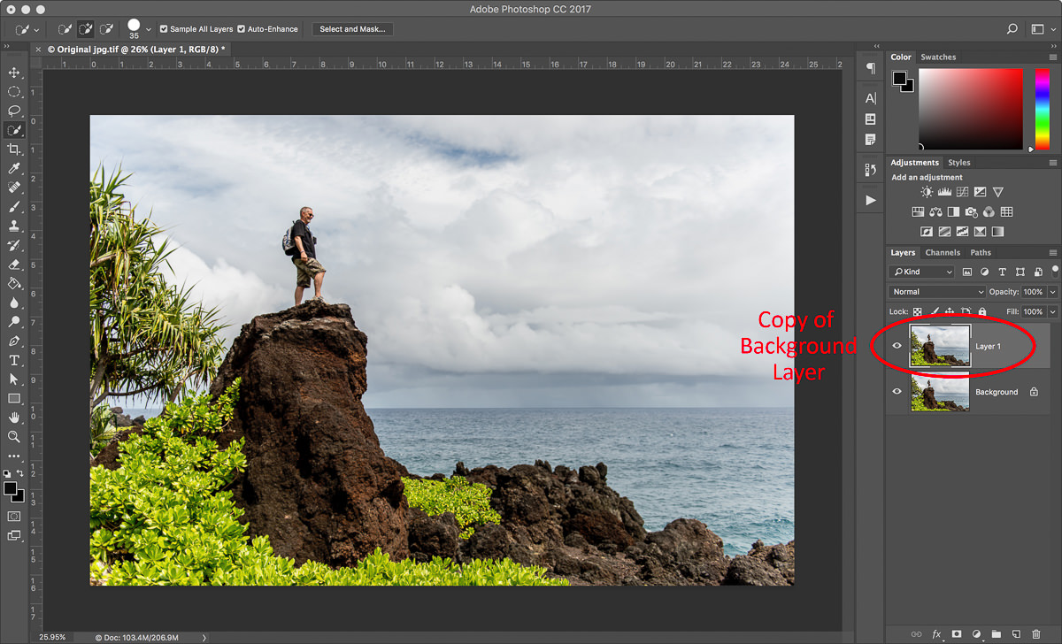
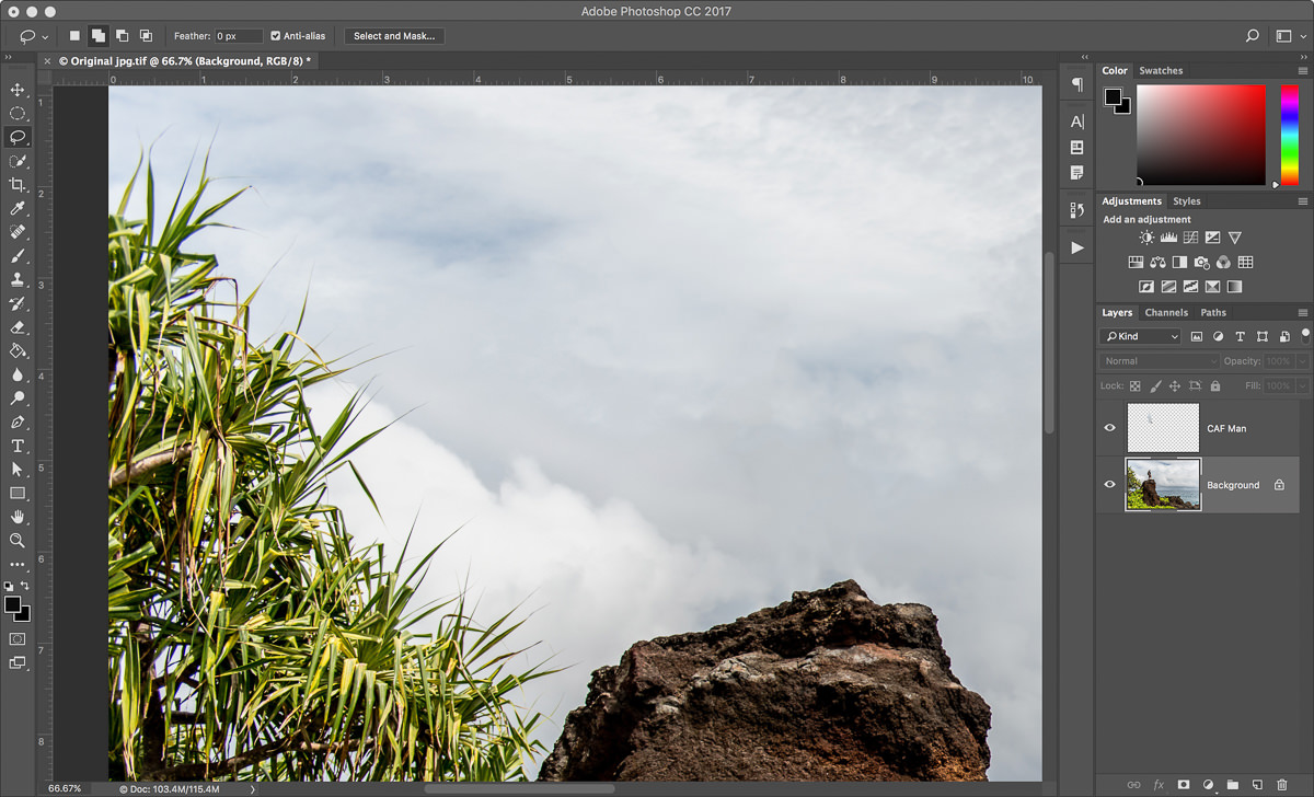
A strength of Photoshop is being able to perform edits non-destructively. Most edits can be performed on their own layer, preserving the original background layer. The Spot Healing Brush, Clone Stamp, and Patch tools all work this way and they can all be used to remove unwanted objects non-destructively. However, if you have ever tried to remove an object from an image using Content-Aware Fill, you will have noticed that you can’t do this on a new blank layer. This tool requires pixels to work. But if you use Content-Aware Fill on your background layer, you end up changing those pixels permanently. You could create a copy of the background and use the tool here. However, this needlessly increases the size of your document. In this short article, I want to show you an easy workaround, which will keep your original background layer intact.
Steps to use Content-Aware Fill Non-Destructively
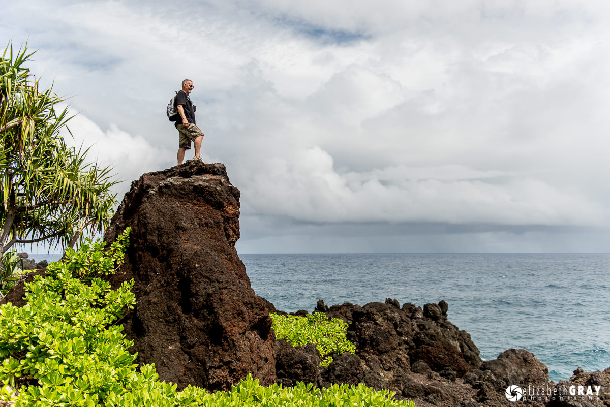
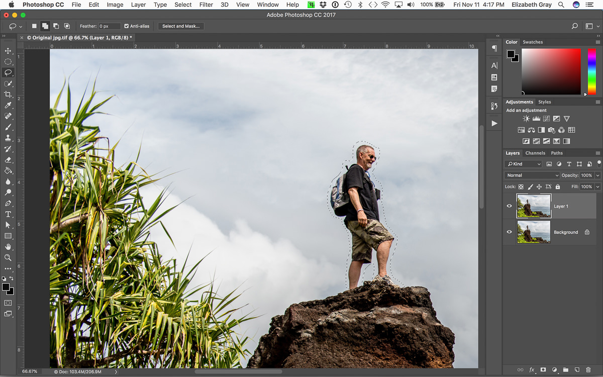
To illustrate the technique, let’s take a look at this image. I shot it last year on the Road to Hana in Maui with some friends. Now whenever possible, I try and get the image right in camera. But sometimes that isn’t possible. So apologies to Keith, but let’s remove him from this landscape!
Here is a photo of my friend, Keith, who did a bit of rock climbing to get to this vantage point. No hard feelings, but let’s remove him from this image!
Create a copy of your background layer. To do this, select the background layer and press Cmd+J (Mac) or Ctrl+J (PC). You don’t need to rename this layer because we will be deleting it in the end.
With the copied background layer selected, use the lasso tool and create a rough selection around the object you want to remove. You could also do this using the Quick Selection tool and expand your selection by several pixels. The selection does not have to be perfect.
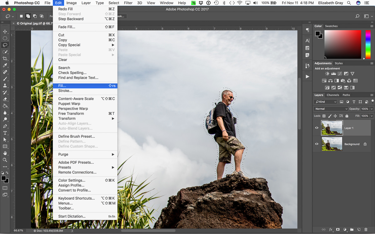
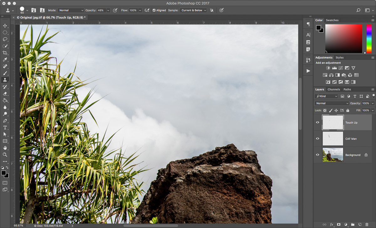
From the Edit menu, choose Fill.
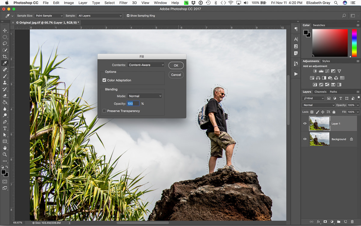
Make sure that Content-Aware Fill is selected from the drop-down menu, that Color Adaptation is selected, and choose Normal as the blending mode. Now click OK.
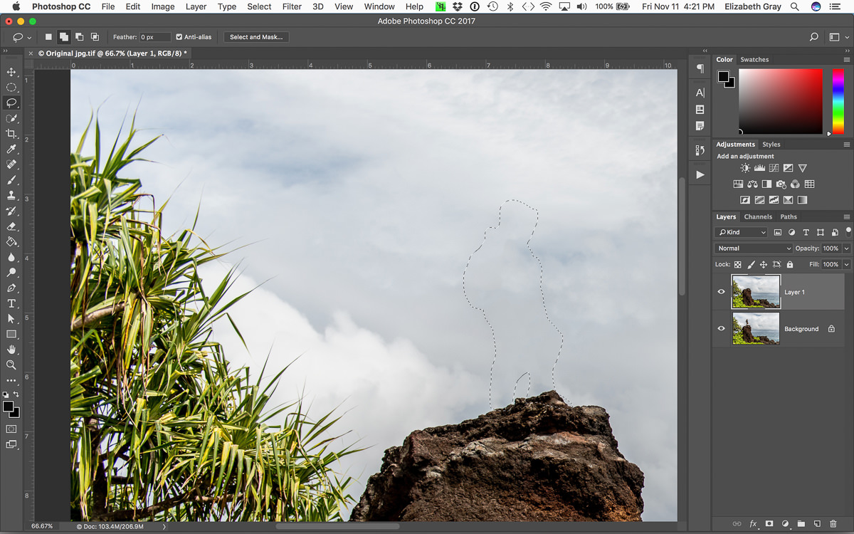
At this point, the unwanted object should have miraculously disappeared and your selection will still be active. This next step is the important one!
With the selection still active, copy it to a new layer. You can do this in one step using the shortcut Cmd+J (Mac) or Ctrl+J (PC). Now the pixels that Photoshop created to fill in space originally occupied by the object are on their own layer.
You are almost done. Delete the copy of the background layer that you made in the first step and rename the layer with the new pixels on it. Renaming will help you keep track of your layers, especially if your final document contains more than a few.
Finishing Touches
Sometimes Content Aware Fill does a perfect job. Other times, you may need to clean up a few areas, especially if you see any pattern repetition. In this example, I didn’t like the light area on the rocks.
To take care of this I created a new layer and used the clone stamp tool to replace the bright rock with something darker. Make sure you have sample ‘Current & Below’ selected and work from a new layer to continue working non-destructively.
Now you are finished and the original background layer remains untouched. You can turn the layers with the new pixels on and off to confirm this.
And here is the final image with Keith removed.
Conclusion
Now I realize that each of you will have your favorite way of removing objects in Photoshop, and in no way am I trying to tell you to use Content Aware Fill all the time. What I have found is that if one method doesn’t work, try another. For small spots and blemishes, the Spot Healing Brush usually works well. Sometimes a combination of techniques works best. For large objects, I find Content-Aware Fill usually does the trick.
What I hope you take away here is that there is no one ‘best’ way. But there are ‘smart’ ways to work inside of Photoshop. Whatever method you use, make sure that you are working non-destructively.
For most photographers, especially those who shoot landscapes, it is crucial to have a good set of filters at your disposal. Filters come in two types: screw-on filters (attaching directly to your filter threads) and square filter systems (sliding into a holder on the end of your lens). A lot of landscape photographers move to a square filter system over time — they have a wider selection of filters, and they let you move your filters from lens to lens more quickly. The main companies that make square filter systems are Lee, Cokin and HiTech, all of which are well-known among landscape photographers. There are a few other companies in the marketplace, too, including a relatively new brand called NiSi. Recently, NiSi has been contacting photography websites for reviews, and they contacted us as well. I have used the Lee system for a while, and experienced a few problems with it, so I wanted to review these NiSi filters and see how they stack up. This review covers the NiSi filter system, along with a few specific filters.
1) About This Review
For this review, NiSi sent us two sets of filters. I took one, and Spencer took the other. We each reviewed the filter set separately and combined our thoughts (which were fairly similar) into this review. We have been allowed to keep these filters. That is always a problem with online reviews — smaller companies sometimes send out freebies to websites, and you have to take bloggers at their word that the review is honest and legitimate. That is especially true in a review like ours, which is mostly positive.
Our opinions here are entirely our own, and we only accepted the filters under the condition that we can write whatever we want about them. These NiSi filters are good, but they aren’t perfect, as this review makes clear. Here, we’re reviewing the entire NiSi system. This includes the filter holder and adapter rings, as well as the filters themselves (a polarizer, an ND grad, and a ten-stop ND filter). We go through all the pros and cons below.
2) Build Quality
The first thing you’ll notice about NiSi filter system is its build quality. As a whole, it feels fairly well-built and solid. In particular, the graduated ND filter is made of glass, and it feels very high in quality. Standard Lee’s and HiTech’s versions are made of resin, which scratches much more easily, although you can get glass filters from each company at a much higher cost.
The rest of the NiSi kit is made of aluminum. This is pretty good, but not perfect. First, NiSi’s aluminum is very thin, which makes it feel a bit cheap (Lee’s filter holder, however, is made of plastic — NiSi wins in this case either way). Also, although the aluminum has worked well so far, I would prefer brass filter threads instead. Aluminum threads don’t do as well in cold weather, and they are more prone to getting stuck on the lens. Plus, they have the tendency to wear out faster overtime (which we have not yet been able to test, but will definitely update the review in the future if it turns out to be true).
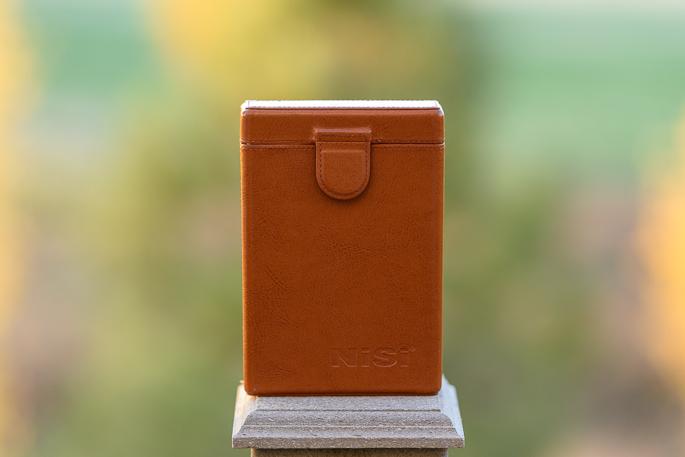
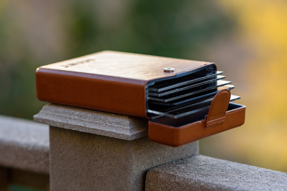
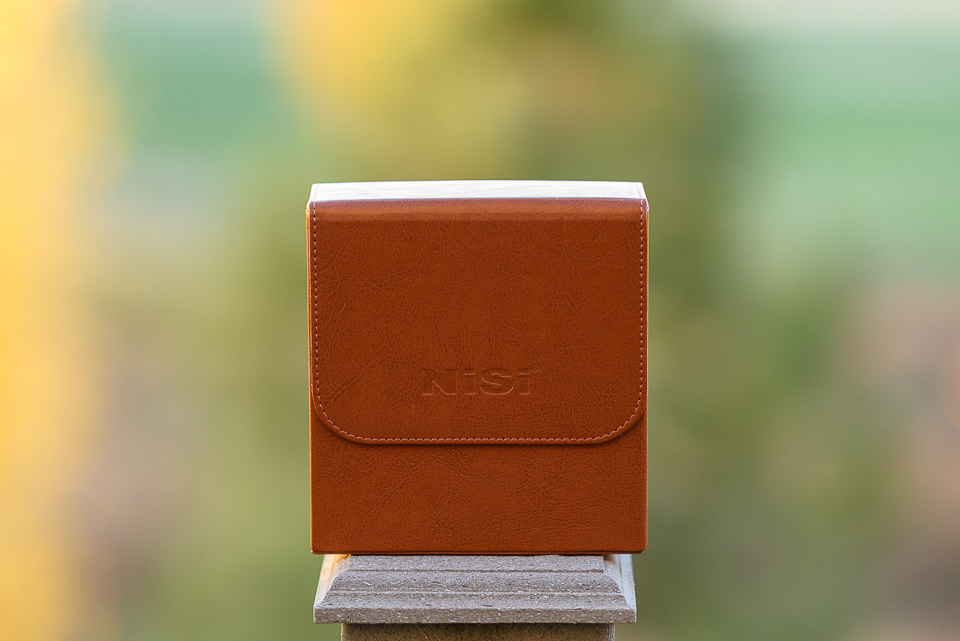
Finally, the leather carrying case for the filters is quite nice. It holds up to six rectangular filters (4×6 or 4×4), and it’s relatively small. If you use square filters, NiSi even provides plastic blank spacers for those, so that you do not have to turn the case over in order to get a hold of a shorter square filter, which is nice.
However, there is one potential problem with the filter case – while it is nice to be able to carry up to six filters, I would not recommend putting more than 4-5 in there. Partially because the case does not close as well anymore and partially because it has a tendency to bend and potentially scratch the first filter. Unfortunately, it seems like there is simply not enough reinforcement on the front of the case, which can result in its bending, as seen below:
The front of the case has a tendency to bend, which can potentially damage the first filter.
My case developed this behavior after several trips, although Spencer’s sample seems to be a bit better for now. If additional pressure is applied to the bent side, it can certainly break the first filter. And even if it does not, the magnetic button on the front has two mounting brackets on its back, which can certainly scratch even a glass filter. I wish NiSi reworked the case and found a way to provide additional protection and eliminate anything inside the case that might scratch filters overtime.
Overall, aside from the above-mentioned issue, the build quality of the NiSi equipment is quite good. As a whole, it is noticeably better than Lee’s, although not worth making the switch in and of itself.
3) Assembly
When you first try to set up your NiSi filter system, it can seem a bit counter-intuitive. That’s because there are a few important differences between NiSi and Lee filters. Assembling the filter system takes four steps:
3.1) Step-Up Ring
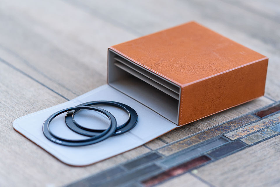
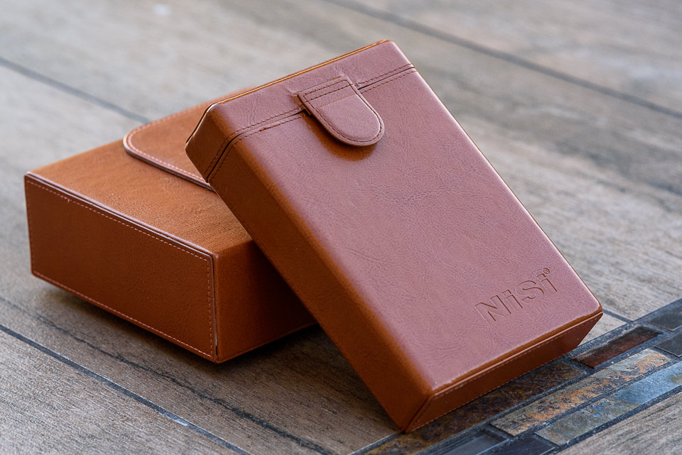
Unless you have a lens with an 82mm filter thread, you need a step-up ring to 82mm, as that’s the native size of the filter holder. The full NiSi system comes with three step-up rings: 67mm to 82mm, 72mm to 82mm and 77mm to 82mm. If any of your lenses has a different filter thread size, you’ll need to buy your own step-up ring to 82mm. The step up rings, along with the NiSi filter holder can be all stored in a larger leather case, as seen below:
3.2) Adapter Ring
Once you’ve attached the 82mm step-up ring, you can screw the “82mm adapter ring” onto your filter threads. The name “adapter ring” can be confusing, because there are a lot of rings involved in setting up a filter system. This adapter ring isn’t actually the piece that holds your square filters — this is what the square filter holder clamps onto.
There is one difference so far between NiSi filters and Lee filters. For Lee filters, the adapter ring (again, what the square filter holder clamps onto) doesn’t have a built-in 82mm filter thread – it comes in all sizes. You need to buy a separate adapter ring for each one of your lenses. My three main lenses, for example, each have their own filter thread sizes: 58mm, 67mm, and 77mm. So, I need three adapter rings as well — one for each size.
As explained above, NiSi is different. Instead of needing three adapter rings, I need three 82mm step-up filter threads, and only one adapter ring. I prefer the Lee system’s simplicity, but there is a good reason why NiSi does it this way: it allows for a built-in polarizing filter!
3.3) Polarizing Filter
This is the interesting part. Because of its design, NiSi’s adapter ring has a built-in way to attach a slim polarizing filter. This fixes one off the main problems with the Lee system — easy use of polarizers. With Lee, there are three ways to use a polarizer:
Attach a polarizing filter onto your lens, then attach the adapter ring directly onto the polarizing filter. This is a bad option, because it creates a lot of vignetting on wide-angle lenses. It also makes the polarizer almost impossible to remove from your lens — any time you try to spin it off, you end up just rotating the whole system instead. I tried this for a while, and it was a nightmare.
Instead, you can use Lee’s “105mm adapter” to attach a huge, round polarizing filter onto the very end of the filter system. In theory, this works well. However, it makes your filter system much larger, and it also can cause vignetting. Now that my widest lens is a 20mm rather than a 24mm, the vignetting is too strong, and this option no longer works (yes, I still use a polarizer on my 20mm lens – mostly for forests and waterfalls rather than blue skies, which turn uneven in brightness when you use a polarizer on a wide-angle lens).
Finally, you can use a square polarizing filter that slides into your Lee holder exactly like any other square or rectangular filter. There are two problems with this approach, although this is what I have been using with my own Lee system. First, it takes up one of the slots in your filter holder – not ideal when you need to stack several filters. Second, and more importantly, you no longer have the ability to turn the polarizer at any angle you want. Instead, you have to rotate the entire filter holder at once. This is a huge problem when you’re using a polarizer and an ND grad at the same time (you may want them rotated in different directions, which is impossible).
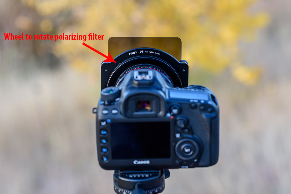
The NiSi system fixes these concerns, although it adds a small problem of its own.
So, how does the NiSi system work? Interestingly enough, there is a small wheel on top of Nisi’s “adapter ring” that actually lets you spin the polarizing filter! I am a big fan of this design. It lets you rotate the polarizer at any angle, and it takes up less space than any of the Lee options:
The one problem is that this polarizer adds another ring that you have to screw in. The polarizer saves space, but it makes things a bit more complicated. If you haven’t used the NiSi system for very long, it can be difficult to remember how to assemble and reassemble it. The Lee system might be simpler and more intuitive to assemble in comparison, especially for a first time user.
Still, on balance, this is an improvement. If you’re looking for a reason to switch from Lee to NiSi filters, this is it – the polarizer simply has a better design.
3.4) Filter Holder
Last is the filter holder itself. There isn’t much to explain here, as it is pretty much exactly like the Lee system. The filter holder has a small knob on the side, which you pull out as you’re placing the filter holder onto the adapter ring. Let go of the knob, and your filter holder stays in place.
4) Ease of Use
This is a double-edged sword. On one hand, as explained above, the polarizer is incredibly easy to use. The small wheel at the top of the adapter ring is a great design. I wish that all polarizers spun like this. However, the sheer number of rings in this system means that everything feels more convoluted than the Lee version. It isn’t any larger – in fact, it saves a bit of space and weight. It’s just more to keep track of in our opinion. Also, it takes a bit more time to swap your filter holder from lens to lens. With the Lee system, you just need to unclamp and clamp the filter holder; here, you need to unscrew and then screw in the adapter ring. Confusing? It’s a bit easier in practice, but still not as simple as the Lee system.
Lastly, NiSi’s filter holder itself doesn’t clamp as easily as the Lee system. What do I mean by that? If you’re trying to use any rectangular filters, it can take a moment before you get the square filter holder to attach properly to the adapter ring. I don’t know why this is the case — Lee’s is easier and quicker to use. However, this isn’t a major problem, just a minor annoyance.
In the end, Lee wins out in simplicity, but NiSi is still very usable. A few minor tweaks would even out the differences.
5) Optical Tests
As we have shown in our glass vs resin filters article, high-quality glass filters definitely outperform their resin counterparts. We have tested NiSi’s glass filters and they turned out to be superior to both Lee’s and HiTech’s resin filters. Let’s take a look at some of the comparisons between different filter types.
5.1) Two Stop (0.6) GND Filter Comparison
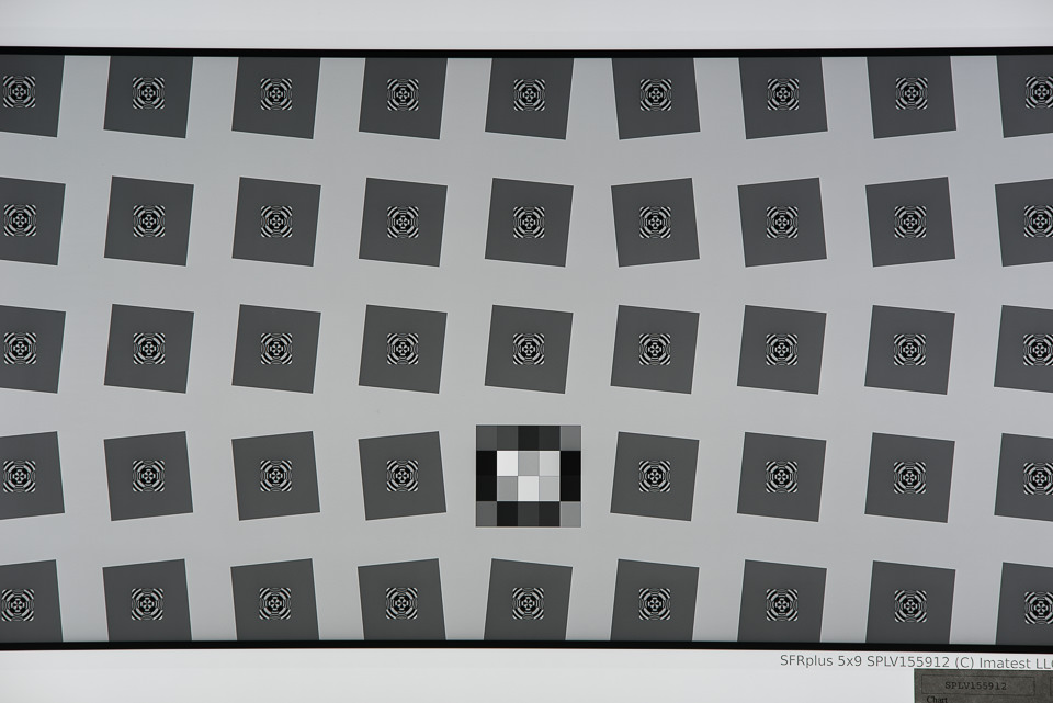
Here is a comparison of MTF results produced by Imatest, comparing the different types of 0.6 GND filters from NiSi, Lee and HiTech:
As you can see, NiSi filters practically do not cause losses in sharpness, whereas both Lee’s and HiTech’s resin filters showed up to 17.5% image degradation. Such optical performance might not be easy to spot on low resolution cameras, but once used on high-resolution cameras such as the Nikon D810 and Sony A7R II, the differences can become quite obvious.
At Photo Plus New York, NiSi showcased its glass filters and compared them to filters from Lee and Hitech. Their setup showed the performance of a NiSi glass filter using a special device, as seen in our interview below:
Obviously, the test was exaggerated quite a bit to make NiSi look good, but still, it made us want to check if their claims were actually true. After testing NiSi filters, we came to conclusion that their glass filters are indeed superior to most popular resin filters on the market. However, this also does not mean that NiSi has something to offer that Lee or HiTech do not – both companies actually offer their versions of glass filters, although at a higher price premium. HiTech’s 0.6 GND Firecrest filters are made from 4mm thick Schott glass, which is basically as good as a filter can get. At $ 350, however, it is over 2x more expensive, making such filters cost-prohibitive for many photographers out there.
5.2) 10 Stop ND Filter Comparison
For our next test, we compared two 10 Stop ND filters from NiSi and HiTech. If you have experience shooting very long exposures, you probably know how images can get hurt with most resin filters, since they introduce quite a bit of color cast. Pretty much every resin filter that I have personally tested from Cokin, Lee and HiTech has always had color cast issues – some are on pinkish side, while others add a lot of green and blue color casts to images. How does the NiSi 10 stop ND filter compare in such cases? Let’s take a look at the following two images:
The image on the left is produced by NiSi’s 10 stop ND filter, while the image on the right is produced by HiTech’s 10 stop ND filter. See the difference in color? That’s not white balance – that color change is purely the result of the resin filter! When I first saw this in the field when testing out HiTech filters, I was really shocked to see such blue-rich colors. In all honesty, I don’t understand why companies like HiTech even sell such crappy filters, because it is impossible to take care of extreme color casts in post-processing. Even if you move your temperature slider towards oranges, it is not just the blues that are affected – this filter adds a bunch of green and red colors as well. You pretty much get the whole color spectrum added to your images and it is pretty bad! Glass filters and specifically the NiSi 10 stop ND filter here, do not have such problems. As you can see, the colors appear natural and there is not even a hint of color cast in the image.
What about sharpness differences? Well, that’s where it is a double loss for resin filters. Just take a look at the below MTF comparison:
Yikes! You might be wondering what happened here. Well, resin happened. As you can see, even with a 10 stop ND filter, NiSi performs really well. There is a slight loss of sharpness in the center, but it is not something you would be able to see in images. Mid-frame and the corners are definitely impacted and that’s expected when a filter is cutting down so much light from entering into the lens. However, that’s nothing compared to what happens with a 10 stop ND resin filter – look how bad that HiTech filter does in comparison. That’s practically a 30% drop in sharpness. Not only does the HiTech filter add nasty color casts, it also does massive damage to image sharpness!
5.3) Polarizing Filter Comparison
Lastly, we wanted to see how good the provided glass polarizing filter is when compared to a high-end polarizing filter from B+W, specifically the B+W Kaesemann 82mm MRC Nano, which by itself costs around $ 135. After going back and forth to measure sharpness between these filters, we could not spot any noticeable differences in performance – the difference was less than 1-2%, which falls into margin of error. So the NiSi filter seems to be as good as the B+W filter in terms of not impacting image sharpness.
However, there are a few important points to add here. First of all, the B+W filter can be mounted independently on any lens with a 82mm filter thread, whereas the thin 82mm NiSi filter can only be used on the NiSi filter holder. Second, the B+W Kaesemann polarizer does not reduce as much light going into the lens – in our tests, we saw approximately 1 full stop of light loss. The NiSi polarizer, on the other hand, had much more light loss – approximately 1.3 to 1.5 stops of light loss in comparison. Third, the B+W filter has noticeably better coating, which does not add as much ghosting and flare to images as the NiSi filter. And lastly, the B+W filter is made from high quality metal and brass filter ring, whereas the NiSi polarizer feels quite cheap in comparison with its lightweight aluminum construction. In short, you definitely get what you pay for with B+W polarizers. But how useful are all these features if you cannot use them with filter holders? That’s where the NiSi polarizer comes in and for that, it does a pretty decent job!
NiSi’s large carrying case for the filter holder and adapters
6) Filter Gradation
Our friend Simone Conti pointed out an interesting observation about NiSi filters that was worth looking into – he said that the gradation of the GND filters was a bit too long when compared to Lee filters. I decided to investigate this issue further and see what he meant, so after I got back from Photo Plus, I put both Lee’s and NiSi’s 0.6 GND filters side-by-side to see what he meant. Indeed, the gradation on the Lee filter appears to be much more sudden. Basically, the filter starts out transparent on the bottom, then the middle of the filter is where the filter softly switches from transparent to 2 stops darker. From just a little higher all the way to to the top, the filter stops about the same amount of light.
In comparison, NiSi’s gradation appears to be much more spread out – the filter starts transitioning in the center and gets progressively darker towards the top edge. There does not seem to be a set “boundary” or a threshold to this gradation in the middle of the filter like on the Lee filter, so it just gets its 2 stop darkness only towards the very top of the filter. This might not be a big deal for most photographers out there, but I would certainly prefer to see NiSi modify the filters, so that the transition happens in the middle of the filter, rather than gradually spread across half of the filter height. Why would this be a potential issue? Well, the NiSi filter simply makes it harder to see exactly where to stop the filter when looking through the viewfinder or composing via live view. The smoother / more spread out gradation can work out great for some environments where one perhaps desires to slowly transition from one area of the frame to another (which can be especially useful when photographing cityscapes with tall buildings and mountainscapes with high peaks), but considering that it is only a two stop filter, I do not think it would be that much of a concern in most situations. Personally, I prefer the gradation to occur in a smaller area in the center of the filter.
7) Other Concerns
A few other reviews online have mentioned that NiSi filter holder slides directly onto the lens (with foam to keep it in place) rather than screwing onto the filter threads. This is no longer the case. For all the versions currently sold, NiSi filters are like the Lee system – they attach via your filter threads. This seems like a much better option, and the old version was resulting in a lot of negative reviews. It seems that NiSi listened to their feedback and redesigned the system.
Also, a lot of people may be wondering if the NiSi system works for ultra-wide lenses without filter threads, like the Nikon 14-24mm f/2.8G. The short answer is yes, but anyone who uses these lenses knows how difficult it is to find a good filter set. Here, you need much larger filters (150mm rather than 100mm) and an entirely different filter holder system if you want it to work. We didn’t test that particular system, so we can’t provide our perspective at this time.
8) Verdict Against the Lee System
For some people, the NiSi system has some noticeable improvements over the Lee filter system. First, the build quality is better, which is certainly nice. Especially with the carrying case, the NiSi system feels a bit more complete. But, more importantly, the polarizing filter situation strongly favors NiSi. This is why both Spencer and I are sticking with the NiSi system from now on. There aren’t huge differences between the two, but NiSi just makes our lives a lot easier when we need to use a polarizer and a grad filter at the same time (which happens relatively often for our landscape work).
Here’s what we would say — if your polarizing situation with Lee is bothering you, it may be worth the switch. Otherwise, there is no reason to switch from Lee, because there really aren’t that many differences between the two holders. If you are just starting out, either is a good choice. We cannot conclusively recommend one over the other. The Lee system is simpler and quicker to use, but the NiSi system is better-made and handles a polarizing filter more elegantly.
Remember, too, that you can swap out the rectangular filters between these two systems without a problem. So, if you prefer, you can use a filter holder from one system and actual filters from another, which is great! Actually, given how well glass filters from NiSi perform compared to Lee, that might be an excellent choice for those who want to keep their Lee filter holders, but want to stay away from resin.
Ultimately, not taking price into account, both systems are very similar. If you need a square filter system, you can’t go wrong either way.
9) Price Comparison and Conclusion
Filter systems like this are sold as components, not as a whole set. Here are the links to each of the NiSi items mentioned in this review. NiSi is primarily sold through Amazon, although you can now find it at B&H Photo Video as well:
NiSi filter system, $ 158 (Includes 67mm to 82mm, 72mm to 82mm, and 77mm to 82mm step-up filter threads. Also includes NiSi’s adapter ring, polarizing filter, and square filter holder).
Is this cheaper or more expensive than Lee’s system? Ignoring the leather case, which I recommend regardless of the filter system you use, NiSi is noticeably less expensive than Lee. Here, are the total costs:
Clearly, Lee is more expensive for a comparable filter lineup. Without the cost of the leather case, the NiSi system is $ 441. A comparable Lee system is $ 605 (or $ 635 if you have the wide-angle adapter ring) and it does not come with all the adapters that are included with NiSi. That’s a large difference for such similar products. Because of this, I am inclined to recommend that a beginner goes with the NiSi system instead of the Lee system. But, if you already have the Lee system and don’t have a problem with your polarizers, there’s no need to jump ship.
Hopefully, this helped you decide if the NiSi filter system is right for you. It isn’t perfect, but a lot of people will see benefits here that Lee doesn’t provide – and vice versa. It’s all up to your specific needs.
It wasn’t until about 4 ½ years ago that I became a passionate photographer. I had a camera that I didn’t know how to use. I wanted to take better pictures like the ones I saw online when I scoured photography blogs.
My kids were 11, 8, and 2 at the time. I had guilt because I would take so many more of my daughter, then 2, than I would of my two boys. I needed to figure out how I could take pictures of my older kids that would accurately tell who they were at these particular stages in life.
Naturally, we put the camera down as the kids get older. When they are little, we focus on those firsts, the rapid changes they go through, and capturing the cuteness that everybody wants to see. As they get older, they get more awkward, spend more time in their rooms, and don’t love the camera in their face.
I was determined to continue to capture my boys as they got older, and I still do. I think it is so important to capture it all. But how? How can you make an interesting photo with teenagers, especially boys?
1. Explore places and things they enjoy
One thing I’ve learned with teenagers is that you do have to pry them out of the house sometimes, but once you’re out, they are agreeable to go places, especially if it involves beaches, water, climbing, hiking, eating, exploring, traveling, etc. I love to capture my older kids doing things they love. I absolutely love shooting with a wide angle lens for these types of shots to capture the entire scene.
2. Don’t push them to look
I never tell them to look at me. They know the camera is there. They know I’ll be taking their pictures, but they also know that if they allow me to do it, I will share some pretty cool shots with them once I have them uploaded and edited. I’ve had them come into my office and ask to see the pictures I have taken of them.
3. Take adventures in new places
My kids love to see cool and unique places, so when we can, we try to explore and take adventures as much as possible. One of the coolest things we’ve done was this summer in Michigan. We hiked up a huge sand dune, and on the other side was a beautiful lake nestled in the middle of all of the dunes. They ran directly into the water from the dunes. They described it as “EPIC” and actually asked me to take their pictures running down the dunes.
4. Capture their quiet moments
Don’t put your camera away when your older kids are doing quiet activities. You may not think it is exciting and you may not think others will either, but remember, you are documenting their lives for you and for them. Often times, it is these photos that you come back to in a few years. Even if it is just a shot of one of my boys on his bed listening to music or quietly sitting at his desk doing homework. If you don’t take the shots, you will never remember them at this stage.
5. Use the light
I always look for light to make my photo extra ordinary. When your subject is in beautiful light, no matter how old they are, the picture becomes something more than just a picture – it becomes a beautiful photograph.
6. Capture the connections
Having a connection is huge. When I am photographing my boys together, I am usually photographing them interacting or doing something together. Most of the time, you really have to just wait for the shot. They may be talking to one another and I can capture facial expressions. Or my older son may be making my younger son laugh. I also like to photograph my older kids interacting with younger kids. I absolutely love capturing my boys with their little sister and younger cousins. These are the photographs that tell such a story.
Lastly, try shooting different angles, silhouettes, and a personal favorite of mine – reflections. Changing up how you shoot can make for an interesting picture. If your teens do not want to be photographed, you can tell so much by capturing the details and not even include their faces.
The older they get, I feel it is so important to capture them. I like to think of it as documenting them becoming men.
I will admit that it is harder to capture them at this age. Of course, it is easier to photograph babies and young kids in their cuteness but, when I struggle to make a good photograph with one of them, or I am feeling like they are boring shots of typical teenagers, that is often when I get a shot that when I look back on it, I am so happy I have it. Remember, you don’t get do-overs; these times are fleeting!
In a follow-up to a previous article,“A Study in Vision, Light, and Shadows”, I decided to share my thoughts and experiences on my most inspiring topic in photography – light. For simplicity, I decided to write about light in a narrow context from the perspective and experience of a landscape photographer, since outdoors scenes are what I gravitate to. Much of the analysis and discussion that follows is equally applicable to other genres of photography, such as portraits, macro, still-life, and commercial photography. In this article, I will cover broadly what quality of light means for me in landscape photography as well as discuss a variety of scenarios where the scenic photographer can use different properties of light to create a given effect. Please note that this discussion is based on my own personal observations and experiences, which may differ from those of other photographers. My goal is to help beginning landscape photographers understand the different qualities of sunlight and how this instrumental tool can be harnessed to fulfill the visualization process.
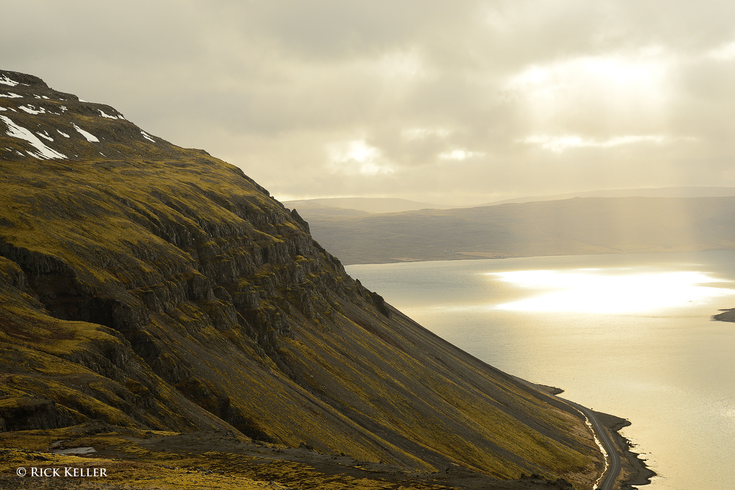
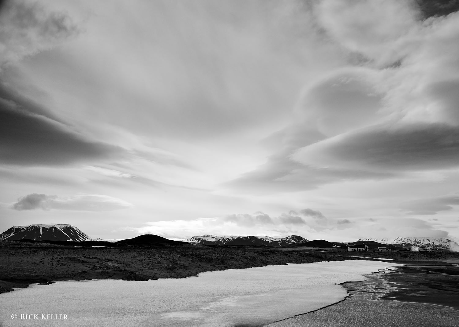
Crepuscular light in the West Fjords, Iceland Nikon D800, Nikkor 24-85mm f/3.5-4.5 G ED VR
As visual artists and photographers, when we hear or read a reference about the “quality” of light, we may ask, “What exactly does that mean?” Visual artists (painters, sketch artists, sculptors, photographers) can talk about light at length, but a consensus on just what constitutes “good light” or “bad light” can be elusive. The short, if not nebulous, answer to this question is that the quality of light may mean different things to different photographers and perhaps hold a different meaning at different stages in their discovery process. The truth is that there may not always be a “best” quality of light that is applicable to all situations or cherished by all photographers.
What are some of the qualities of light that scenic photographers seek? Is there a common denominator? Some photographers may cherish a “warm” scene…
Nikon D5000, Nikkor 55-200mm f/4.0-5.6 G ED VR
or a “cool” scene . . .
Nikon D800, Nikkor 24-85mm f/3.5-4.5G ED VR
Some photographers may prefer to work with so-called “hard” light . . .
Fundamentally, I view light as the requisite physical tool and aesthetic device to translate artistic vision into an image that conveys what the artist was feeling at the time of opening the shutter. Many landscape photographers (myself included) may describe and swear by “magical” light that may be difficult to express in words, but they surely know it when they see it. One of my favorite quotes from the incomparable Galen Rowell is, “My first thought is always of light“. Mr. Rowell’s philosophy is the epitome of the technical and aesthetic imperative of the photographic process. In the video clip below, please scroll to the 1:45 mark to hear Mr. Rowell speak with passion about his approach to light.
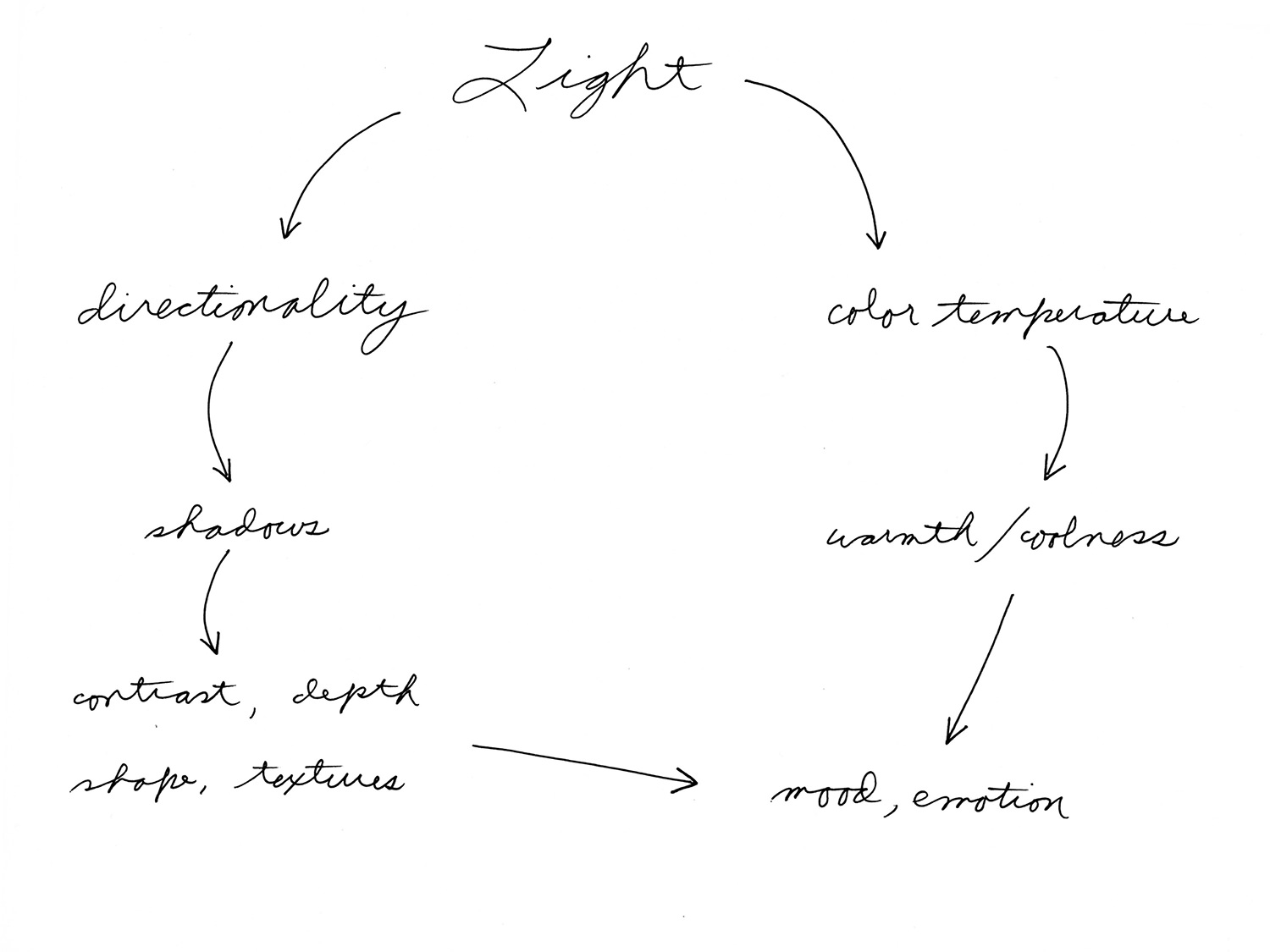
In the creation of a landscape photograph, I approach the quality of light with two interrelated properties in mind: the directionality and the color temperature. Why these two properties? The directionality of light determines the all-important quality of *shadows*, the *contrast*, and the *textures* in the landscape. Shadows, in turn, are what create depth, shape, and dimensionality in the scene and may also confer a provocative mood and emotion to the photograph.
To help beginning photographers understand the various properties of light, let’s take a look at a few controlled demonstrations of the directionality of light. Consider a plain sheet of crumpled copy paper. If we vary the directionality of light, would this influence the physical appearance and mood of this subject? The following photo shows the paper being illuminated solely with an overhead incandescent ceiling lamp. The directionality of this lighting is more or less even, but not completely. As you can see, there are shadows that lend a sense of shape, dimensionality, and texture, but the effect is neither compelling physically nor emotionally. Actually, it looks somewhat flat because the shadows are relatively flat.
Next, let’s adjust the lighting by keeping the overhead incandescent lamp on and placing a photoflood lamp in front the subject, directly behind the subject, and from both sides. Again, the lighting is roughly even. This is similar to the light of an overcast sky, for example, where sunlight is illuminating the scene from all directions (i.e., the soft box effect) and shadows are being filled in. Compared to the previous image, this subject bears a similar physical and emotional appearance – lifeless and boring.
But wait … what happens if we change the directionality of the light? This is where the drama unfolds. Let’s turn off the overhead ceiling lamp as well as the lamps from behind, in font, and from the right leaving only the paper illuminated from the left side at a low angle.
Wow… what a difference. This particular light has created a starkly different appearance and emotion. With the source of light now being unidirectional and raking across the subject at a low angle, we can perceive longer shadows, more shape and contours, more textures, and a heightened sense of depth that were minimal in the previous more evenly lit subjects. With more prominent visual cues of well-defined shadows alternating with highlights, the mind is more inspired to interpret and “see” faces, mountains, valleys, hills, defects, and creases.
What about other forms of the directionality of light? Can the visual artist and photographer still create this dramatic type of rendition without side lighting? To find out, let’s illuminate the paper solely with a lamp from behind at a low angle (i.e., backlighting):
Very interesting…compared to the previous image made with side lighting, there are stark similarities and differences. For one, the long shadows remain, which means we can appreciate the same physical attributes (shape, texture, depth) as well as a dramatic emotion. The difference is that the “landscape” itself has changed because of the change in the direction of the shadows. Instead of long shadows being cast perpendicular to the axis of the lens, the shadows are now being cast towards the lens. Thus, with a new pattern of alternating shadows and highlights, the mind can now interpret a completely different scene. This rendition bears “new” faces and mountains, if not a different identity. Because the shadows are different, structures that were previously seen with side lighting may be less prominent, may be no longer appreciated, or be interpreted differently by the viewer. Conclusion? Two different sources of light…two different sets of shadows…two starkly different moods and interpretations – all by virtue of directionality of the light.
OK, what would happen if we keep the light unidirectional but illuminate the subject from directly in front (i.e., light source behind the lens)? Based on the previous examples, can you predict the directionality and “quality” of the shadows? That is, what do you think the lens will “see” from this type of light? And what physical and emotional impact would this light have on the image and therefore on the viewer?
As one would expect, in comparison to side lighting and back lighting, the front lighting delivers a starkly different rendition. Because the shadows are now headed away from the lens, they are more hidden, in much the same way the shadows were hidden in the first two examples when they were filled in by more even lighting. With the shadows now more concealed from view, predictably we lose much of the physical depth, textures, shapes, and mood that were prominent with the side lighting and back lighting. The front of the subject now appears “smoother” with loss of textures, creases, and defects. Comparatively, this effect is no more compelling than the “even lighting” in the first two examples. In essence, the front lighting is similar to the quality of light that many portrait photographers use, namely front diffused lighting (i.e., butterfly lighting) to conceal wrinkles, pores, creases, and defects on the skin of the face. By concealing shadows and thus minimizing texture, the viewer interprets a softer and smoother surface. For glamour photographers, this quality of light may be what is desired for effect; but for the landscape photographer, recording these defects is *exactly* what we desire. We want to treat our audience to alluring textures, creases, deep shadows, and maybe deliver a dramatic mood and story.
As you can readily deduce from these simulations, shadows and contrast are an essential visual cue to the human mind in the perception of shape and depth in three-dimensional space. Without these visual cues, the mind would otherwise interpret a flat scene, which may not be desirable from an aesthetic standpoint. Further, these demonstrations strongly infer that the quality of light that lends itself well for landscape photography is low angle, unidirectional light from the side or directly behind the landscape. Hence, the way in which the photographer uses the direction of light to create a photograph is essential to creating the overall physical and emotional impact of an image. This beautiful phenomenon explains how a given photographer with a given artistic vision (or two different photographers with different life experiences and artistic visions) can photograph the same subject and come away with completely different images. In my humble opinion, this is the epitome of photography as a form of art. It really *is* all about the light; the “latest greatest gear” is irrelevant…
Now, let’s turn our attention to real life examples of the quality of light in outdoor photography.
1) Side Lighting
This is my favorite quality of lighting, as its unidirectionality beautifully creates alluring shadows, textures, and shape as well as imparts 3-dimensionality and mood to a scene:
Words really cannot do it justice – a visual artist just has to discover and appreciate this light for himself/herself. Consider the following landscape scene where the incident sunlight is coming in at a low angle nearly perpendicular to the axis of the lens.
I crafted this composition such that there would be light sweeping across the landscape creating an interplay of shadows and highlights in the immediate foreground, in the middle, and in the background. As you can see, the shadows in the sand, the foliage, and in the sandstone rocks create an illusion of depth as well as an array of interesting textures extending from near to far. In my humble opinion, assuming the composition is strong, this type of light display is one of the more enjoyable aspects of landscape photography.
In this next photo, made during a chilly but breathtaking hike through the highlands of Iceland, the light was coming in at a low angle nearly perpendicular to the axis of the lens (sound familiar?). After patiently waiting for a snow/sleet storm to pass and the cloud cover to gently lift, the most beautiful quality of light I had ever witnessed bathed the mountain. “It was glorious!” The shadows and contrast were alluring, as were the sense of dimension and the textures. The mood was peaceful, uplifting, and radiant… As I witnessed the beauty unfolding, I was inspired to make a photograph that conveyed all of these attributes and emotions.
Nikon D800, Voigtländer 40mm f/2 SL II
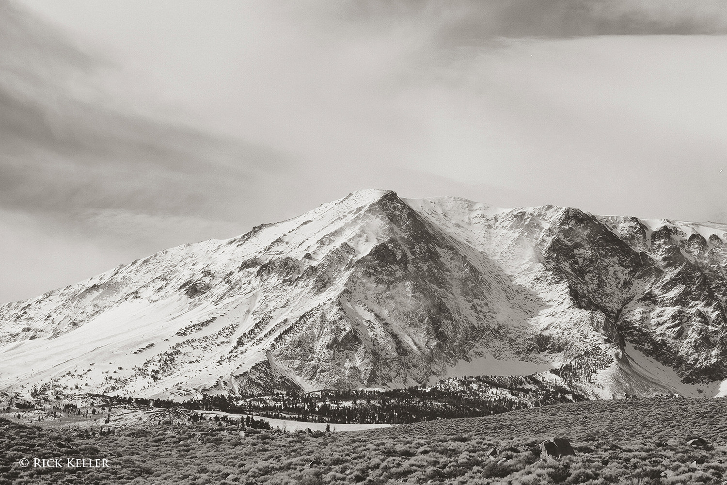
I made this next photograph after a clearing winter storm in the Eastern Sierra Nevada Mountains of California (more on this special case of light in a future article). As you can see, the light is raking across the mountain at a low angle and perpendicular to the lens. Please note the direction of the shadows, the overall contrast, and coarse textures in the snow and rock. Again, this quality of lighting is what really gets me excited about landscape photography!
Beyond pure landscapes, side lighting can potentially yield the same beautiful physical and aesthetic results with plants and flowers, as the following two images illustrate. Each flower was illuminated by sunlight coming in low at a nearly 90 degree angle to the lens. The textures of the petals are nicely elucidated, and once again the interplay of highlights and shadows create depth and an element of intrigue.
Next, let’s consider examples of backlighting, which is also adept at revealing textures and creating shape and dimensionality with additional attributes in special cases (more on this below).
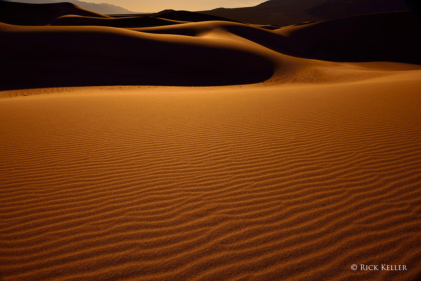
In the next photo of sand dunes at sunrise at Death Valley National Park, the light is sweeping across the landscape from behind at a low angle, which casts the shadows toward the lens. As with side lighting, this quality of light magically brings out the textures of the sand and beautifully accentuates shape and contours by virtue of the interplay of shadows and highlights.
Nikon D800, Nikkor 28-300mm f/3.5-5.6 G ED VR
Further, in terms of creating mood and affect in a landscape, backlighting can work its magic in a number of other ways. In order to create an alluring mood, I often use backlighting to take advantage of the silhouette effect and translucence.
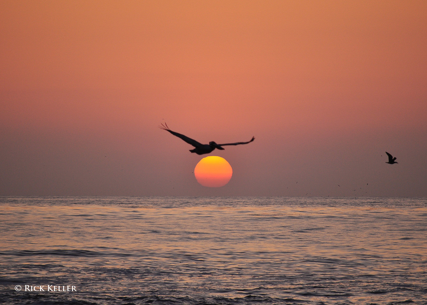
3) Silhouetting
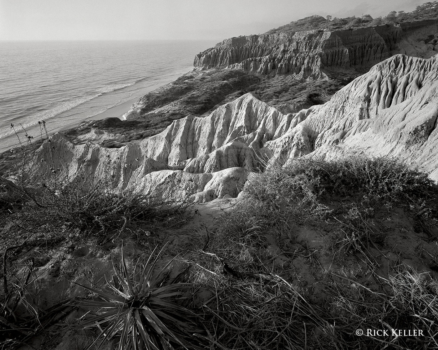
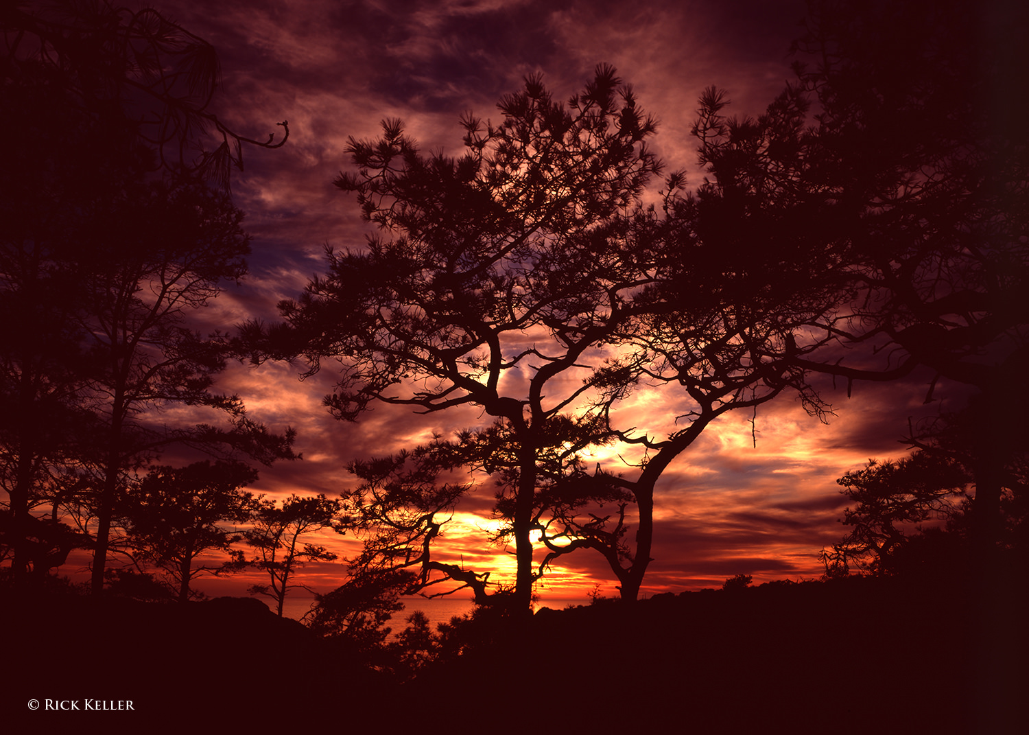
In the next photograph taken at one of my favorite landscape subjects, Torrey Pines State Natural Reserve, the silhouetted pine trees against a radiant backdrop at sunset created a vibrant and uplifting mood. As I opened the shutter to make the exposure, my artistic goal was to juxtapose one of nature’s rare life forms (the second rarest pine tree in the world) with vibrant colors to invite the viewer into a magical world . . .
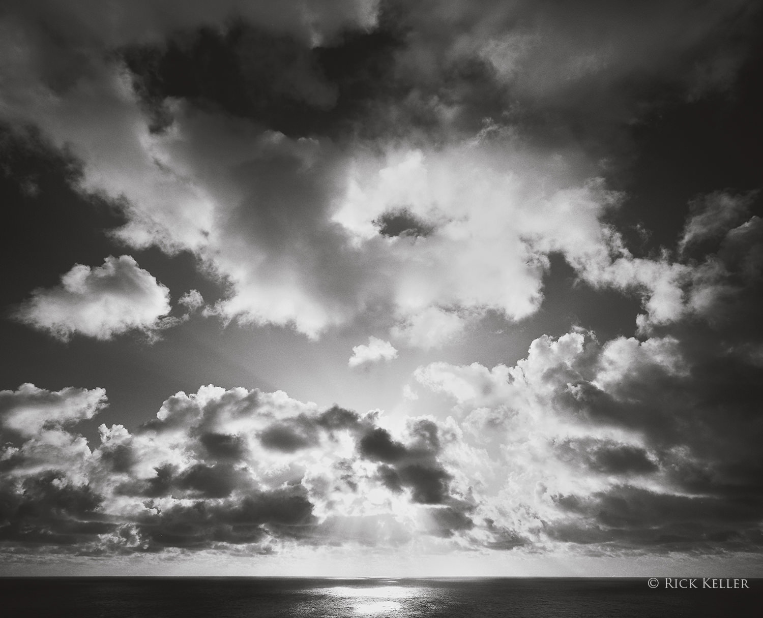
Similarly, this next photo of a cloud formation at sunset evokes the same physical attributes and emotion. The mix of deep shadows and strong highlights creates depth and emotion, and the backlight skimming the underside of the clouds and the surface of the ocean creates alluring textures. As I studied and marveled at this stunning light display, I felt as if I could reach out and touch the clouds and feel the light bathing my hands . . . At the decisive moment of opening the shutter, this was exactly the emotion that I wished to convey with my photograph.
Mamiya 7II, 43mm f/4.5, Fujichrome Velvia 50, 85C
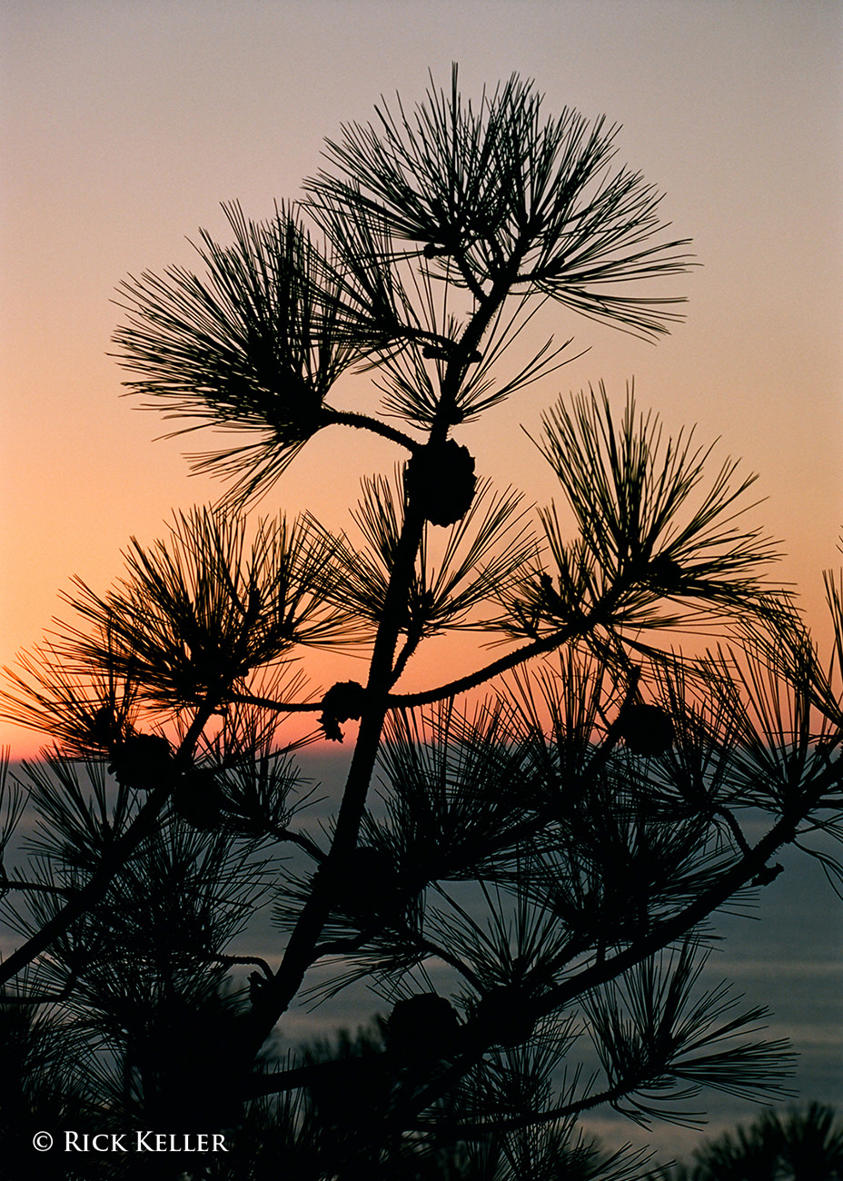
Further, the composition that the photographer crafts need neither be grand nor exotic to explore the silhouette effect. A composition that emphasizes simplicity may have an equally profound aesthetic impact…
Nikon F6, Nikkor 70-200mm f/4 G ED VR, Kodak Portra 160, 81C
4) Translucence
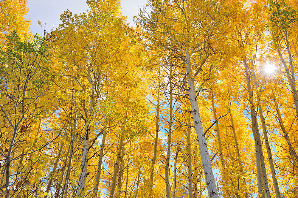
Another special case of backlighting involves the elegant transmission of light through a variety of media. A classic example is the warm and brilliant glow of sunlight through foliage in autumn, as the next photo illustrates. Texture and the illusion of depth notwithstanding, this form of lighting in and of itself may well be the salient feature of such an image.
Nikon D800, Nikkor 28-300mm f/3.5-5.6 G ED VR
On a smaller scale, as in close-ups, translucence may also be used creatively to make an otherwise prosaic subject appear enticing, as the following photograph of a delightful pansy flower after a fresh rain illustrates.
Kodak Easyshare Z1012 IS
My personal favorite use of translucence in the creative process involves the glorious radiance of sunlight through clouds (in particular near sunset). Provided the photographer skillfully manipulates the exposure/film development/post-processing to control the strong highlights, the aesthetic effect can be very pleasing.
Mamiya 7II, 43mm f/4.5, Ilford Pan F Plus 50, Wratten #25A
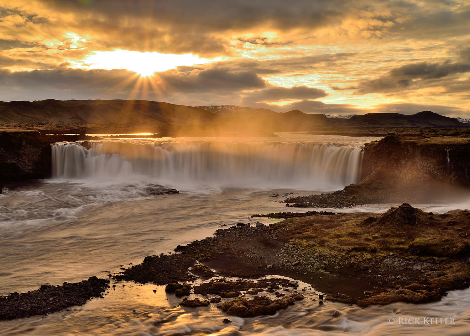
In addition to solids and gas/clouds, translucence with water may also confer a pleasant surprise on the mood of a landscape scene. Consider the following photograph I had made during a trek through southern Iceland to photograph the “Midnight Sun”. Here at an obscure yet delightful waterfall, the sun’s radiance through the water mist had an uncanny effect on accentuating the already glorious scene that was unfolding.
Nikon D800, Nikkor 24-85mm f/3.5-4.5 G ED VR
5) Front Lighting
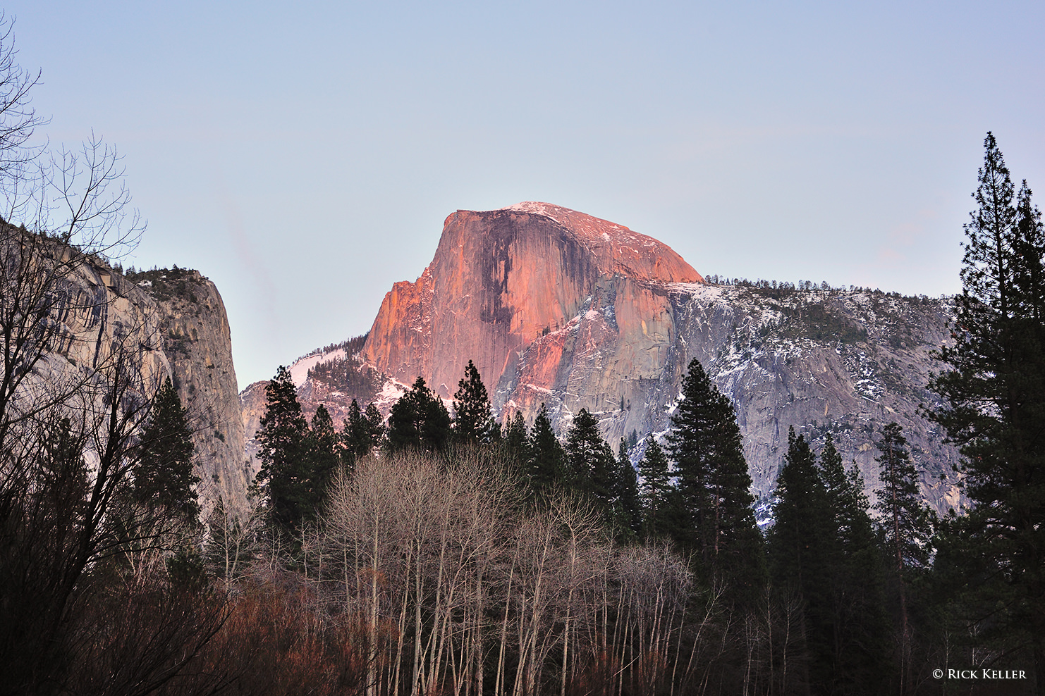
Of all the qualities of light that I have explored, this is my least preferred quality of light, for the reasons illustrated in the simulations above. Again, the directionality of light (coming from behind the lens) effectively *hides* the shadows from the lens, which for a landscape photographer is not at all desirable. Hidden shadows have the unfortunate effect of depriving shape, depth, and textures from a scene, which in turn results in a flat image, physically and emotionally. Having said that, I can think of three scenarios where front lighting can potentially be used to create a compelling landscape photograph. The first scenario is where the sunlight (in particular at early sunrise and late sunset) is illuminating a distant structure (such as a mountain), and the resulting glow on the landscape may be aesthetically rich enough in its own right to create an inviting image.
Nikon D3s, Nikkor 50mm f/1.8 D
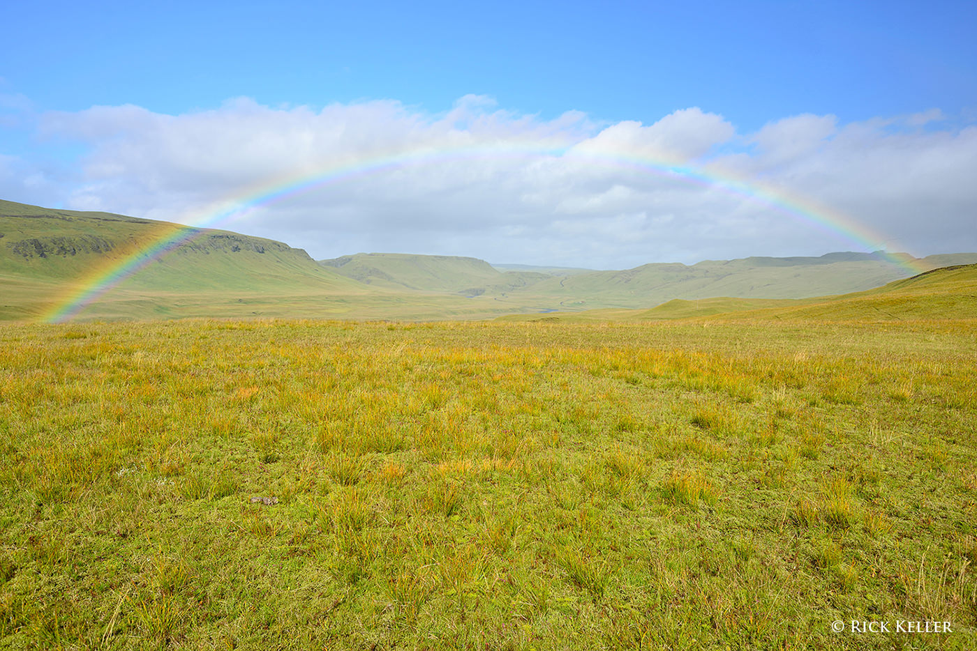
The second scenario would be photographing a rainbow, one of the more interesting (yet relatively uncommon) light phenomena in nature. A discussion of rainbows is far beyond the scope of this article, but I would like to invite our Readers to the following video clip of an interview with Galen Rowell (please scroll to the 1:32 mark to hear Mr. Rowell discuss the phenomenon of rainbows). Also, I highly recommend this excellent article, “How To Photograph a Rainbow”, authored by our very own Nasim Mansurov.
Nikon D800, Nikkor 28mm f/2.8 Ais
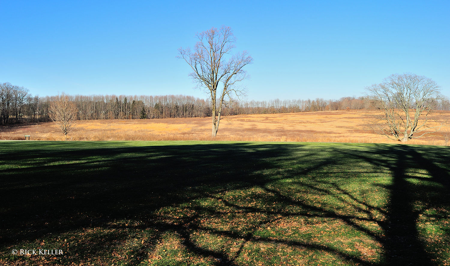
The third scenario where front lighting may appeal to a landscape photographer would be to capture the shadow(s) cast by an object that is situated directly behind the camera (such as a tree) in order to create foreground interest in the scene. Personally, I have yet to feel inspired by this type of lighting scenario, but it is certainly something that may be considered if the composition appears weak or if the photographer’s position in the field relative to the light cannot be easily changed.
Nikon D3s, Nikkor 24mm f/1.4G
6) Even Lighting
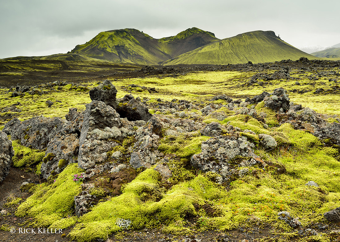
As you might already have experienced with your landscape photography exploits, even lighting (in particular from overcast skies), is not as visually or emotionally interesting as side lighting and backlighting. Because of the diffuse nature of this lighting, much of the shadows in the landscape is filled in, resulting in relatively low contrast and a flat physical and emotional appearance, as the following photograph reveals. For these reasons, I typically avoid this type of lighting in photographing landscapes, unless there is something structurally unusual or unique about the landscape itself.
Nikon D800, Voigtländer 40mm f/2 SL II
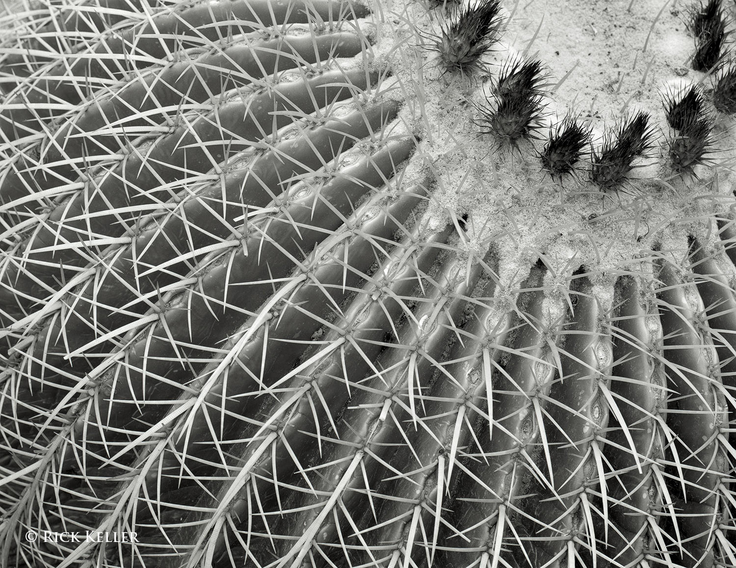
However, even lighting can potentially be favorable in photographing outdoor subjects up-close, in particular trees, plants, and flowers, where low contrast and softer shadows may make the subject appear more flattering. Consider the following photograph of a barrel cactus. Here, the skies were bright overcast (approximately f/8 light intensity via “The Sunny 16 Rule”) and the lighting was predictably low in contrast. This was actually the light that I desired for this subject, because soft shadows would have conferred a more pleasant mood to an otherwise coarse subject.
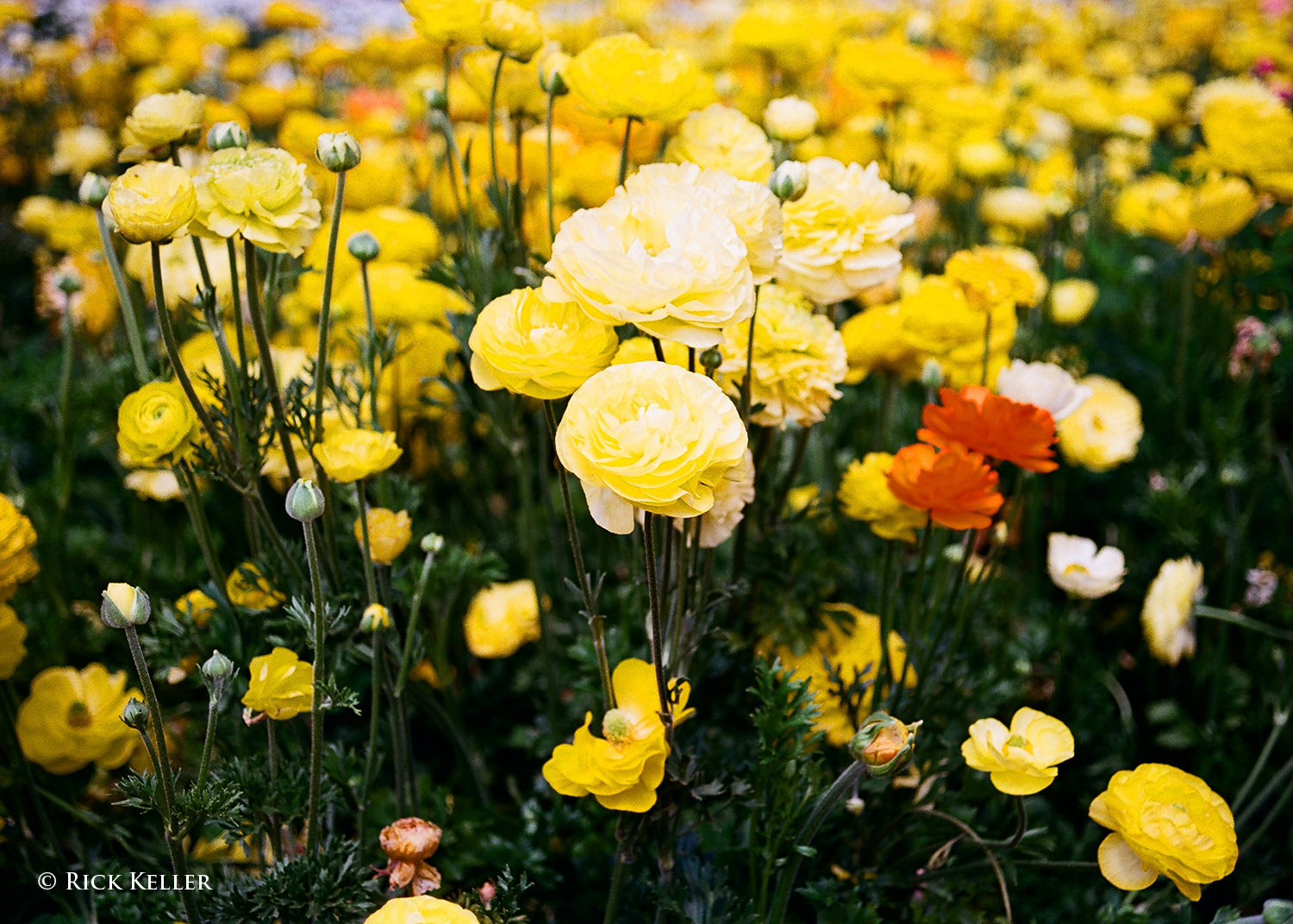
Another potential advantage of diffuse even lighting in the visualization process would be to capture the brilliance of colors in plants and flowers, particularly under the illumination of bright overcast skies (between f/5.6 and f/8 intensity). I hope many of my fellow photographers have also discovered the radiance of yellows, reds, and greens in flowers under overcast skies, as the following two images illustrate.
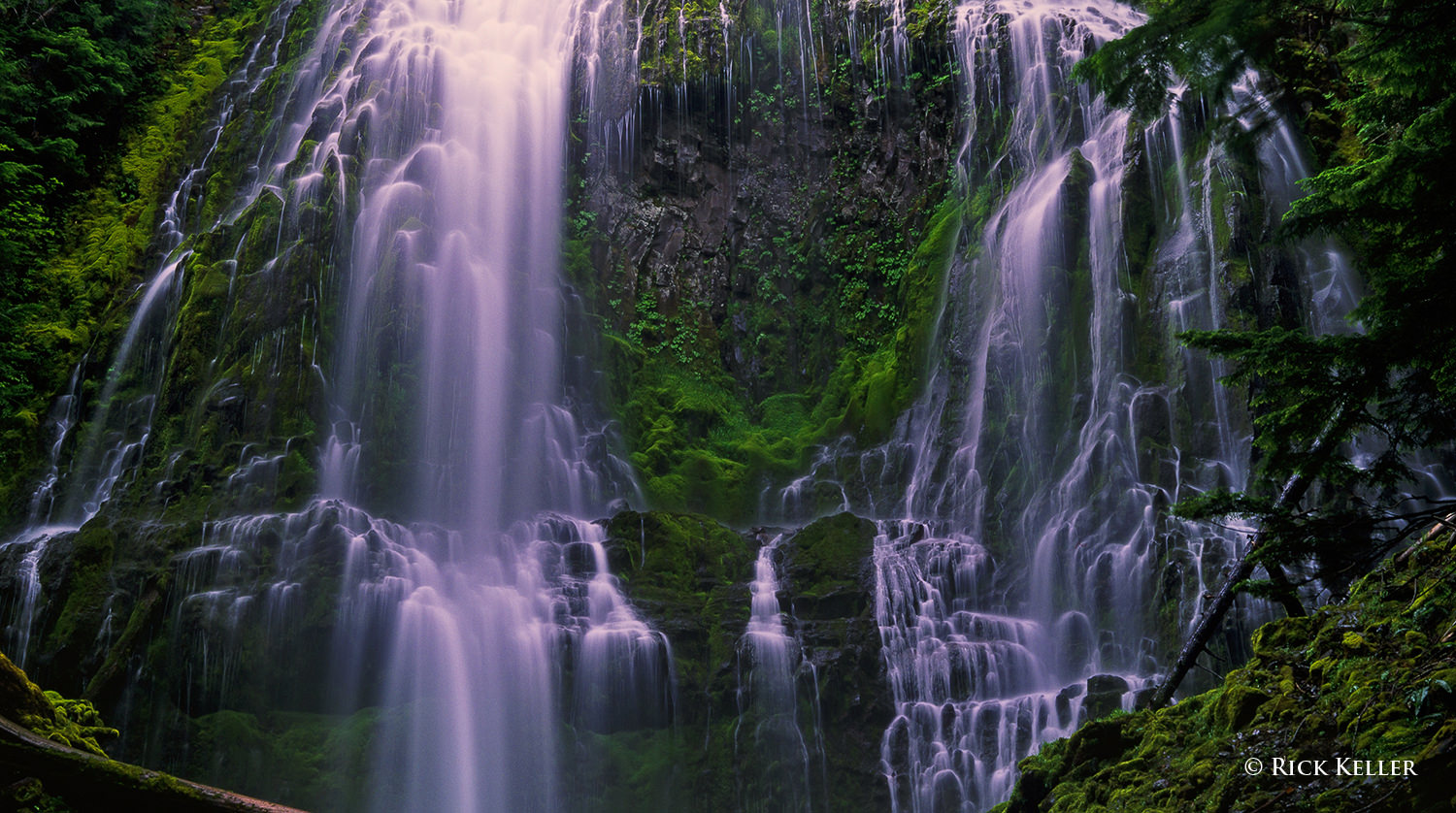
A third scenario where even lighting may be advantageous would be in photographing waterfalls. Many scenic photographers (myself included) prefer soft, diffuse, low contrast lighting (as opposed to the direct illumination of sunlight) for these subjects, as the intense glare and reflections from direct sunlight on the water may not be aesthetically pleasing.
Mamiya 7II, 43mm f/4.5, Fujichrome Velvia 50, 85C
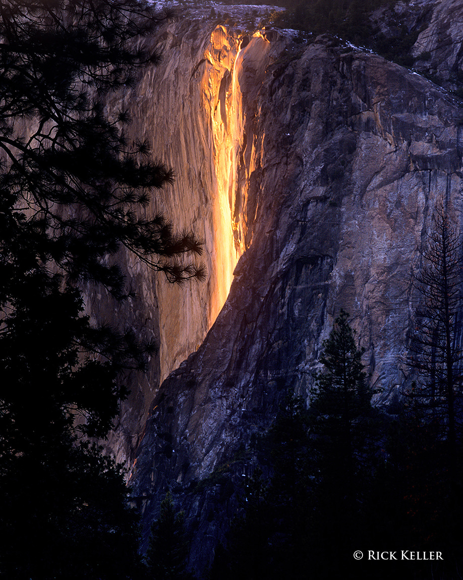
One notable exception to avoiding direct illumination of waterfalls would be the iconic Horsetail Fall in Yosemite National Park (aka the Fire Fall), where the direct illumination of sunlight on a modest stream of water falling over the east face of El Capitan in mid-February creates an uncanny appearance of lava pouring over the face of the mountain.
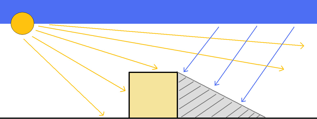
As is the case with front lighting, the non-unidirectional quality of mid-day sunlight is one of my least preferred choices of light in landscape photography. The issue with this type of lighting is that the shadows it casts are relatively shorter, more abrupt, darker, and possess less textural detail than the longer, softer, and more detail-laden shadows of unidirectional light. Consider the following two schematics that illustrate this problem.
Sun high in the sky at mid-day
Sun low in the sky at the extremes of the day
Because of the high position of the sun in the sky at mid-day (particularly during the summer months in the U.S. where I mostly photograph), the high intensity, non-unidirectional light potentially “interferes” with skylight, which is responsible for illuminating shadows in open shade. In theory, this interference may diminish the textural range of the shadows, minimizing their detail. The short nature of these shadows also blunts the dimensionality of the scene, making it appear relatively flat. Conversely, when the sun is lower in the sky at the extremes of the day (i.e., sunrise and sunset), the light is more unidirectional and thus there should be (in theory) less interference between the incident sunlight and skylight. This translates into longer shadows that may potentially have more detail and texture.
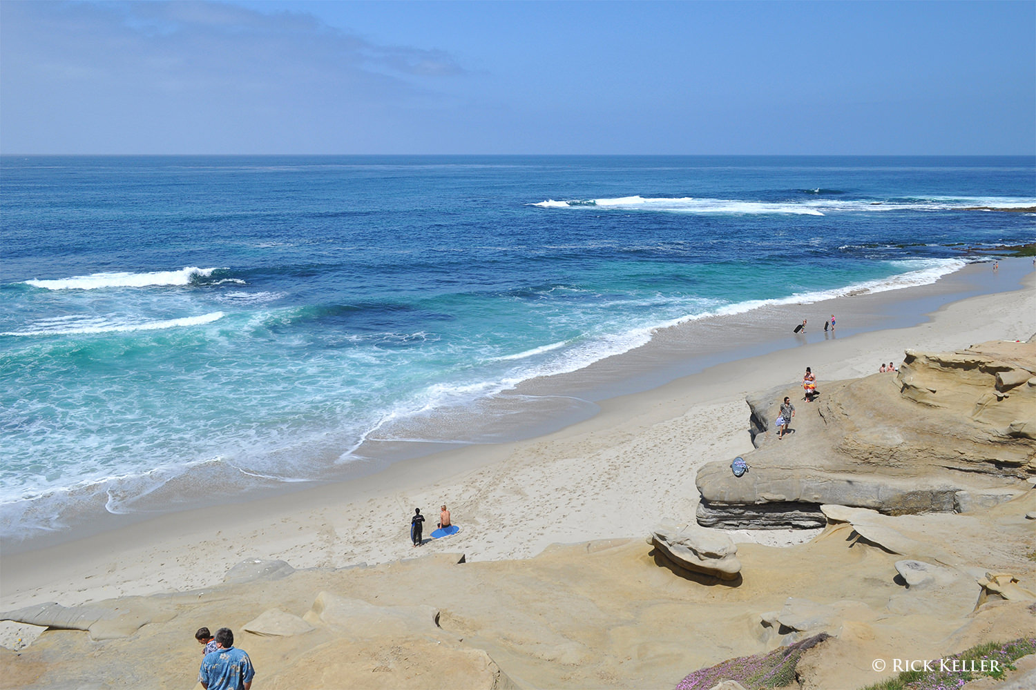
Another disadvantage of mid-day sunlight is that the color temperature (more on this below) is more “neutral”, meaning that it is more “white” in color, which does not lend itself well aesthetically for color landscape photography. For all of these reasons, I typically avoid this quality of light for landscape photography. Nevertheless, there are a number of scenarios where this quality of light may be desirable for scenic photography. One scenario would be in black and white architectural photography, wherein the photographer can make use of the high contrast and dark shadows to create abstract photographs, particularly if lens filtration is used to block blue light. Secondly, for color landscape photography mid-day sunlight under clear skies can be used to capture the vibrant blues, greens, and turquoise in water, as the following two images illustrate. This lighting responds well to a polarizer filter to cut down water reflections and enhance the color saturation of the water.
And thirdly, the high intensity light from the mid-day sun on a clear blue sky (f/16 to f/22 intensity) has been a cherished tool for the infrared photographer, as this is the time of the day when sunlight is enriched with infrared radiation.
Mamiya 7II, 43mm f/4.5, Ilford SFX-200, Hoya R72
8) The Golden Hour
“You only get one sunrise and one sunset a day, and you only get so many days on the planet. A good photographer does the math and doesn’t waste either.” – Galen Rowell.
Ahhh . . . this is perhaps one of the most well-known and cherished qualities of light for many landscape photographers. A formal introduction is not needed for this quality of light, which is my personal favorite tool in landscape photography for all of the reasons already examined above. Finding this light is easy: shortly after sunrise and shortly before sunset, although the duration of each “Hour”may vary depending on your location relative to the Earth’s equator. Close to the equator, the Golden Hour may last less than an hour, and far from the equator it may last much longer than an hour. Again, words cannot do justice to this special quality of light. You*have* to see and experience this light for yourself. This quality of light is rich in emotion, aesthetics, and beautiful warmth. It is lower in intensity and more diffuse compared to the light from the mid-day sun. Of course, the Golden Hour light boasts the unidrectionality that is essential to creating long shadows, revealing textures, and imparting dimension to a scene. For more background on why this special form of light is warm in color, I would encourage you to read about the interesting physical phenomenon of Rayleigh scattering. As Mr. Rowell elegantly stated in the above quote, this light is all there for the taking. 🙂
For comparison, and to re-enforce the stark difference in the physical appearance and mood of a landscape between unidirectional lighting and even lighting, please closely examine the following photograph of the same sand dunes made minutes before the “Golden Hour” commenced. Textures that are clearly appreciated in the sunlit scene above are conspicuously absent in the evenly lit scene. The contrast, shadows, and contours in the sunlit scene are striking, whereas the evenly lit scene appears flat, as skylight alone is illuminating the scene and filling in all of the shadows. One landscape is warm, radiant, and dynamic; the other is cold, flat, and lifeless. The same subject . . . two different qualities of light . . . two starkly different photographs. Viewing tip : please click on either of these two photos and use the arrows at the lower right to toggle between the two to appreciate the differences.
Nikon D800, Nikkor 28-300mm f/3.5-5.6 G ED VR
9) Color Temperature
In addition to the directionality of light, color temperature also plays a prominent role in the visualization process in color photography. Undoubtedly, many beginning landscape photographers already appreciate and enjoy how the relative warmth (or coolness) of a scene potentially confers a special mood and emotion to a photograph. Hopefully, many of the above photographs have illustrated this property. Color temperature is an interesting physical property of light that defines the relationship between the temperature of a radiation source and the color of light that the source emits. In digital color photography, color temperature of light is often synonymous with a principle called white balance. For a complete discussion of this topic, I highly recommend our previously published articles, “What is White Balance?” and “Understanding White Balance – A Beginner’s Guide”, authored by our very own Nasim Mansurov and John Bosley, respectively.
The color temperature of sunlight cycles during the day, being low in temperature (i.e., visually warm) at sunrise, gradually escalating toward mid-day (i.e., becoming visually cooler), then gradually decreasing again toward sunset (i.e., becoming visually warmer), then precipitously escalating again at dusk.
In color digital photography, there is not a native white balance that is used to make an exposure; this property can be altered. In color film photography, the color temperature of a given film is fixed (i.e., daylight balanced vs tungsten balanced), but this too can be modified for creative purposes. It goes without saying that the most important way for a photographer to control the white balance is to choose the appropriate lighting. However, if the available light is not ideal to fulfill the photographer’s visualization process, then the white balance can be manipulated to achieve the desired effect. For example, color film photographers can easily (and directly) alter the color temperature of light before it enters the lens with the use of warming (or cooling) screw-on lens filters. Color digital photographers can easily alter the color temperature through the computer menus within the digital camera. Nasim’s article provides an in-depth look at how to set the white balance on a digital camera. Additional details on the use of warming filters can be found in these articles on visualization and film photography.
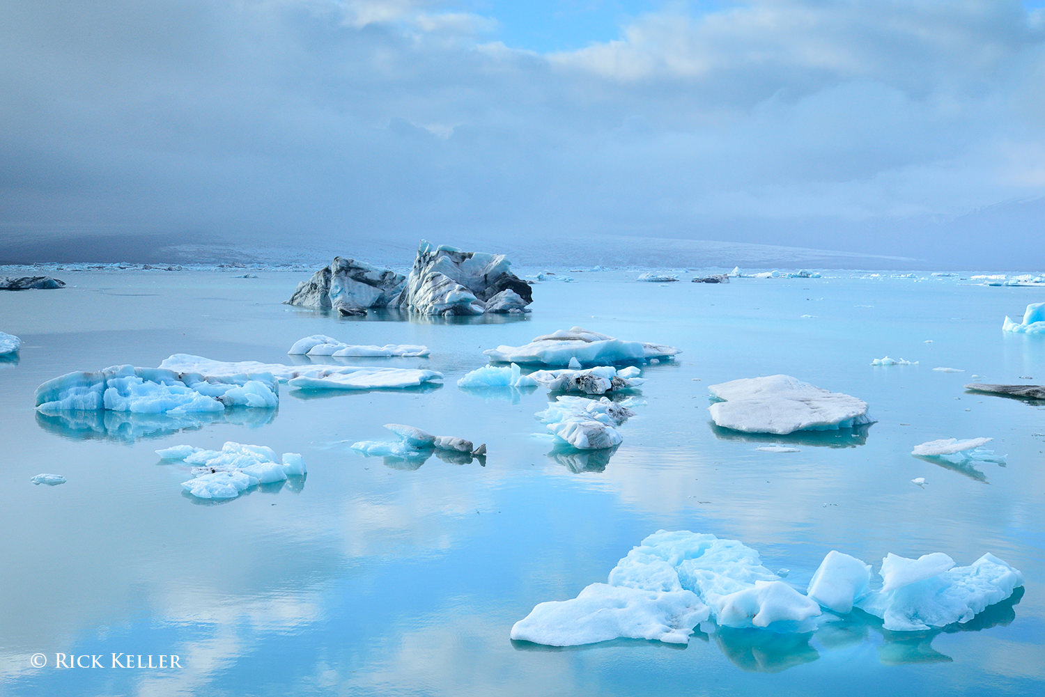
When and how much a photographer should alter the color temperature is a highly individualized decision that is predicated on the photographer’s artistic vision and goals for creating the photograph. There is no right or wrong . . . For my landscape and scenic photographs, I prefer a warm rendition. In many of the above color film photographs, I relied on warming filters such as the 81A, 81C, or 85C to lower the color temperature (i.e., filter out cool blue light) to create a warm and uplifting mood. Alternatively, other color film photographers may employ a cooling filter (such as the 80 filter series) to raise the color temperature (i.e., filter out warm orange light) to create a cool rendition. In several of the color digital photographs above, I preset the digital camera menu to record the exposure with a warm white balance, such as “5600 Kelvin” or “Cloudy”. On the other hand, to create a cooler rendition with a digital camera (a classic example would be winter scenes), I would typically preset a white balance by selecting a specific color temperature in degrees Kelvin. For example, in the third photograph of this article of majestic Jökulsárlón, Iceland, I manually inputted a color temperature of 4800 degrees Kelvin to emphasize the coldness of the subarctic climate.
10) Conclusions
The take home point from this article is that light is the most instrumental tool that the photographer has to translate artistic vision into a photograph. The quality of light can be described in different ways and does not always fit into neatly defined categories, and there is certainly overlap in descriptions. However one defines this quality, it certainly may hold different meanings by different photographers who have different life experiences, as we would expect.
The directionality of light exerts a powerful influence on how a photographer crafts the composition and makes the exposure. The directionality of the light, and thus the quality of the shadows, literally shapes how the image is visualized in the mind’s eye and translated into a physical image and ultimately determines the emotion that the photographer wishes to convey. There is no one ideal quality of light for all photographers for all scenarios. It all depends on what the photographer wishes to construct and convey.
The color temperature of light and its relative warmth (or coolness) can be sought and/or manipulated to achieve the desired effect. Analogous to the directionality of light, how this property is visualized, crafted, and manipulated lies at the heart of the creative and visualization process.
In my humble opinion, in lieu of expending precious time and emotional energy grappling with gear acquisition and upgrading to the “latest greatest gear”, a photographer’s exploits would be far better served by learning and exploring light itself. Use whatever gear you already have to explore your artistic vision, channel your creativity, and hone your skill set. My best recommendation: scout the light . . . hunt for the light . . . and be inspired by it! As an exercise, leave your camera and lens at home and go out and study the lighting and your subject. Try going out at different times of the day to examine the “quality” of the various properties of light: the directionality, the shadows, the dimensionality of your subject, the color temperature, and discover for yourself how all of these attributes influence the structure and mood of your scene. Take good field notes. Pack a notepad, pen, maybe a pair of binoculars, and a couple of tools (e.g., a polarizer filter, warming filter) and learn how the light and shadows evolve so that when the decisive moment of opening your shutter arrives, you will be in command to capture what you have visualized for your photograph. In the end, this will make you a happier and (hopefully) a more skilled and accomplished photographer. So, what are you waiting for? The light is out there waiting for you.
Please, stay tuned for upcoming follow-up articles on “The Quality of Light“, including the special cases of the “second sunset”, fog, and storms as well an essay, “Does The Latest Greatest Gear Really Matter?”, where I will examine how the oldest and most vintage tools in photography are *still* being used to create brilliant photographs and works of art as well as discuss whether perpetual gear “upgrades” have any impact on the overall quality and merit of one’s photographs.