I’ve always been compelled by photographic incongruity. Call it odd, call it wonderful. Call it any number of things. But one thing it is, for me, consistently, is interesting. I’ve got a never ending curiosity about the just plain odd.
It might stem from the tutelage of the DOP at LIFE magazine, John Loengard, who was a big influence on me as a young photographer. He always gravitated towards pictures he felt were “peculiar.” Which certainly is a close cousin of odd.
Before the age of digital photographic convenience, I had a small, leather bound book of my favorite pictures. These were distinctly different from my portfolio pictures. These were not commercial in intent, they were more personal, really, and had no particular reason to exist or be grouped in this book other than the fact that I liked them. It was arduous putting it together. I had to make individual prints, slide them into glassines, and bind them into a clumsy portfolio.
Enter Printique. Off the heels of our new website, in which there is an odd picture category called Double Take, I assembled, online, a book of a small number of odd moments I’ve had at camera. I did the layouts online, easily, selected a beautiful paper stock for printing, and hit a button, at home. What showed up thereafter was a lovely, beautifully printed, bound book, boxed, custom-made and, well, odd. Wonderfully so. Hard cover, 10 X 12.5, 22- Pages. Art direction, sizing….all up to you, as the creator.
A book presents lots of decisions to be made, right? Front and back covers. Edge to edge.
Our paper choice was Luster. We talked with Printique prior to printing, for advice, and then we made a range of test prints ahead of time. That’s a great way to determine the look and feel of the eventual, finished book. Luster was a great choice because it has a bit of luminance to it, and we felt that complemented the range of colors and oddities presented. Cropping. Full Bleed? How to deal with the gutter in a Book? Color. Do you “keep” in a similar color palette on opposing pages or contrast it and think of the color wheel?
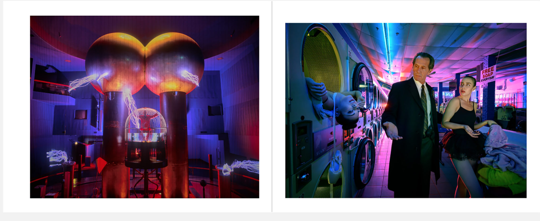
Witness below. Primary colors galore. Saturation, impact. The color wheel in print. Those reasons drove the creation of this spread.
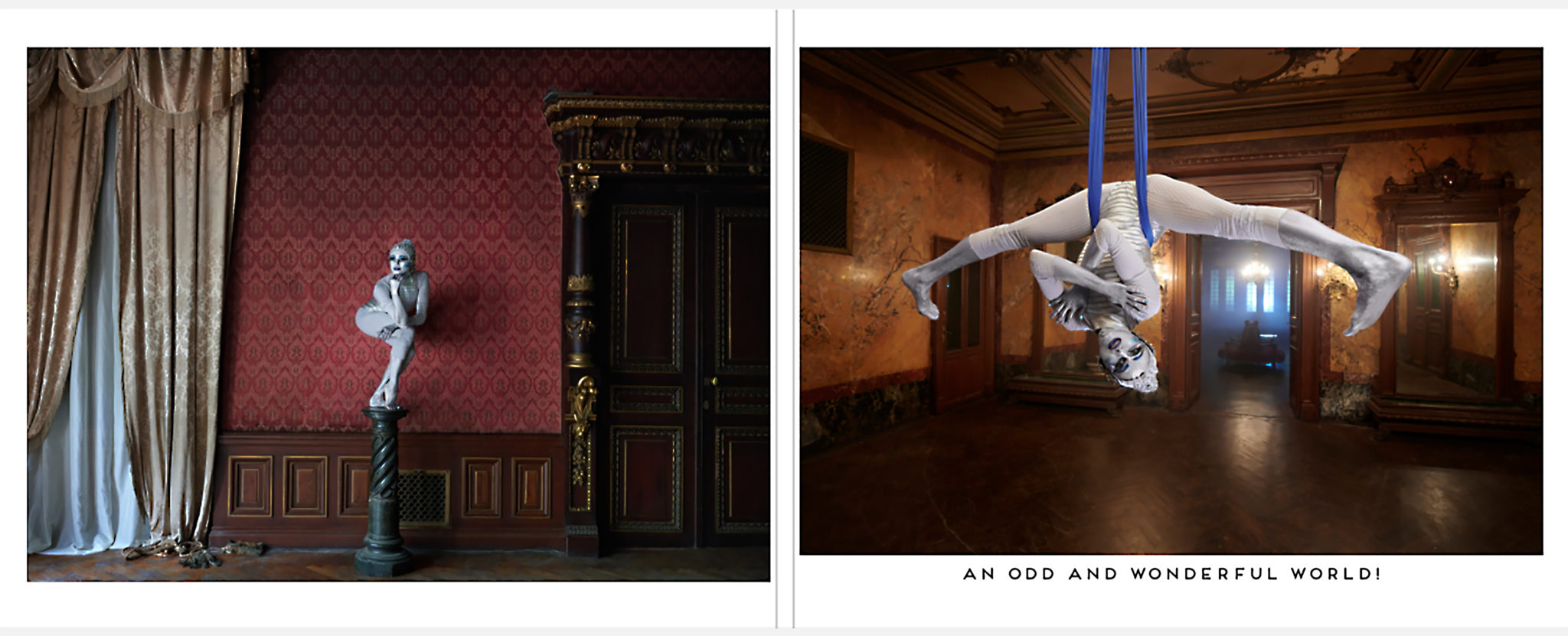
We created spreads that dealt with gesture. On this spread, the outrageous, overstated gestures demanded they be paired.
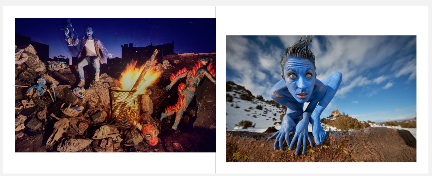
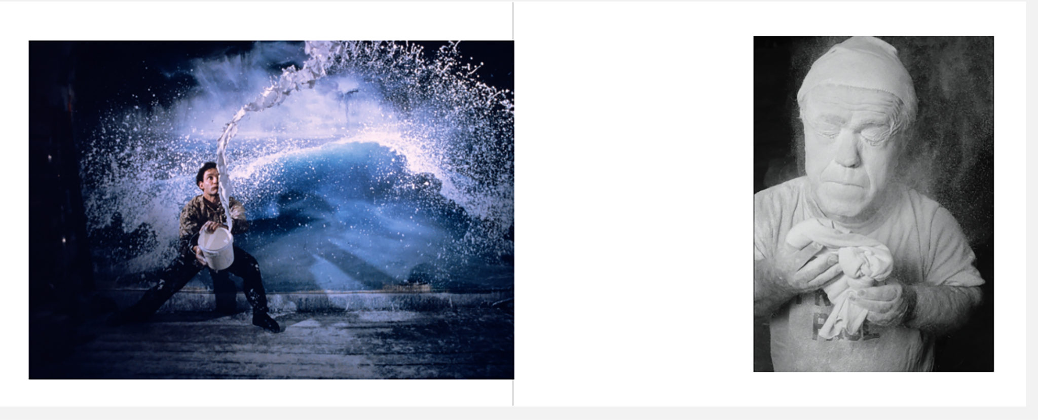
We decided to mix B&W and color on the same spread. Always stylistically risky, but the opposing pages rendered in true fashion. I felt an emotional and physical synchronicity between these two very disparate artists. The paint flying and the powder flying about are part of their expression and creation.
The formidable quality of the book, and the ease of its creation has set me on a new path. After many years of shooting pictures, there are any number of whimsical, fun, odd, incongruous, serious, weighty or otherwise collections of images I could bind together. For gifts, remembrances of trips and adventures, for a spot on the coffee table, as the world opens up and guests are once again possible. The list of book possibilities is long, and enticing.
Printique makes all this photographic rumination and collection not only possible, but easy. More books tk.
The post The Book of Odd appeared first on Joe McNally's Blog.


