
The Olympics were a blur. This book is not.
That’s the thing about a book, and I realize I’m once again displaying my well developed ability to state the completely obvious.
A book hangs around. Front and back covers, below.
The internet observances we routinely make are click, click, click. Hop, skip, and jump. Not a lot of time, often, for dwelling or rumination. That is the province of the book. Hard cover, heft, permanence. Time for a comfortable chair and a cup of coffee, and spend a while.
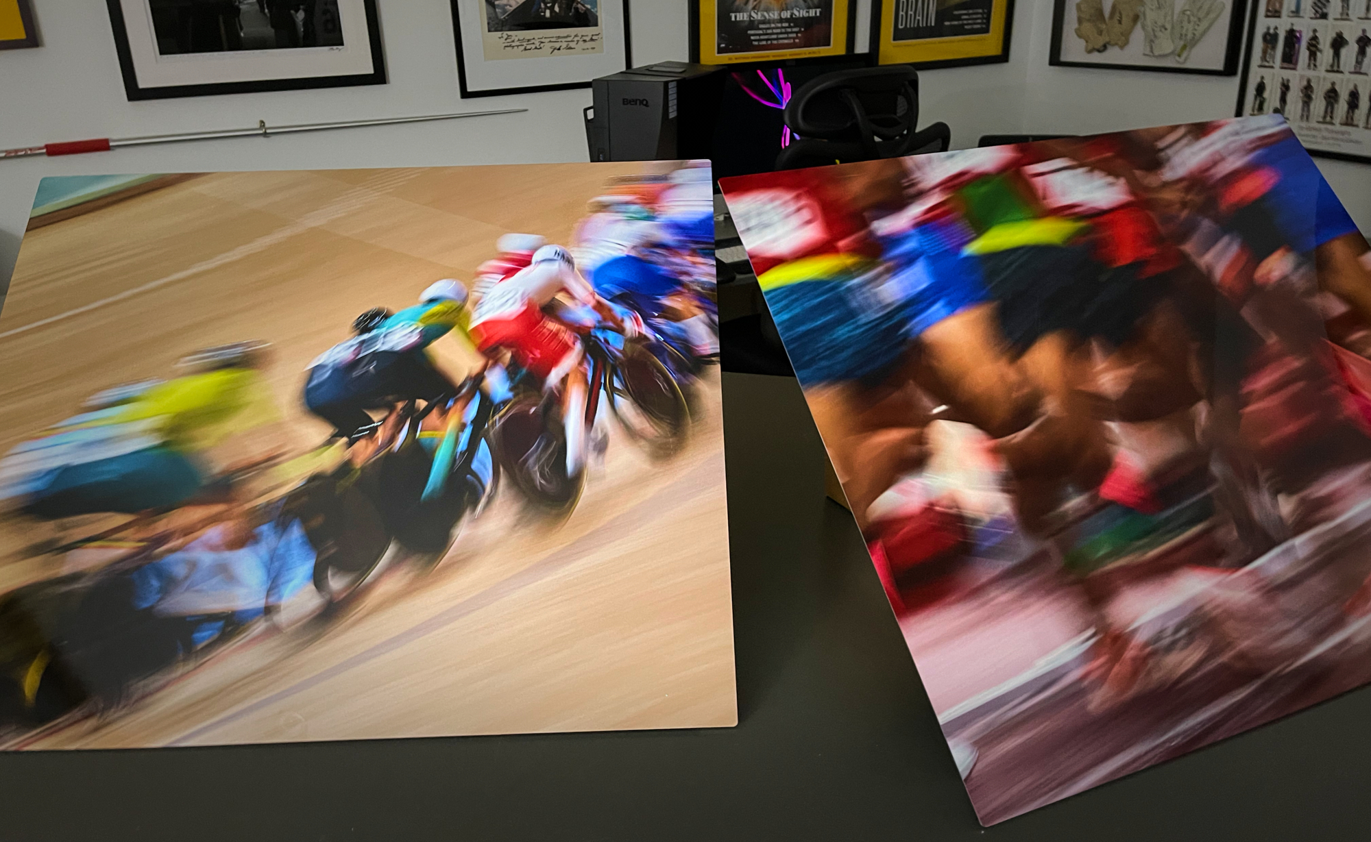
Printique does lovely, rich, resonant printing in their books, so I turned to them to print a selection from the frenetic stadiums and pitches of Tokyo, just to have and to keep. It showed up the other day, wrapped in tissue paper, in a formal box, that, when I opened it, spilled color into my hands. Great printing, excellent punch factor.
And these were not easy files to print! Many were shot at stratospheric ISO’s, and in less than memorable light. And the book rocks. So happy to have something of the Games on my shelf. It will well complement the metal prints Printique just made for us to hang on our workout wall!
Pictures constitute memory. And digital is fantastic, super fast and easy to share. But a book….ink on paper is not a click of the keyboard. It stays with you.
This tome was printed on luster paper, and is hard cover, measuring 10×12.5 34. Lots of options in the Printique realm for the creation of a permanent addition to your library, and your memories.
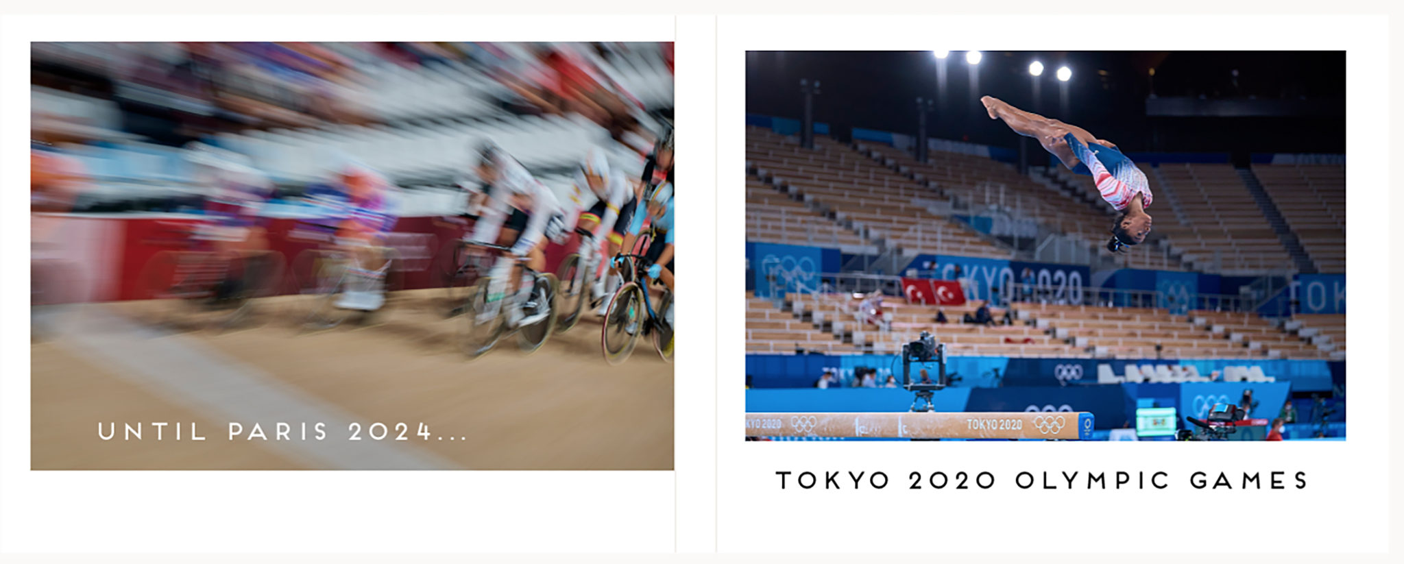
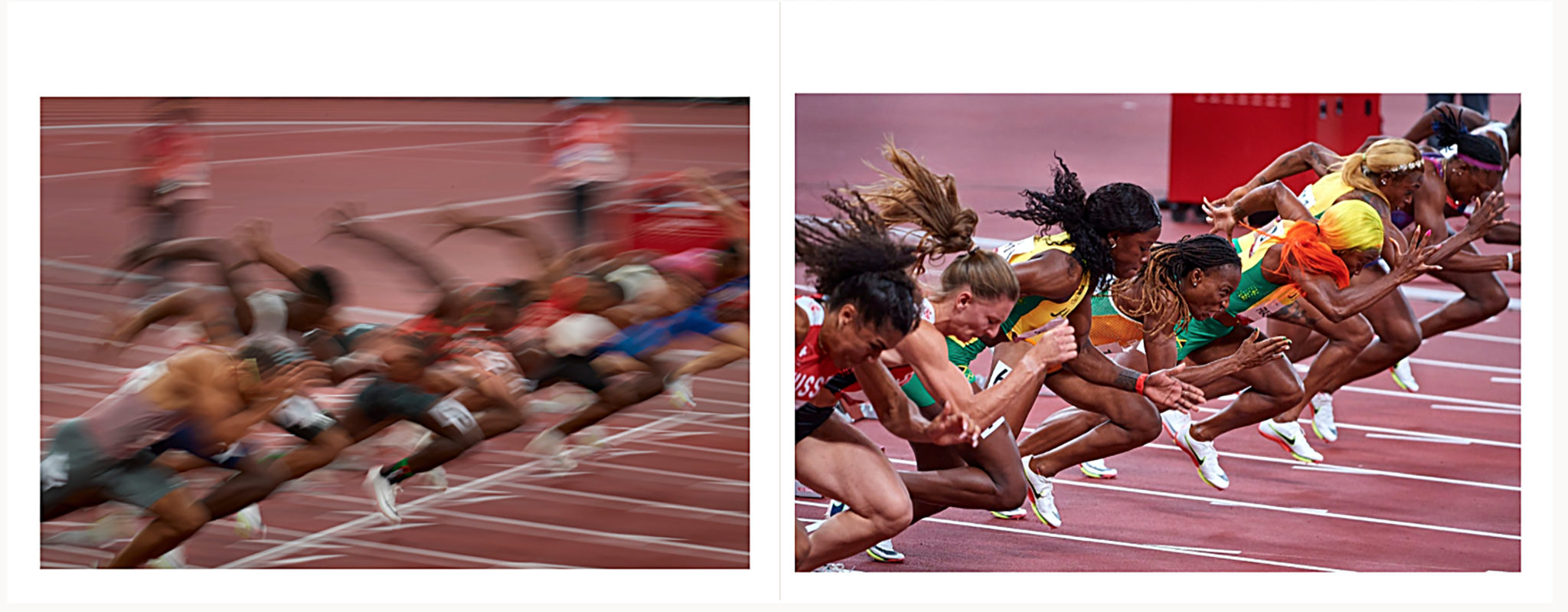
Laying this out was an effort by Annie Cahill, here at our studio. The Printique website allows for almost infinite adjustments as you seek to make a point with each spread. Starting line at the sprints. Slow shutter, fast shutter.
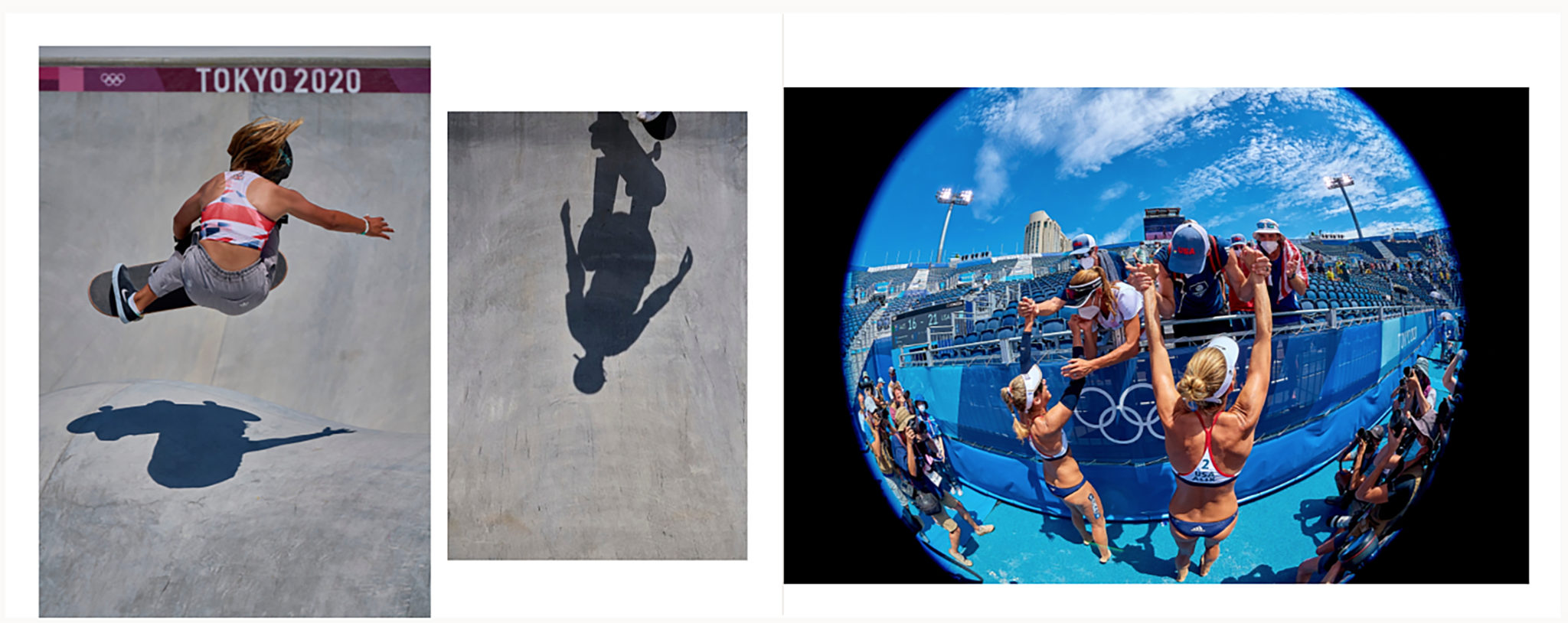
Sunlight, shadows, and a play on shapes on opposing pages.
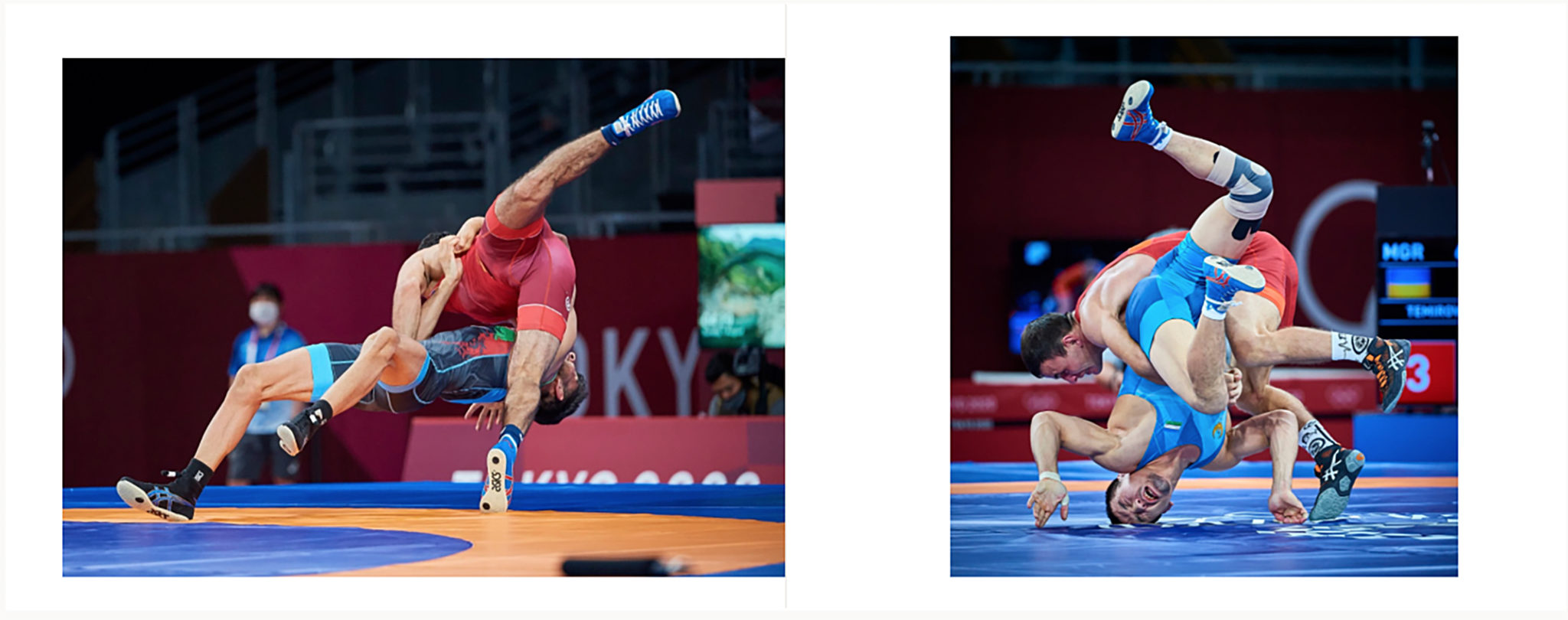
Legs and arms everywhere, not to mention pure strength. Greco-Roman wrestling, lightweight division. Mindset here on layout was not only the synchronicity of color but the play of similar gesture.
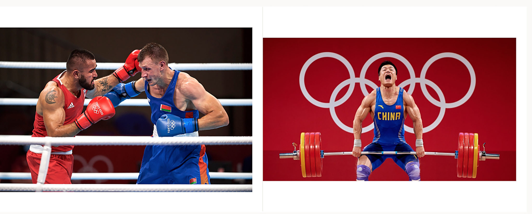
Boxing. Weightlifting. Olympic uniforms are distinctive and often packed with color. Spread below has images filling the frame and seem to work next to each other with the intensity of the gestures. Every spread was true in its color rendition and kept true to the dynamic range of an image.
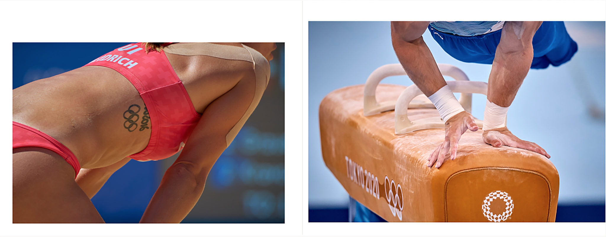
The “big pictures” are important, but often in sports, the details loom as crucial to storytelling. Hands, strength, body parts, muscles, injuries, tattoos. These are all totems to be sought after as you shoot.
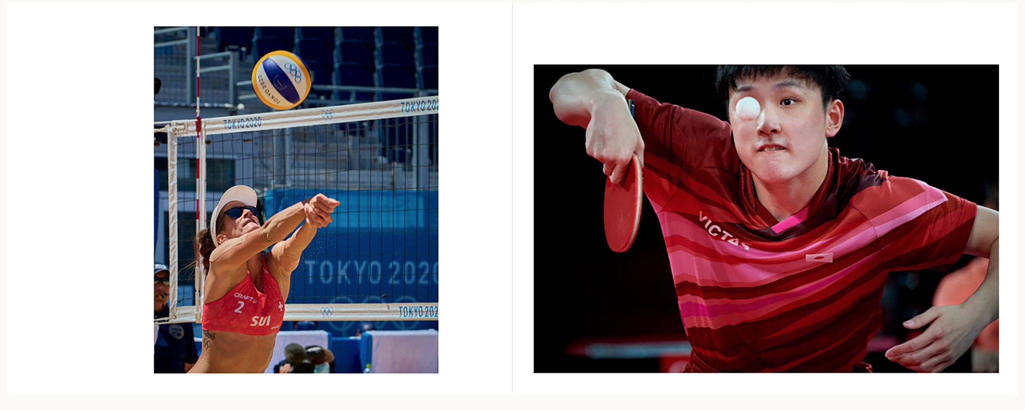
Old saying, eyes on the ball. It’s important to have fun when you’re working on a book layout. Look for similarities and things that can “play” off of each other on facing pages, or maybe things that are incongruous could be a strategy to also keep the energy going as you turn a page.
Fast action, both stopped and blurred. Hard colors to mix on a spread, and it was handled beautifully.

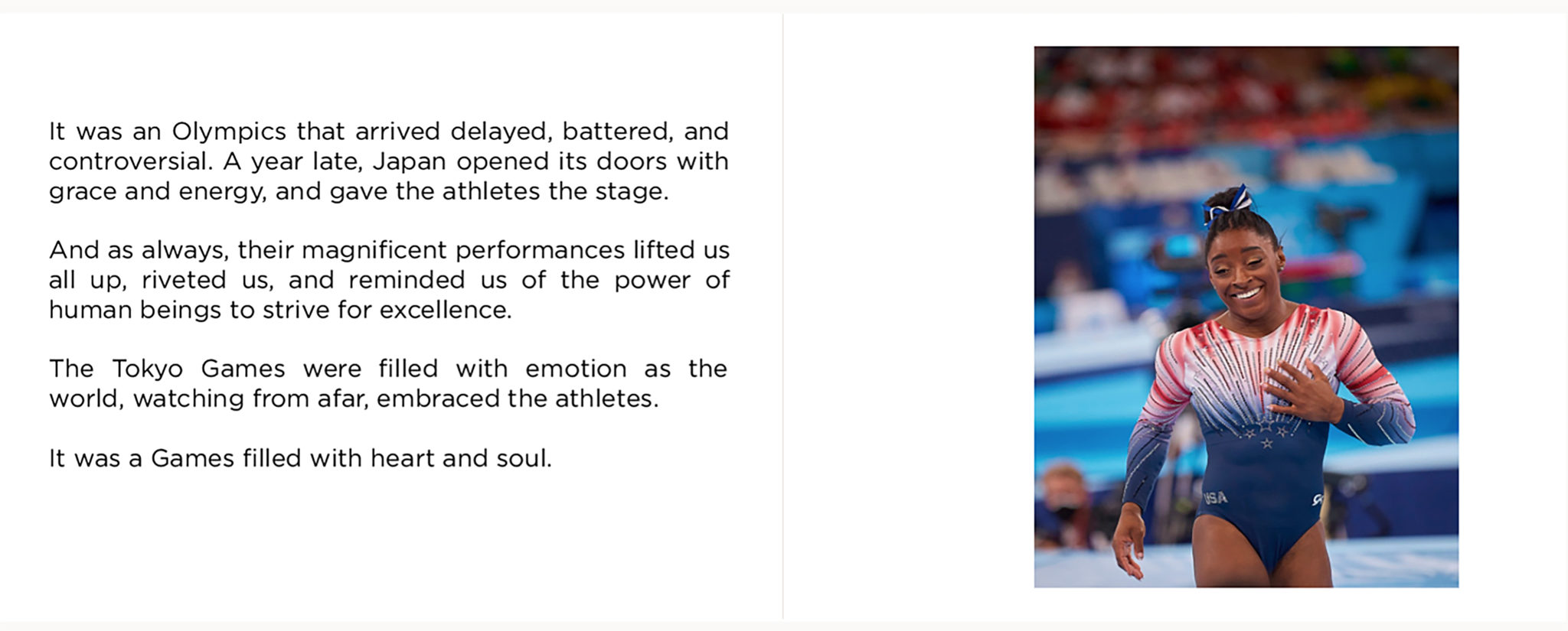
And a heartfelt closing text and picture. Printique enables you to mix and match pictures and text options, very quickly and easily, and design as you would.
As I said, a book is not a click. It has staying power. More tk….
The post Printing an Olympic Book – Thank you Printique! appeared first on Joe McNally Photography.


