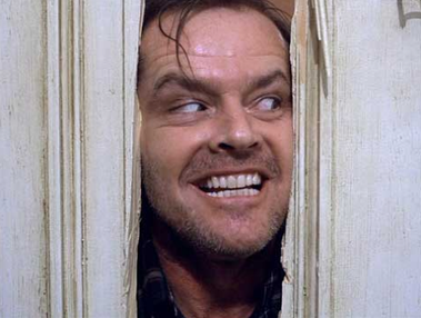
 Some of your headshots aren’t as good as Jack Nicholson’s in the “Shining!”
Think about it for just a second. You’re telling people you’re a professional photographer. You’re hopefully showing terrific work in your galleries, (another pet peeve when the work is mediocre), but your headshot is horrible!
Why would you think a grab-shot selfie was acceptable? I saw one headshot after another with Uncle Harry’s signature all over each one!
So, let’s make this next week “Upgrade Your Headshot Week.” If you need help, check out anything Peter Hurley has written or shared. He’s got a great book out and he’s even more effective when you attend his workshop or class at a convention.
Meanwhile here’s an idea to help you in the process:
Personally, I like a collage of three images for your about page. Make the primary image one of you working. Have a camera in your hand and pose the shot with a client. It’s you photographing a subject with the camera in your hand, looking through the viewfinder and taken off your right shoulder slightly behind you. In the back ground will be your subject slightly out of focus.
The second picture might be you interacting with your kids or spouse. You want something your clients can relate to and since women make 98% of the purchase decisions to hire photographers in the portrait/social categories, then show an image that Mom can appreciate. If you’re a commercial shooter then a shot of you looking at images, at a desk, etc.
The third could easily be a more formal headshot showing your skill set with lighting, etc.
Here’s the point, which I’ll make one more time. You’re a professional photographer – use a headshot that suggests you know what you’re doing!


