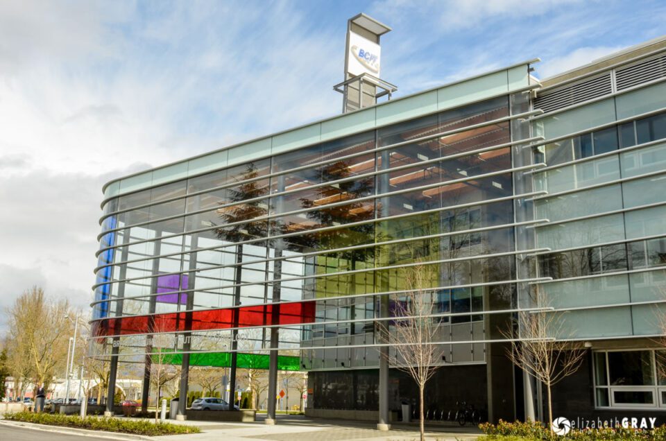
A couple of weeks ago I wrote the article “Four Simple Tips for Better Composition”. In that article, I discussed in-camera techniques for keeping your horizons level and verticals vertical. However, even if you are careful, this is not always possible. This is especially true when trying to take pictures of tall buildings. I received several great comments mentioning that Photoshop’s powerful “Transform” tool can be used to correct the keystoning issues that arise in such a situation. I thought it would be a good idea to follow that last article up with one on post-processing methods for perspective corrections. I will go over a couple of ways to quickly fix horizons in Lightroom and how to easily improve/correct keystoning in Lightroom. I will also go over some more advanced techniques for perspective correction using Photoshop, for when the Lightroom methods don’t quite make the grade. The combination of good in-camera image creation and post-processing perspective corrections should allow you to create images that reflect how are eyes see and our brains perceive the world around us.
1) Correcting Horizontals in Lightroom
Even when you are trying hard to create images with level horizons in-camera, it is easy to find yourself a bit off-kilter! Luckily it is very easy to correct images with tilted horizons in Lightroom.
1.1) Adding an Overlay Grid
Firstly, let’s make it a bit easier to see how crooked your horizon really is. Open your image inside the Develop Module. Now lets overlay a grid on the image.
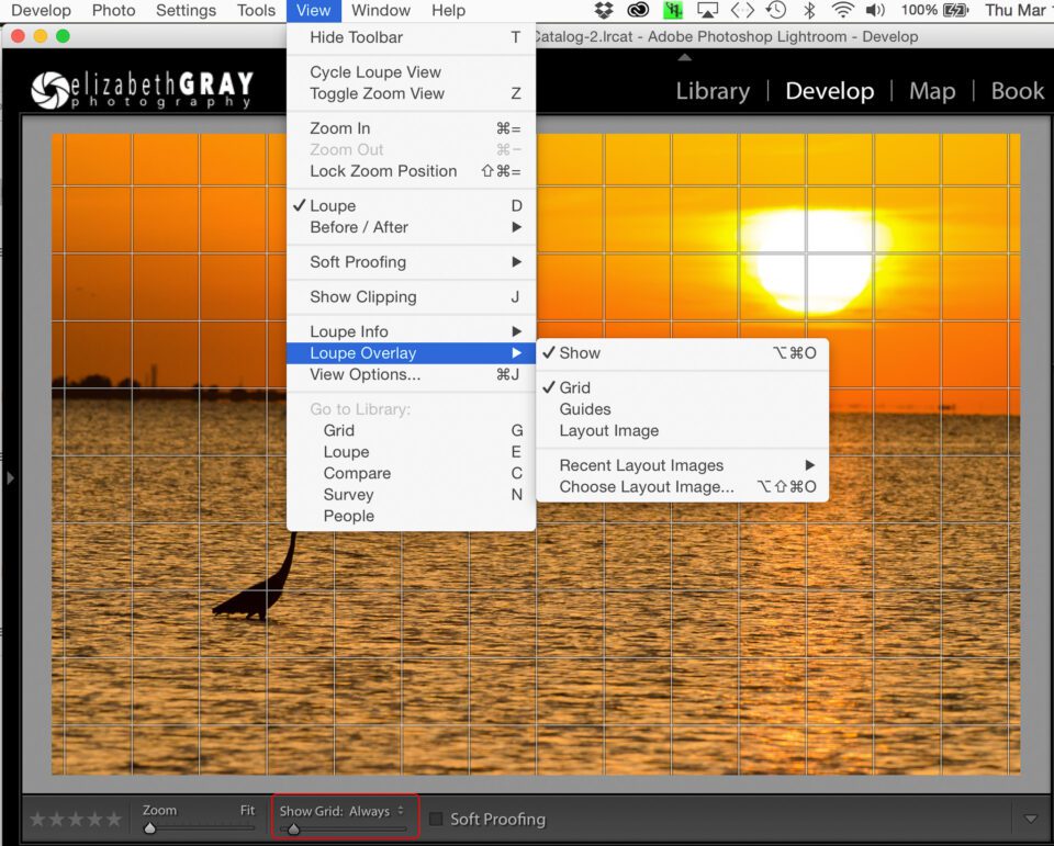
- Go to View>Loupe Overly> and select both Show and Grid.
- In the toolbar at the bottom of the screen, just above the filmstrip, select Show Grid: Always (You can turn this setting back to Auto or Never once your horizon is corrected).
- You can change the spacing of the grid by moving the slider under Show Grid.
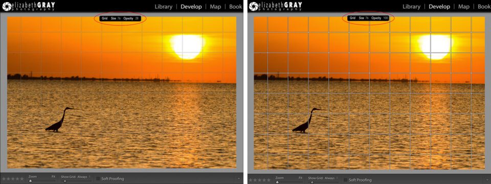
If you are finding it hard to see the grid, try changing its opacity.
- Hold down Command (Mac)/Ctrl (PC) and a small box will appear at the top of the screen.
- While continuing to hold down the Command (Mac)/Ctrl (PC) key, position the curser over the word “Opacity”.
- Click and drag to change the opacity to values between 10 and 100.
1.2) Fixing Well Defined Horizons
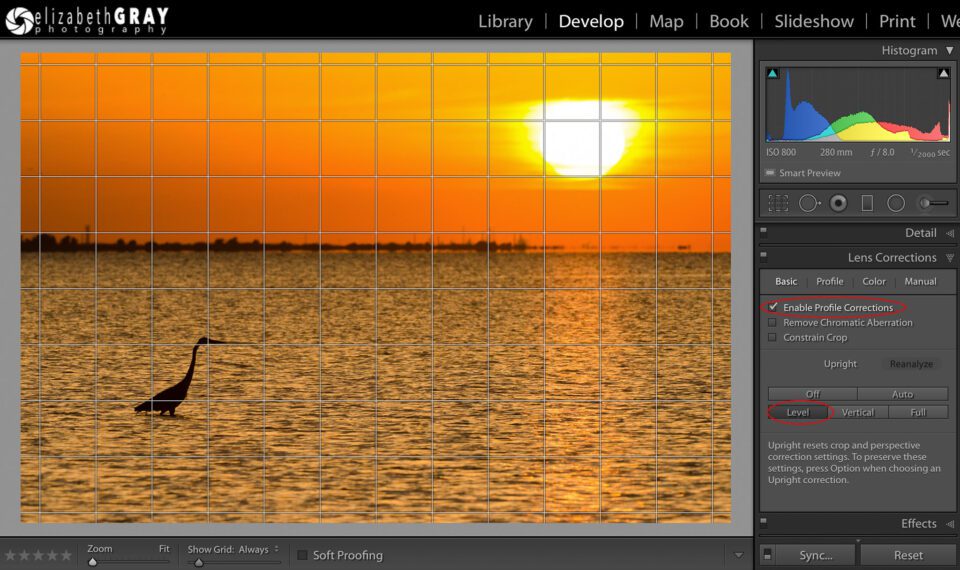
If you are working with an image that has a clearly defined horizon, like an ocean, usually the Level Mode in the Upright Perspective Correction tool will remedy the problem with one click.
- Open the Lens Corrections panel in the Develop module and click on the Basic tab.
- Make sure that the Enable Profile Corrections box has been selected before you correct the perspective. This gives Lightroom a better starting point and results in better image analysis.
- Click the Level box.
Magically your image will rotate the exact amount needed to fix the wonky horizon.
With this sunset image, the horizon is clearly defined so the Level tool works very well. Notice how the horizon is now parallel to the overlaid grid lines.
One annoying feature of this tool is that it will reset any cropping you have already done. Luckily, there is a work around. If you have cropped your image, hold down the Option (Mac)/Alt (PC) key when you click the Level box. This will maintain your crop. However, Lightroom will be able to make more accurate calculations if it has more data to work with. It is a good habit to make your horizon correction first, and then crop your image.
1.3) Fixing Horizons that are Not Well Defined
When you use the Level mode in the Upright Perspective Corrections described above, Lightroom uses the data in your image to analyze how much of a correction to apply. When there is no clear horizon, Lightroom can have problems with this calculation. If this is the case, I like to use the Straighten tool under the Crop options.
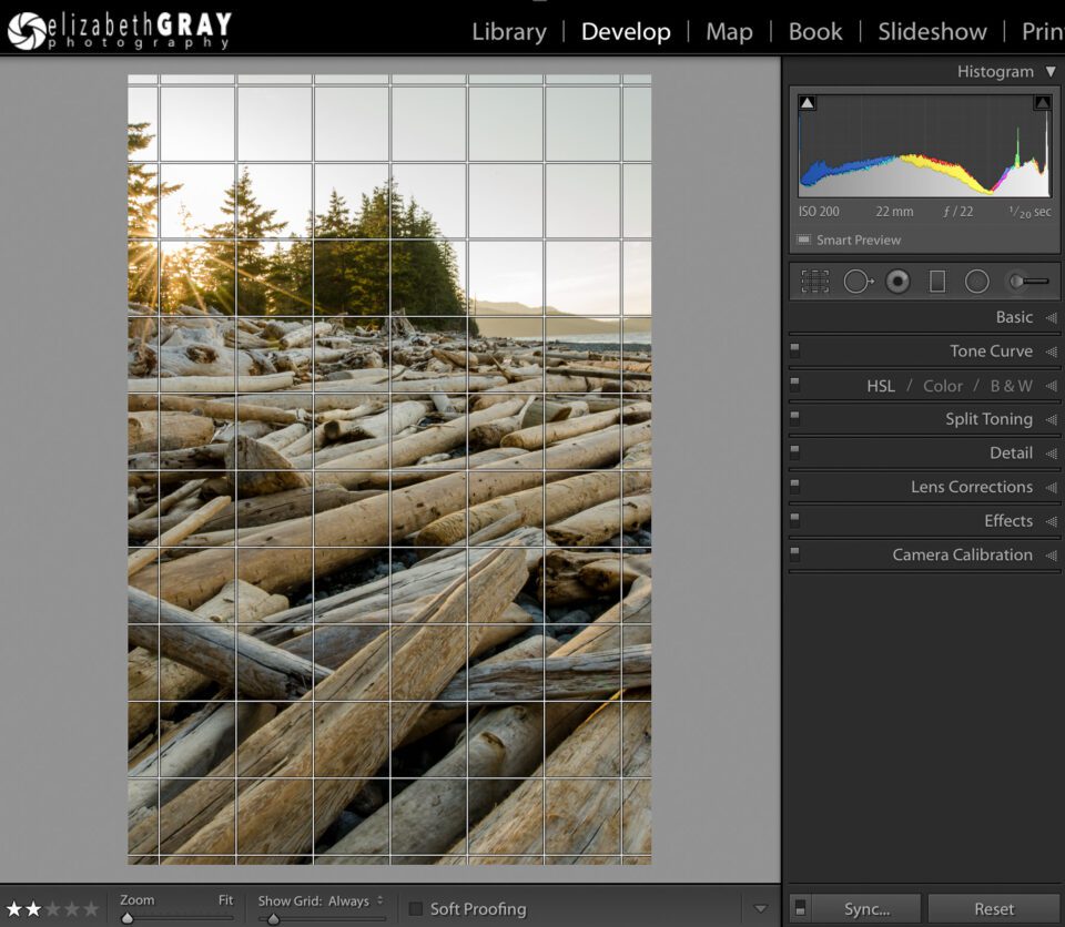
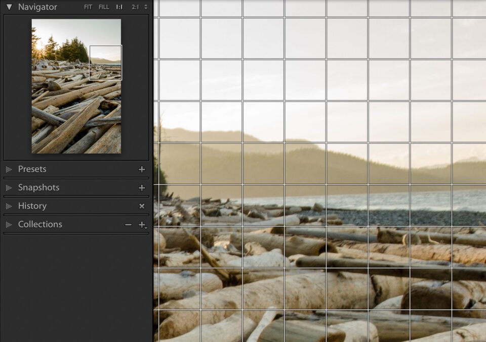
In this photo, there is a very small section of horizon showing. To make matters worse, the logs contain many lines, some of which are close to horizontal, and they are far more dominant than the horizon. All this conflicting data “confuses” Lightroom when it tries to calculate how much of an adjustment to make.
You can see from the enlarged portion of the image that the horizon is indeed sloping down towards the left.
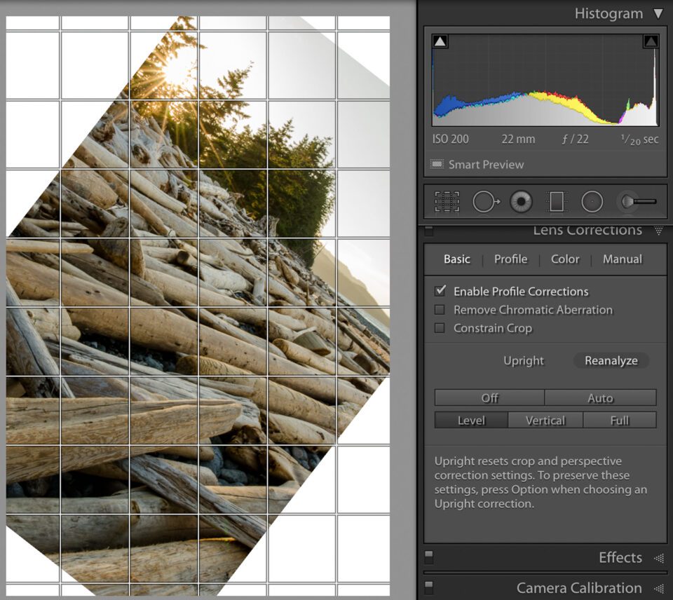
If I try to do the automated Level correction, like I did with the sunset image, Lightroom makes a horrible choice! It has probably confused the log near the front of the frame as the horizon.
In situations like this you have to give Lightroom a hint in order for it to determine how much of a correction to make.
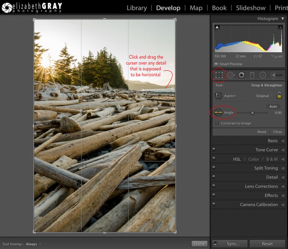
- From the Develop Module tool drawer (underneath the histogram), click on the Crop Overlay tool. This will open the crop options.
- To select the Straighten tool, click on the ruler.
- Now click and drag the cursor over any detail that is supposed to be horizontal. You do not have to drag across the entire width of the photo. This will give Lightroom the information it needs to calculate how far off from level the horizon is, and rotate the image the proper amount to fix it.
- To confirm the correction, hit the enter key.
You can also try to manually rotate the image. To do this select the crop tool and position your cursor outside the edge of the photo. The cursor will change to a double-sided curved arrow. Now you can rotate the image until the horizon is level. I find the rotation tool very sensitive. I tend to get much better results dragging the ruler along something that is supposed to be horizontal instead.
It is important to note that all of these methods result in some loss of image. The more off-kilter your horizon, the more the image will be cropped once it is leveled.
2) Correcting Keystoning in Lightroom – Vertical, Full and Auto Modes
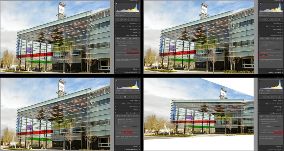
You probably noticed the other three modes in the Upright Perspective Correction tool: Vertical, Full and Auto. As we saw above, Level corrects horizontal details in a photo but does not make corrections to elements that should be vertical. Vertical, Full and Auto modes make automatic corrections to the vertical details in a photo with a single click, but each affect the photo in a different way.
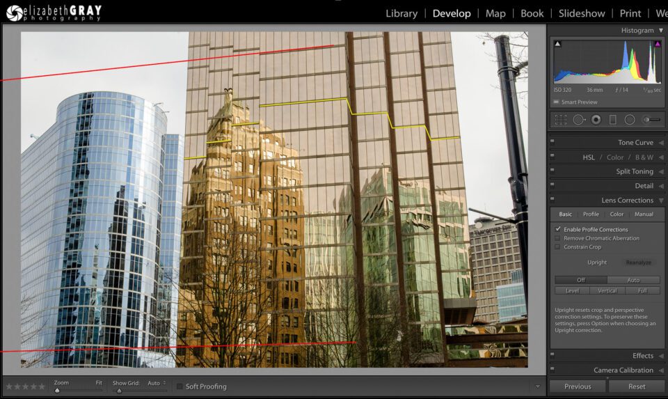
Lets take a look at an example to see how the remaining three Upright Perspective tools impact a photo. There are several issues happening in this image below. Firstly, the buildings exhibit some keystoning. They appear to be tipping backwards. This is because my camera was tilted up to take the picture. Secondly, it appears my camera was not completely level with the ground. Notice the red lines, they are dropping significantly from right to left. To me, it looks like the main building is tilting to the left. One last note, I intentionally did not take this photo with my camera square to the main building. Notice how the horizontals are not parallel (red lines show some horizontal keystoning). They appear to converge to a point somewhere beyond the left edge of the picture. The reason I did this was to get some perspective. The footprint of the building has three setbacks on each side (yellow lines). If I photographed the building straight on, I wouldn’t have seen any of the sides of the building where it steps back on the right. In hindsight, I wish I had taken the image at even more of an angle to add additional interest!
To try and better illustrate what the corrected image should look like, consider this simplified sketch of a rectangular building. All the vertical corners are upright. In addition, the horizon is level (green line). However, the other horizontals are not level. They are showing perspective, and converge to a vanishing point. This shows the viewer that the image is three-dimensional, and not just a head on shot of a two-dimensional façade. The converging horizontals give the impression of depth. When we see things with our eyes, objects that are further away appear smaller. That is why the closest vertical corner of the building is taller than the other two. With this sketch in mind, lets look at how the remaining Upright Correction modes affect the cityscape.
2.1) Vertical Mode
Vertical mode considers the vertical elements in the image when it calculates how to correct the image. This mode tries to make those elements upright.
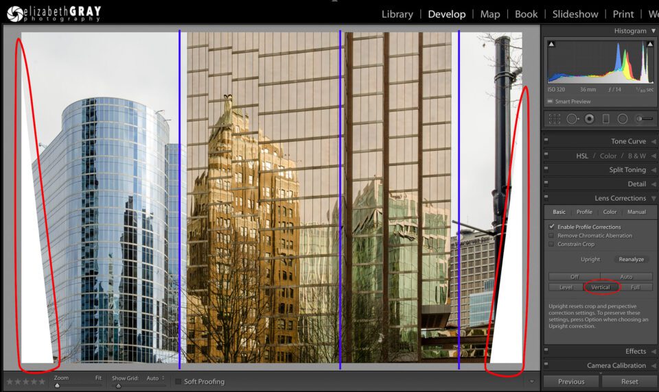
Look at the vertical blue guides I added to the photo. Notice how the vertical elements have indeed been corrected. The horizontal elements remain more-or-less unchanged. Two other problems have occurred though. Firstly, notice how the bottom corners of the picture have no information (white triangles). Unfortunately, the only way around this is to crop your image. This is why I like to compose the original shot with extra space around my subject. The extra space will give me the room I need to crop into the photo after I make my perspective corrections.
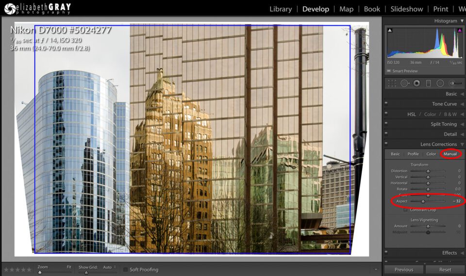
Secondly, the Vertical Mode tends to vertically stretch images. Sometimes it is not too noticeable, while other times it seems very pronounced. Luckily there is a manual correction that can help.
- While in the Lens Corrections Panel, select the Manual tab.
- Adjust the Aspect slider to the left until you are happy with the transformation. As a side note, moving the slider to the right will make your image even taller.
- Crop your image (blue box) to remove any white areas where there is not enough picture information. Depending on how much you moved the slider to the left, you will loose data at the top and bottom. This is in addition to loosing those triangles we saw in the Vertical Mode correction.
2.2) Full Mode
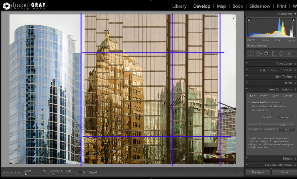
Full is a combination of vertical and horizontal corrections. I find this mode often makes very severe, often unrealistic, adjustments.
I have added some blue guidelines again. Observe how both the verticals and horizontals have been corrected. However, to me it looks like the perspective of the photo has changed. The main building no longer feels three-dimensional.
With all that being said, depending on the photo, Full mode can work miracles. Don’t be afraid to give it a try. If you don’t like this auto correction, just choose another mode.
2.3) Auto Mode
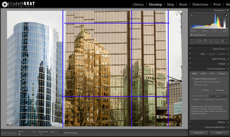
Auto, which corrects both vertical and horizontal elements, does so in a more conservative way. This correction tends to look more natural. The vertical elements of the image will be closer to upright, but may still exhibit a bit of keystoning. Horizontals will not be forced artificially to be level. In general, buildings will maintain some perspective.
For me, this is the most realistic and visually appealing of all the possible perspective corrections for this particular photo. Again, I have added some guidelines to help you see the corrections. The building is still displaying a bit of keystoning, but much less than it did prior to the correction. The obvious tilt to the building has been corrected. Lastly, the horizontals have been corrected, but not in the harsh way that they were using the Full mode.
2.4) Additional Upright Perspective Correction Comparisons
Because these auto perspective corrections are so photo dependent, here are two more example images.
In this first image, Auto and Vertical look almost identical and I feel give the best correction. Level doesn’t seem to do much, while Full makes some pretty drastic changes!
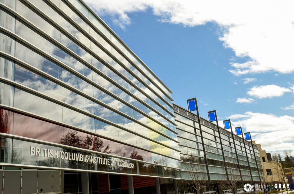
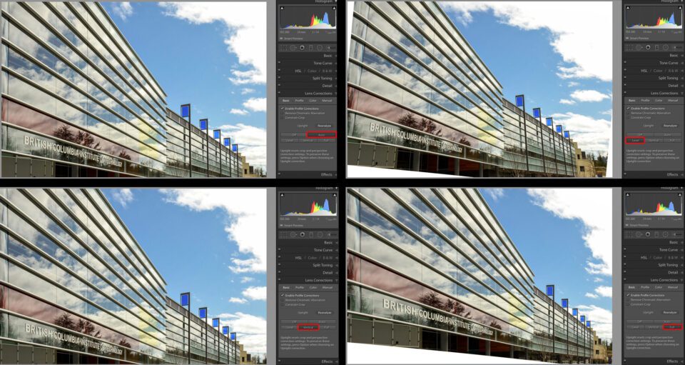
Here is another shot of the same building from a different angle.
In this second shot Auto and Vertical both do a decent job, but I give the edge to Vertical mode. Full does a good job with the corrections, but requires such a huge crop, that it is not practical. The Level correction doesn’t straighten the flags and looses quite a bit of information in three of the corners.
Luckily for us, Lightroom is non-destructive. Experiment with each of the Upright modes until you find the one that works best. What works for one photo, may not be effective for another.
3) Manual Corrections in Lightroom
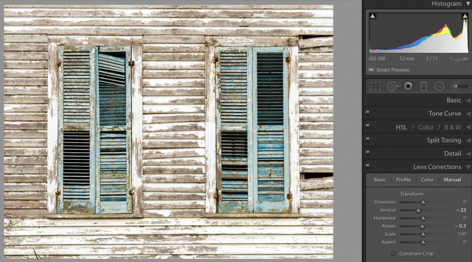
Sometimes, for reasons known only to Adobe, none of the Upright modes seem to accomplish anything! Even when you think the fix should be easy. In this case, try using the manual corrections. Actually, experimenting with these corrections, will give you a better understanding of what the auto corrections do. In this image, it didn’t matter which of the automatic corrections I tried, none of them made a significant difference to the obvious keystoning.
Lets try a manual perspective correction.
- In the Lens Corrections panel, select the Manual tab.
- You will find six sliders here, all of which can be adjusted independently.
In the images below I have exaggerated the effects of the Manual transformations so you can see how their adjustments affect the photo.
Distortion: Corrects barrel and pincushion distortion. Think of it as inflating or deflating the image. Notice that moving the slider to the right results in areas with no information.
Vertical: Works to correct keystoning. Imagine a horizontal line drawn through the center of your picture. When you move the slider, the picture swings in and out around this imaginary line. As you drag this slider, notice what happens to the corners of the photo. Depending on which way it is moved; you will end up with white corners at the top, and bottom corners that have been pulled out (or the reverse).
Horizontal: This slider is very similar to the Vertical slider, except it swings the image around an imaginary vertical line. It is used to correct horizontal keystoning.
Rotate: This one is pretty self-explanatory. The image is rotated either clockwise or counter-clockwise when the slider is adjusted.
Scale: Enlarges or shrinks the image.
Aspect: We looked at this slider when we were looking at the Vertical Upright mode. When you use it, it will either squish or stretch, for lack of a technical term, the image.
With this window image, I ended up using a vertical correction, minor rotation and gave the picture a final crop.
If you don’t get the perspective correction you want using the automatic modes, try the manual corrections. They can be used on their own, or in addition to one of the automatic Upright modes. Remember, each photo will produce different results, so play with them all before you decide on your final correction
4) Free Transform Tool in Photoshop
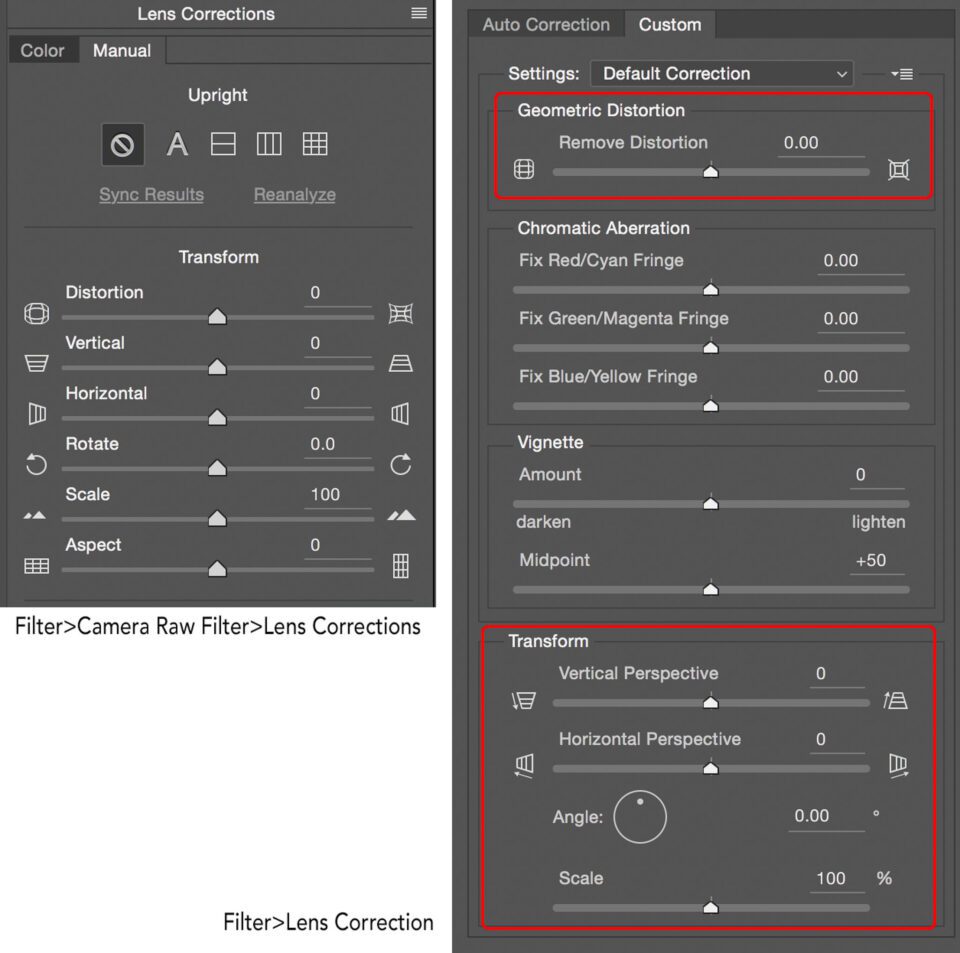
I do not want to spend much time talking about all the ways in Photoshop to fix perspective. However, I will mention two and briefly discuss a third. The easiest, and probably the best way is to use the Camera Raw filter. This will allow you to do the same types of edits as I discussed in Lightroom. The only difference is the interface.
Some photographers prefer the Lens Correction filter, which uses similar controls to Lightroom’s Manual Lens Correction Tab.
In my article “Four Simple Tips for Better Composition” several readers commented that if the Free Transform tool was used instead, I could minimize the areas with no picture information (those white triangles that the Automatic Upright Perspective Correction tools often create). This is true, however, there is always a price to pay!
The Free Transform tool can be found under Edit>Free Transform. I like to increase the size of my canvas before I use Free Transform, so I can see where all my pixels are moving. I’ll do a final crop at the end.
- While your image layer is active, Go to Edit>Free Transform. You will now see four handles at the corners of your image and four side handles.
- To push or pull the corners evenly, press Command+Option+Shift (Mac)/Ctrl+Alt+Shift (PC) and drag a corner handle.
- To move a handle individually, press Command (Mac)/Ctrl (PC) and drag any handle. A handle can be moved in any direction.
- For a complete description of all the corrections you can make, check out the Adobe Helpdesk.
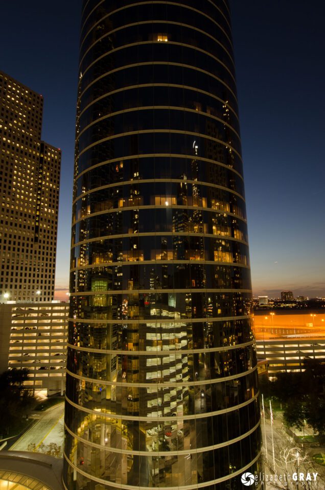
Take a look at this image shot in Houston. There is some keystoning and a bit of a tilt to the building.
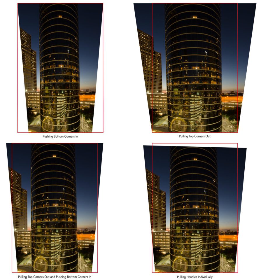
Below are several different correction options. I have outlined the location of the unaltered photo position in red. In the first shot, I pushed the bottom corners in evenly. Notice the white triangles with no image data. In the second option, I pulled the top corners out. No white triangles, but I have lost a lot of the sky. In the bottom left example I did a bit of both, top corners out and bottom corners in. Smaller white triangles and less sky lost. This is the recommended way to correct keystoning. It results in a more natural correction with less distortion. In the last example, the bottom corners are pushed in evenly. The top two corners are moved out and down different amounts. Again, some areas with no information and some sky lost.
As you can see it is a trade off. All of these options will need a final crop, resulting in slightly different final versions. The key here is not to go too hog wild! When you transform a photo, you are moving the pixels around. The more manipulations you do, and the more drastic they are, the less sharp the final image will be. Before you commit the transformation, make all the adjustments you need. This is preferred to doing several transformations separately.
5) Conclusion
Both Lightroom and Photoshop have some very powerful perspective correction tools. In my photography, I find that I make use of Lightroom’s corrections most often. With those, I usually find the automatic corrections do the trick. If I have a photo where I want to be selective about which information I have to crop out (sky or foreground), and I don’t want Adobe to make that decision for me, I use the Free Transformation tool in Photoshop.
The best way to learn these tools is to experiment. If something doesn’t work in Lightroom, simply reset the tool. In Photoshop, make a copy of your background layer to work on. If you don’t like the results, delete the copied layer and start again. Before long you will learn what techniques work best for you and your style of photography. With these editing skills, careful image capture (remember to leave some crop room), and a bit of creativity, you will see great results.
The post How to Use Perspective Corrections in Lightroom and Photoshop appeared first on Photography Life.

