One of the biggest frustrations with Lightroom’s built-in watermarking tool, is the fact that it often ends up making watermarks appear too soft / blurry, especially when extracting smaller JPEG images. This happens due to Lightroom’s rather poor implementation of watermarking on images. Not only does Lightroom seem to apply sharpening to images before adding a watermark, but also, the resizing algorithm used by the software appears to be pretty bad. No matter what image dimensions one chooses, Adobe has not provided a way to turn off scaling in Watermark Editor, even if one provides transparent PNG / GIF images with the correct dimensions. For this reason, many photographers end up using Photoshop for adding watermarks to images, which certainly does take more time and effort, but certainly delivers much sharper results in comparison. After seeing poor watermarking results, I decided to look into alternative methods to see if there is a way to make watermarks sharper using the same tools. After some experimentation, I came up with two methods that ended up working well and that’s what I am going to share with our readers in this article.
Take a look at the two images below – the “Before” image shows how poorly the watermark is added by Lightroom, whereas the “After” image shows how it can look if it is done right:


Please note that the methods discussed below are somewhat advanced and require specific software such as Adobe Photoshop (for the first method) and Illustrator (for the second method). For the second method, you will also need to download an open-source font generation software called FontForge.
Method #1 – Resizing Watermarks to Exact Dimensions
This method is probably the easiest one to implement, since you only need to use Photoshop to adjust your watermark. Basically, the idea is to adjust your transparent PNG or GIF image, so that it has exactly the same image dimensions as the output image. For example, if you have an export preset that exports images at 960 pixels wide, you will need to adjust your PNG / GIF image so that the image width is exactly 960 pixels. This way, Lightroom can be forced not to scale your watermark and it will appear as sharp as you make it from Photoshop.
Unfortunately, this method has a few serious drawbacks. First of all, you will need to create two sets of watermarks for each side of image if you want to be able to place watermarks in all four corners. Second, you will need to create watermarks for both horizontal and vertical images separately, or Lightroom will again revert back to scaling. And if you output in multiple resolutions, you will need to repeat the same process for the rest of them, which can quickly increase the number of watermark presets you have on your computer. The result is definitely worth the effort still in my opinion though, as your watermarks will look drastically better in terms of sharpness and quality compared to the poorly resized versions that Lightroom spits out by default.
Here is the full list of steps you need to run:
- Determine the desired image dimensions for both horizontal and vertical images. In this particular example, I will only run through horizontal images that I want to output at 960 pixel wide resolution.
- Open up your transparent logo in Adobe Photoshop. Make sure that the logo has a transparent background, as seen below:

If your logo is white, it might be hard to see it due to the bright checkerboard pattern of the background. If that’s the case, you can easily change it by visiting “Edit->Preferences->Transparency & Gamut” and setting “Grid Colors” to “Dark”: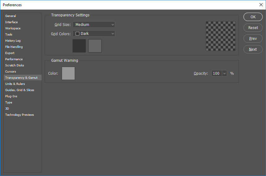
Now it should be much easier to see the logo:
Note that we have not changed anything on the image itself – we simply made the transparent background appear darker. If your logo is dark, you can choose the lighter transparent background / checkerboard. - Now determine how big the logo should be when exported at your desired image dimensions – that’s what we need to resize the logo to. For the image size example of 960 pixels wide that I am using, I will be resizing the logo to 100 pixels wide, basically around 10% of the total width of the image. Go ahead and press CTRL+ALT+I (CMD+ALT+I on Mac) on the keyboard and type the target size:
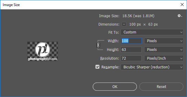
For the “Resample” algorithm, choose Bicubic Sharper, since we are reducing the image dimensions and want to keep it sharp while resizing. - The next step is to fill up the resized logo with extra space to cover the lost dimensions. Press CTRL+ALT+C (CMD+ALT+C on Mac) to bring up the Canvas Size tool:
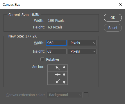
Put the desired image dimension under width (in this case it is 960 for me) and leave the height value the same – that one does not matter. Make sure to move the Anchor to the right, so that the watermark is moved to the right side of the canvas. Once you click OK, you should see something like this:

- The watermark image is ready, but there is one small step I recommend you take. If there is not enough space to the right side of the image, it is best that you leave a little bit there to avoid using the horizontal inset in Lightroom. Unfortunately, Lightroom will again down-size your logo if you use the Horizontal inset, so it is best to leave a little bit of empty space to the right of your logo. You can simply drag the logo to the left a little, or for consistency, I always prefer using the keyboard left button instead. Make sure to press the “V” key to switch to move tool, then after selecting the corresponding layer that hosts the watermark, simply press the left arrow on your keyboard to start moving the logo away from the right edge of the frame. I moved mine about 10 times, which is 10 pixels from the edge of the frame.
- Save it as a PNG file again by pressing CTRL+SHIFT+ALT+S / CMD+SHIFT+ALT+S (Save for Web) and choosing PNG-24 as file format. Make sure “Transparency” is checked:
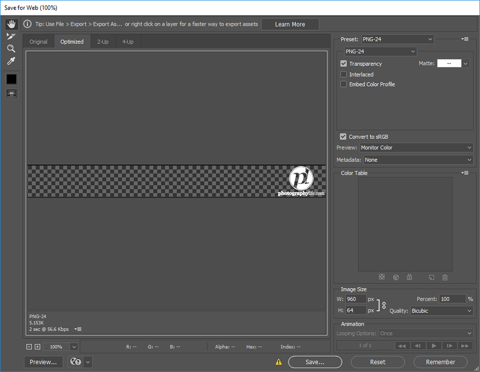
Give it a meaningful name like “960px Horizontal-Right.PNG”
- Repeat the above step, but this time put the Anchor to the left side when resizing the canvas. This one will be used for the left side, so save it just like above with a name like “960px Horzontal-Left.PNG”
- Now that you have both files for the horizontal images, let’s go ahead and create the necessary templates in Lightroom. Fire up the Watermark Editor by going to “Edit->Edit Watermarks…”:
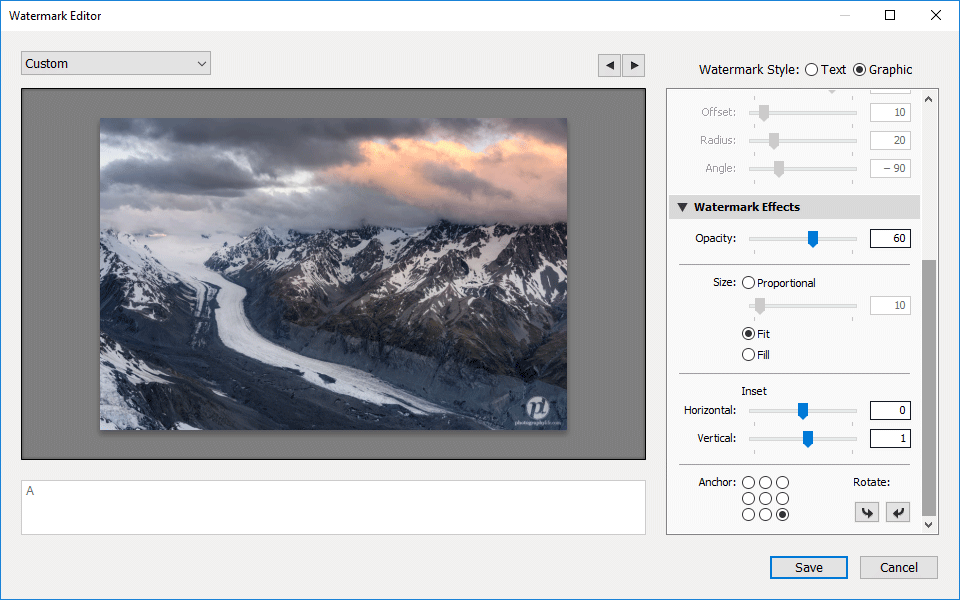
Choose “Graphic” and pick the first file that we have just created. In my case, I used the “960px Horizontal-Right.PNG” image. Scroll down to “Watermark Effects” and make sure to select “Fit”. This way, nothing will get up-sized or down-sized, since the horizontal dimensions of the watermark match the dimensions of the image. Under “Inset”, do not touch the Horizontal value, but feel free to change the Vertical value, since you probably want to move it up or down a little depending on where on the right side you are placing the watermark.
- Save the Template with a meaningful name such as “960px Horizontal Bottom-Right”:
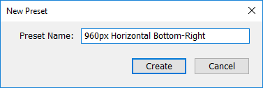
- Repeat the last twp steps above for the top of the image, then repeat it for the two left sides and give all three appropriate template names.
- You are all set! From here, all you have to do is export horizontal images and pick the right template to specify exactly where your logo is going to be.
- If you are planning to extract vertical images, repeat all of the steps above for the vertical images as well and name templates like “960px Vertical Bottom-Right”.
Here is the final result, with a crisp watermark applied to the exported image:

Without a doubt, the above process is much more complicated than it should be. Adobe’s software design team should really get a slap on their hands for not making it possible to choose a watermark with exact dimensions and not scaling it in any way. There should be a way to add a simple option called “No Scale” under “Watermark Effects”, which allows the end user to choose a watermark and apply it to any side of the image, making “Inset” work by simply shifting the watermark by pixels either horizontally or vertically. It would save so many steps for sure!
Method #2 – Creating a Logo Font
The second method, which is a bit more complicated as it involves the process of creating a font and then installing it into your computer, is a much better approach compared to the first one, because you do not have to deal with different image sizes and dimensions – you could literally just have 4 templates in your Lightroom to make watermarks, irrespective of the image dimensions. The initial process is somewhat painful, but if you are ready to commit some time, you will be very happy with the results.
The only issue with this method, is that you cannot have different colors in your watermarks, since fonts can only be of one particular color! In my case, it is not an issue, but if you have different colors and tones that you want to preserve, your only bet is to use the first method.
Basically, the idea is to create a true-type font with your logo placed in one of the characters (like “A”, for example). Once the font is created and installed on your computer, you no longer have to use a Graphic watermark style. You can use “Text” and simply type the character that holds your watermark. Since fonts are vector-based, increasing or decreasing font size will not result in up-sizing or down-sizing of images, preserving sharpness in watermarks every time you use them.
Let’s get started:
- First, if you do not already have an SVG-formatted file containing your logo, make sure to convert it from your .AI or .PNG format logo file using Adobe Illustrator. Fire up Illustrator, then open up your logo. If you already have your logo in Illustrator vector file (.ai extension), all you need to do is save your file in SVG format. If you only have a transparent .PNG file, you will need to open it first, then run Image Trace in order to convert the logo to vectors that you can later export. Go to “Window->Image Trace” to bring up the Image Trace panel:
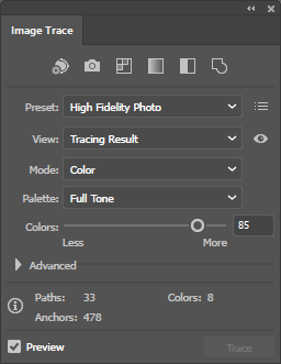
Select “High Fidelity Photo” for the best quality vector conversion, then uncheck “Preview” and click “Trace” to start the process. - After tracing is done, you will be able to view the tracing results from the top drop-down panel. Take a look at “Outlines” and make sure that your logo edges look good. If you are happy with the result, click the “Expand” button to convert the tracing object into paths.
- Now your logo is converted to vector paths! If you select the Direct Selection Tool (A), you will be able to select the different vector paths, as shown below:

As you can see, I was able to select the “.com” part of the logo – those blue dots indicate different vector paths. - The last step in Illustrator is to get rid of the potential borders of the image that got added as a result of the image trace. Simply click on the blue edges as shown below, then press the “Delete” key to get rid of them:

Also, go through any of the areas that need to be removed for transparency – if you have letters such as “o”, you will need to clean those middle areas up, so that the vector paths only cover the actual edges of the letters and not their insides. - From here, all we need to do is save the image to SVG format. Go to “File->Save As”, then click the drop-down menu where it says “Save as type” and pick SVG (*.SVG). Give your file a name like “Logo.SVG” and click “Save”. A window will pop-up that looks like this:
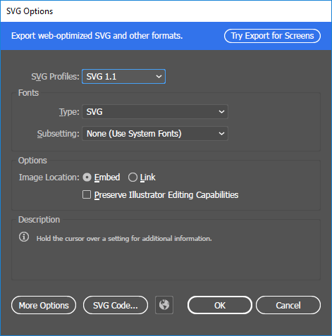
Just choose the defaults and click OK. The vector file is ready to be imported into a font creation tool. You can now close out of Adobe Illustrator. - Download and install the open source font creation tool called FontForge from here. Fire up the software, then when the first window comes up, click the “New” button on the bottom to create a new font:
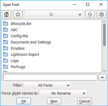
You will see a new window that looks like this:
If you have never used FontForge before, the software can look a bit complex to use. However, we only need to perform a couple of tasks here – mainly import the SVG file into one of the characters, then generate a TTF file.
- Put the logo into one of the characters – simply double click any of them. I went ahead and picked capital letter “A”. You will see another window pop-up that looks like this:

Go to “File->Import”, then click on the “Format” drop-down and choose “SVG”. Double-click on the “Logo.SVG” file you previously created from Illustrator:
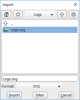
You will now see the vector paths appear in the main window, as shown below: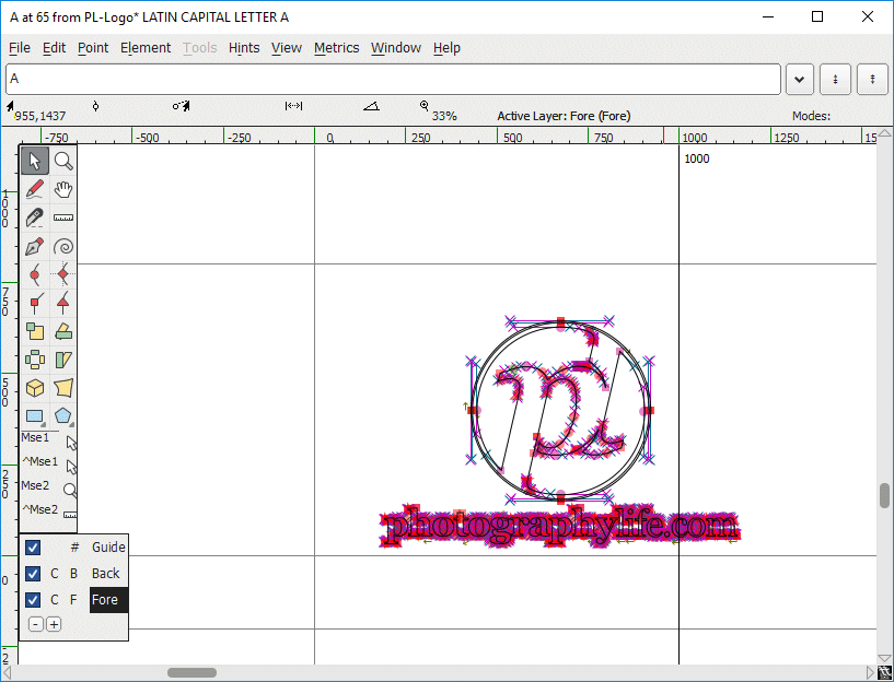
Everything looks good, so you can go ahead and close out of this window to return to the main window.
- If you click on any other cell, you should now see that the character you previously chose now contains your logo, which is exactly what we want! From here, we now need to give the font description and name and save it. Go to “Element->Font Info” (CTRL+SHIFT+F) and type the necessary information such as Fontname, Family Name, etc:
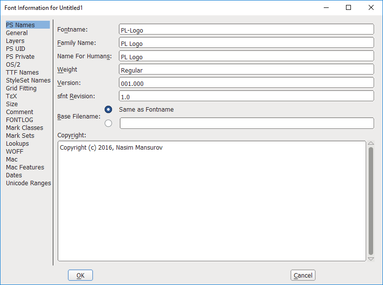
I chose “PL-Logo” for the “Fontname” field and “PL Logo” for “Family Name” and “Name for Humans” fields. You can name your font anything you want – just don’t use any special characters or a space in the “Fontname” field. Once done, click the “OK” button on the bottom of the window.
- We are done with font logo creation! Now let’s go ahead and save this font in TTF format. Go to “File->Generate Fonts” (CTRL+SHIFT+G), type the name of the font file name, then pick “TrueType” from the drop-down menu:
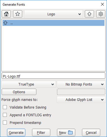
Go ahead and click “Generate” to generate the TTF file. - The font file is now created, so let’s go ahead and get it installed in the operating system. In Windows, all you have to do is right-click the TTF file and click “Install” to get the font installed. If you are a Mac user, you can double click the font file to open up fontbook. From there, just click on “install font” on the bottom of the preview to get the font installed.
- The font is now installed in your operating system, but Lightroom does not know about it. Make sure to close out of Lightroom and reopen it.
- After Lightroom relaunches, go to “Edit->Edit Watermarks”. Choose “Text” as the Watermark Style, then click on the “Font” drop-down area and find the font that you have previously installed. For me, it was “PL Logo”. After you pick the phone, type the character in the bottom-left field that stores your logo. In my case, I saved the logo under capital “A”, which is exactly what I typed:
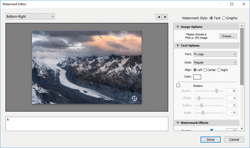
Make sure you de-select “Shadow”, so that shadows are not added to your logo. The cool thing is, now if you wanted to, you could make your logo in any color, including black and white – just select the appropriate color and you will be good to go. Since it is a font, it will always work with any color 🙂 - Just like with any other font, you will be able to indicate Opacity, Inset and Anchor locations. Don’t forget that the font size is set through the “Proportional” Size. In my case, I had to set it to 14 to make it about the same size as with a PNG file:
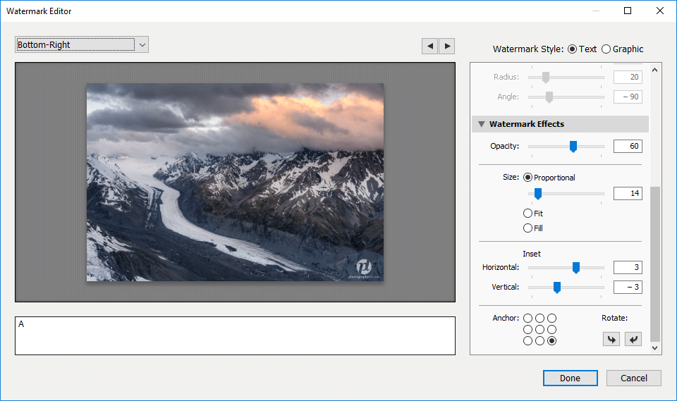
Just like it is explained in my How to Watermark Photos in Lightroom article, go ahead and create templates for each corner of the frame.
Here is how the watermark looks when using the above settings:
Not bad – much better than what Lightroom did to the watermark when it down-sized it via a PNG file!
From now on, you will be able to create watermarks of any size on any part of the image, whether it is a horizontal or a vertical image, which is really neat! Now that you have the font with your logo on it, you can also use it in Photoshop or any other application – it will always be available for your use, even in documents. Just keep in mind that other people won’t be able to view your documents with your logo, unless they get the TTF file from you and get it installed on their computer.
Hope this article was useful – let me know if you have any questions or feedback in the comments section below!
The post How to Make Sharp Watermarks in Lightroom appeared first on Photography Life.


