This is one of my favorite videos, recorded for the June 2014 issue. That little screen shot to the right should demonstrate the lengths I’m willing to go to when it comes to helping my readers understand an idea. LOL If you want to read the article, Shutter Magazine is free on line. My column starts on page 168, and here’s the link.
Here’s the summary version and why I wanted to write about this today:
I’m on hundreds of photographer’s websites every week, many of them without any serious branding. So many times I’m looking at a site that’s the equivalent of a patchwork quilt put together by somebody who’s colorblind. Nothing matches! Put that together with difficult navigation, unnecessary policy statements and an abundance of mediocre images and it’s simply not a fun experience for people to visit the website.
In the video I mention the golden arches – we know exactly what that logo represents and that it’s McDonalds. Your competing for the same recognition, just in a smaller space. Your competitors are every company making noise to your target audience at the same time you’re trying to reach them. That means your website, blog, social media “real estate,” business cards, stationery, brochures and anything I missed, all have to have the same look and feel.
Continuity doesn’t stop with the design of all these components, but continues with your tone and text. For example, I’m a big fan of first person about pages. Yet, so many of you talk about yourself in the third person and then will often switch to first person in the end. Stay with first person and write it like an artist’s statement from your heart. Share your passion for the craft and working with people instead of describing yourself while having an out of body experience!
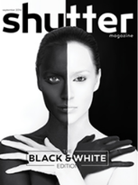
If you want to subscribe to Shutter Magazine, it’s become the leading publication in professional photography with over 90,000 in online readership. Plus, the monthly hard copy is stunning and typically runs over 200 pages. There’s no other magazine you can say that about. Just click on the cover of the September issue to find out more.
And, if you want advice to always look sharp no matter what the situation, I’m thinking about setting up a business as a wardrobe stylist!


