Been tardy as per the blogosphere of late, late being the operative word. Traveling. Assignment in Romania, then the UK. Then teaching in the UK. And now….vacation. A bit of downtime to usher in the end of a wonderfully bumpy year.
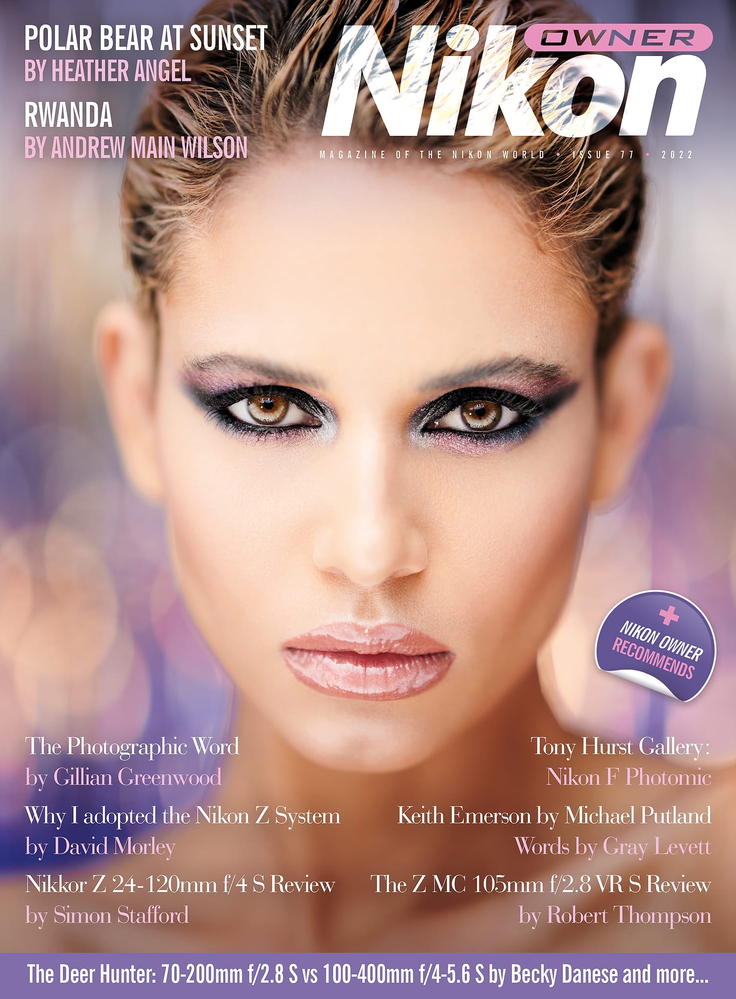
Happy to report on the story of two covers, just out or about to be. One is the venerable, lovely magazine of Gray’s of Westminster, the fabled camera store that defines excellence. They have peerless knowledge and service to offer the customer, leading it to be one of the most awarded camera stores in the world. No other store in the world has ever been granted a Coat of Arms, which is a highly distinctive honor. And, Nikon Owner magazine is chock-a-block with great writing and photos, examining the continuing conundrum known as photography from all points on the compass–technical, historical, lyrical, pictorial…need I go on?

The other is Cuba Seen magazine, a quarterly, bilingual labor of love initiated by Jennifer Spelman and Andrew Child, who have been photographing Cuba too many times to count. Teaming with a formidable array of writers and designers, Cuba Seen is a celebration of the humanity and loveliness of this amazing island. Pictures bring understanding and friendship, and that is the core mission of this publication.

It’s been a while since I’ve been lucky enough to have a couple of covers, given the random nature of being a photog. I shook my head a bit. I’ve always labored on (incessantly, boringly, endlessly) about the benefits and virtues of versatility behind the lens. So, I was struck a bit by the odd disparity of styles of these covers.
The Cuba pic was sweet, simple available light. Most likely a D810, or even a Nikon Df, with a 24-70mm lens. Click.
Truth be told, I have always loved laundry pictures, go figure. The below is the back cover of the book, Baseball in America. I must confess, it ain’t really about baseball. Maybe, just maybe, though, it’s about the feel of the game, played on a simple level in hometown America.

The fashion pic on the cover of Nikon Owner magazine was shot at the studio of my dear friend Gianluca Bertone, of the marvelously chameleon-like beauty, Thais Dilima. Beauty light combo, D850, Nikon 58mm f.95 NOCT. Manual focus drop on the eyelashes. Infinitesimally narrow DOF. Eyes like crazy. Superb makeup by Claire Piao. Foreground lights, background lights, fancy lens, moving parts, production values, studio time. Lots of work before the click.
Two sides, perhaps, of the photo coin we continuously flip in the air. From heavy lifting and pre-visualization to accommodate a job to the spontaneous gifts of light, gesture and happenstance that surprise our lens when we do a wander.
We have to be prepared for both.
Looking forward to a visit to Grays of Westminster tomorrow and a LIVE chat with Becky Danese and Konstantin Kochkin! Kicking off the chat at 2:15pm GMT.

More tk….
The post A Tale of Two Covers appeared first on Joe McNally Photography.


