Where you place subjects within a photograph is called composition. And yet composition does so much more than tell us where the subject is.
It can impact how we feel about a subject.
It can guide us through an image.
And it can be the difference between a successful photograph and an unsuccessful one.
Composition can drive the emotion, storytelling ability, and technical success of a photo. But how do we know where to put our subjects?
Luckily, there are some rules that can guide us as we compose our frames. Let’s dive into some of the more popular compositions and why they work.

The rule of thirds
The rule of thirds is an age old guideline used to compose visual images. Derived from the Fibonacci’s spiral, the rule of thirds gives us rough guidelines for the mathematically-ordained areas of the frame toward which we are naturally drawn.
The guideline states that an image should be divided into nine equal parts, spaced equally by two horizontal lines and two spaced vertical lines. Important elements should be placed along these lines or where they intersect.
By placing subjects using the rule of thirds, we ensure that the viewer’s eye immediately falls on the elements in the frame that are most important. We also ensure that the image does not feel static or boring as this slightly off-center placement naturally adds some movement to the image.
Pro tip: When using the rule of thirds for a portrait, place one eye alone a rule of thirds intersection.

Centered composition
This might be most commonly used to compose an image when first starting out. It is natural to put what we want to be the center of attention in, well, the center.
The center can sometimes feel boring unmoving, and static, making a lot of seasoned artists gravitate toward the rule of thirds. However, center placement can also translate as balanced, steady, and strong. The key is to pick the best opportunities where a center placement can work for you rather than against you.

Placing your subject in the center commands the viewers attention. Especially when the subject is directly gazing back to the viewer.
If you find the foreground and background are too busy, try placing the subject in the center. It can can help draw the viewer’s attention and create stability in the midst of the busy-ness.

Placing a subject in the center of the frame is also effective in helping to tell the viewer where the main focus is. In this example, my subject is a relatively small portion of the frame. Using centered composition helps to emphasize his importance.

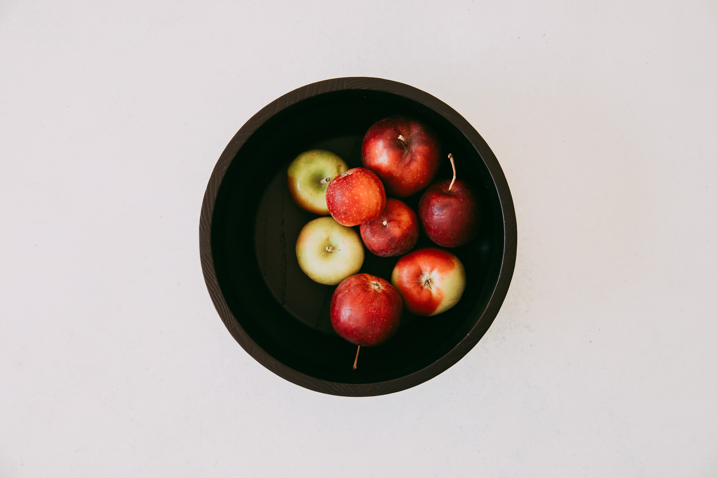
I also love centered compositions when shooting flat lays. Shooting from this different perspective and using shape while centering the subject can create a powerful composition.
Pro tip: when there is a lot of dynamic movement and activity in the frame, use a centered composition to create stability so that the photo doesn’t feel chaotic.

Right side composition
We tend to read images as we do words in a book. We naturally scan them from left to right.
As you move your subjects away from the middle, you want to look for balancing elements within the frame. Negative space on the left with the subject on the right is a comfortable subject placement. It allows our eyes to travel through the negative space until we land on the subject.

This is an opportunity to tell a story with your compositions and subject placement. A subject may be comfortably placed on the right side of the frame. But what if they were gazing back towards the left?
Does that force your gaze back in the other direction?
And does that make you feel uncomfortable?
Do you question what it is the subject might be looking at or thinking about?
Is their placement and gaze a part of the story you want to tell?
Or would a different placement work better to tell your story?
Pro tip: Use leading lines from the left to lead the viewer to your subject placed on the right.

Left side composition
Meeting your primary subject on the left is initially a little less comfortable for the viewer. It is an unexpected placement and halts that natural path from left to right.
And yet that very discomfort can be used to command attention. You are telling the viewer this is where their attention should stay. That you do not want their eyes to be distracted from anything else in the frame.
Placing your subject on the left can also give the feeling of implied movement. We are no longer following negative space into the frame as we do with the right side composition. Rather, we are following that negative space from the subject out of the frame. In our imaginations, that can translate to the subject moving along that vision path.

Here I have balanced the subject on the left with plenty of space on the right for the horse and rider to move across the frame.

In this image, I placed the subject on the left rule of thirds line. It is natural for the viewer to follow the subjects offer gaze across the frame, left to right. The horizon acts as a leading line to guide the viewers eye across the frame.
Pro tip: You can find overlays in Lightroom and Photoshop to help you create stronger compositions.

Have fun!
Photography is an art. We will all interpret and see things differently. For every rule or guideline that I’ve listed above, there will be an awesome shot to prove it wrong!
So try various compositions every time you photograph any given subject. Then see what speaks best to you. Perhaps following the rules will work best at times. Other times, you may find that bending the rules is what tells your story best.

Just remember that composition is yet another tool that you get to use to tell the stories you want to tell with your camera.
The post Intro to composition: Where should you put your subject and why? appeared first on Clickin Moms blog: Helping you take better pictures one day at a time.
Clickin Moms blog: Helping you take better pictures one day at a time


