A good looking image consists of many different things, most of which are subjective. In this article I want to briefly discuss one specific variable, which is image brightness. While I don’t plan on going into much detail and getting very technical, I do want to show you how you can adjust image brightness and the final look of your image using a few different methods in your post processing software. Although I’m using Lightroom, the method and concept should be similar regardless of what software you prefer using to edit your images.
To start with, we should figure out what the term brightness means. We all know what the concept of “bright” means in our everyday lives. For example, if I say that the sun is bright you know exactly what I mean. This is not the same meaning as “brightness” in photography. When you change the brightness of an image, you are mainly affecting the midtones of the image. Compare this to changing exposure, which affects the highlights, midtones and shadows evenly, and you’ll see that adjusting the brightness of an image can be quite powerful.
Let’s look at some examples. So that you know what’s going on, these are screenshots from the Develop module in Lightroom. We’ll specifically be looking at the sliders in the “Tone” sub-module on the right side. Here’s a straight out of the camera snapshot that I took of my wife while we were driving down Highway 1 near Big Sur. You can see that the overall exposure looks pretty good, but the image looks a little flat.
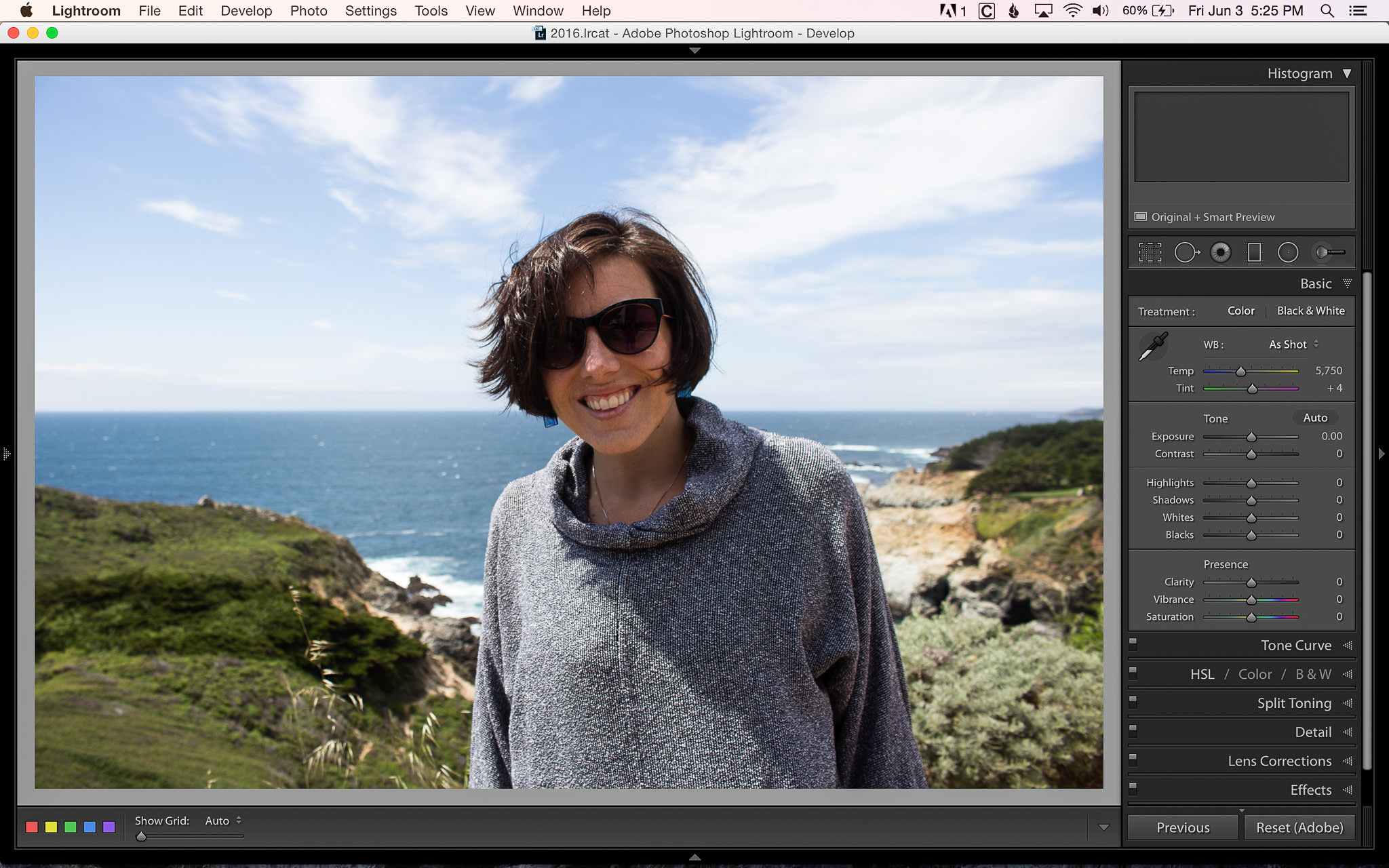
Image with no adjustments
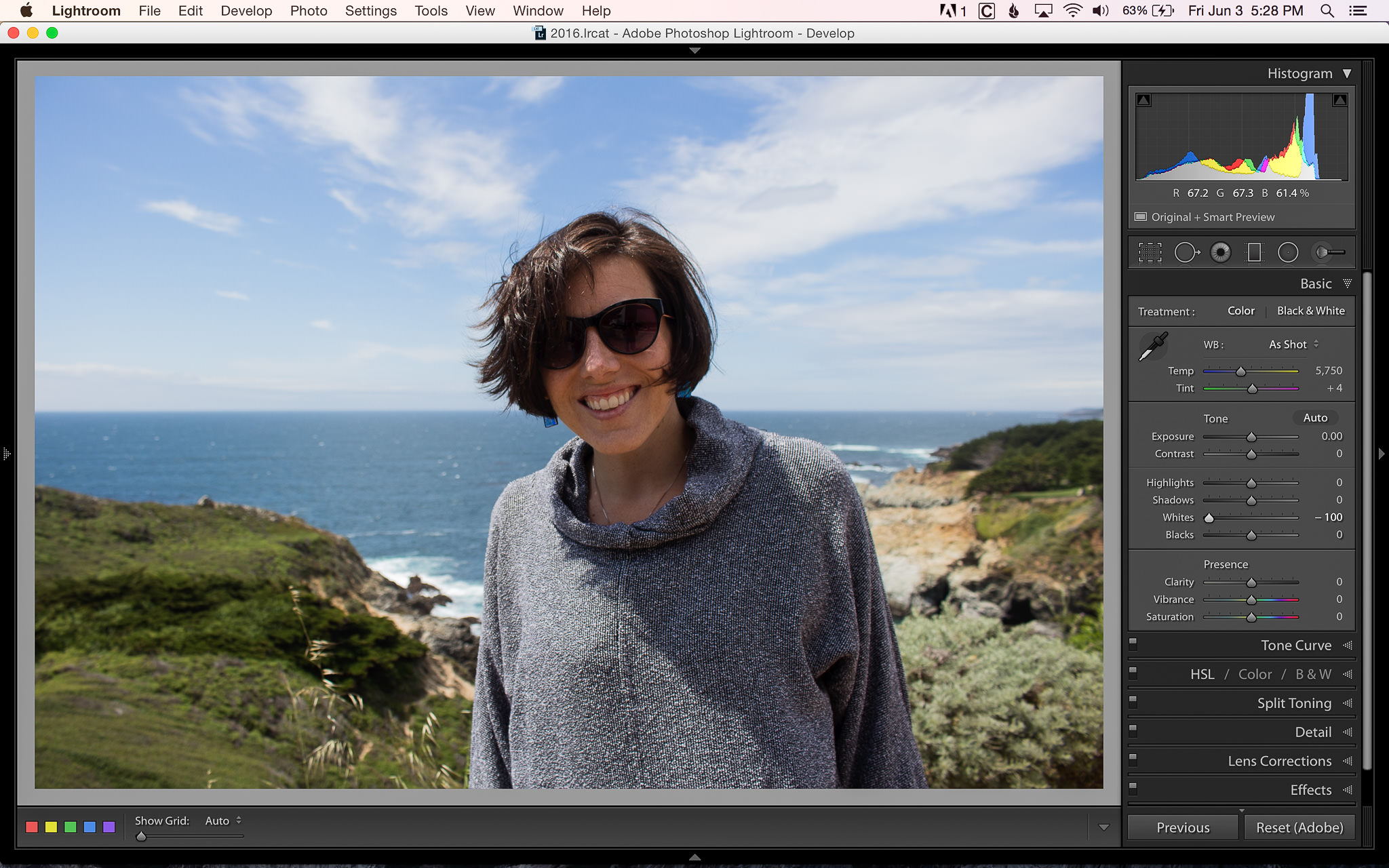
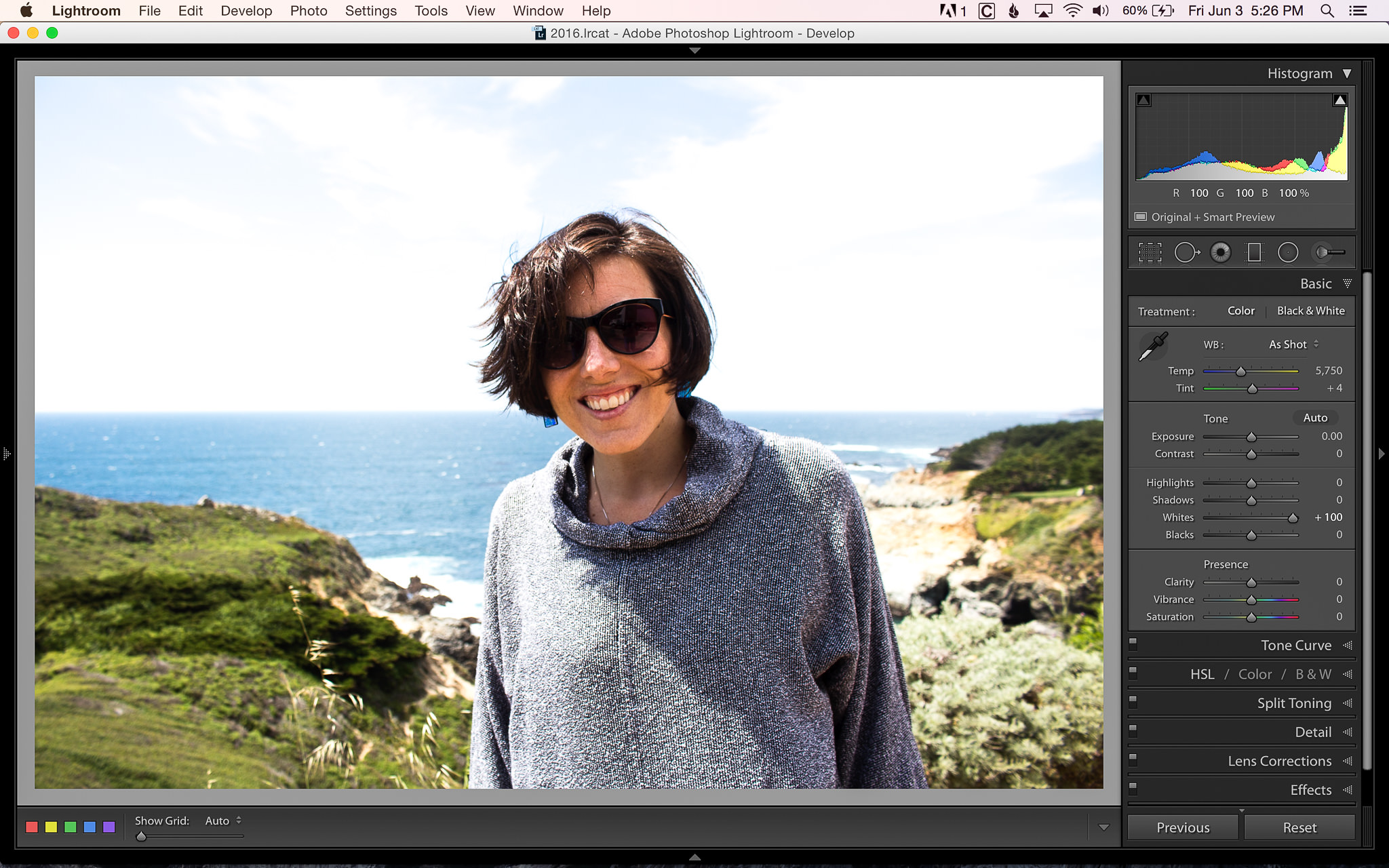
By adjusting the “Whites” slider, you can see how it changes the image. Here you can see the difference between -100 and +100:
White levels at -100
White levels at +100
You might have noticed that the entire image seems to have a change in contrast. When the white levels are increased (+100), the sky and her skin are greatly affected, while the shadows on her shirt barely change. When the white levels are decreased (-100), the image looks much flatter
Let’s do the same thing with the “Blacks” slider. You can see how it changes the image when we adjust the slider between +100 and -100:
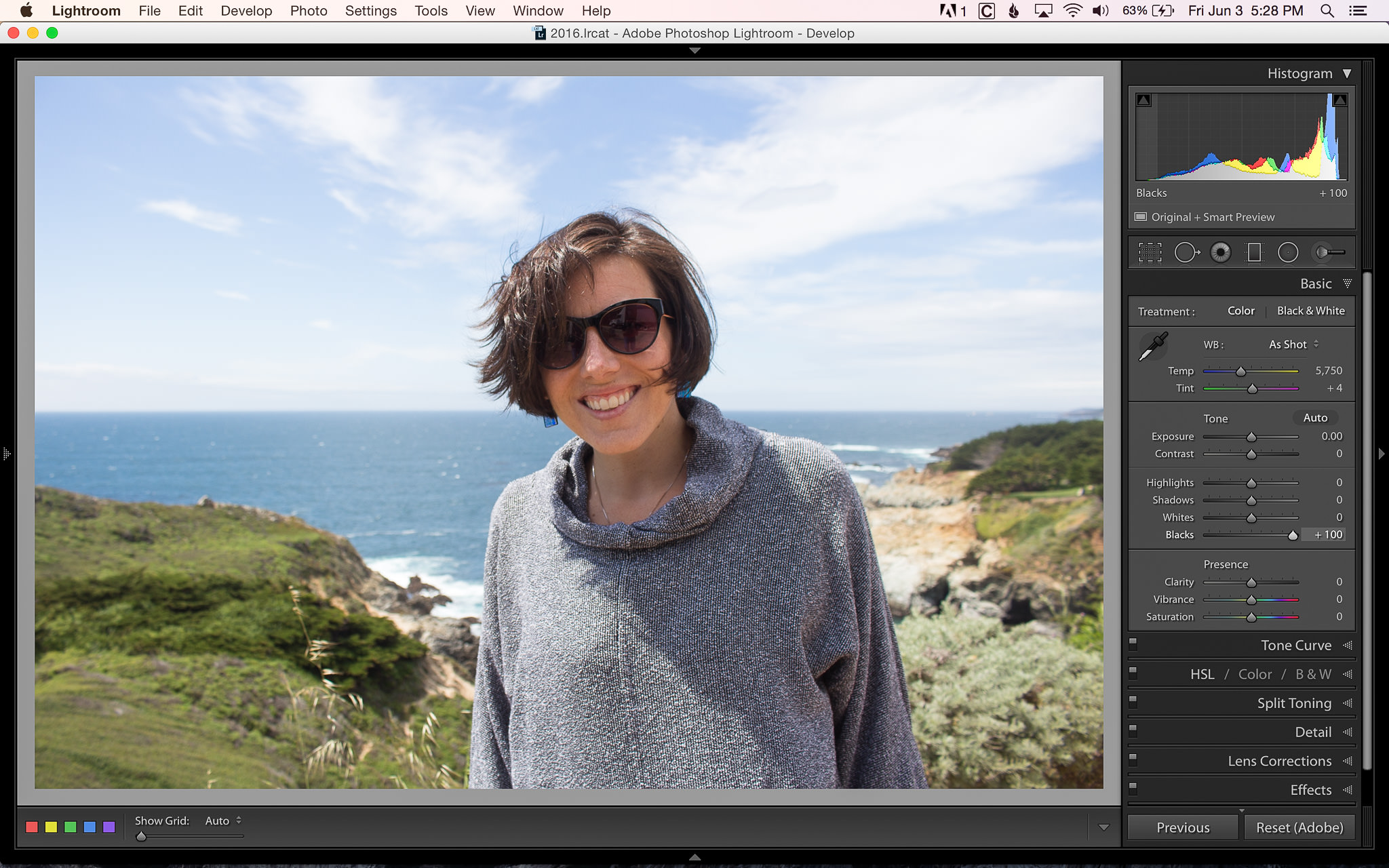
Black levels at +100
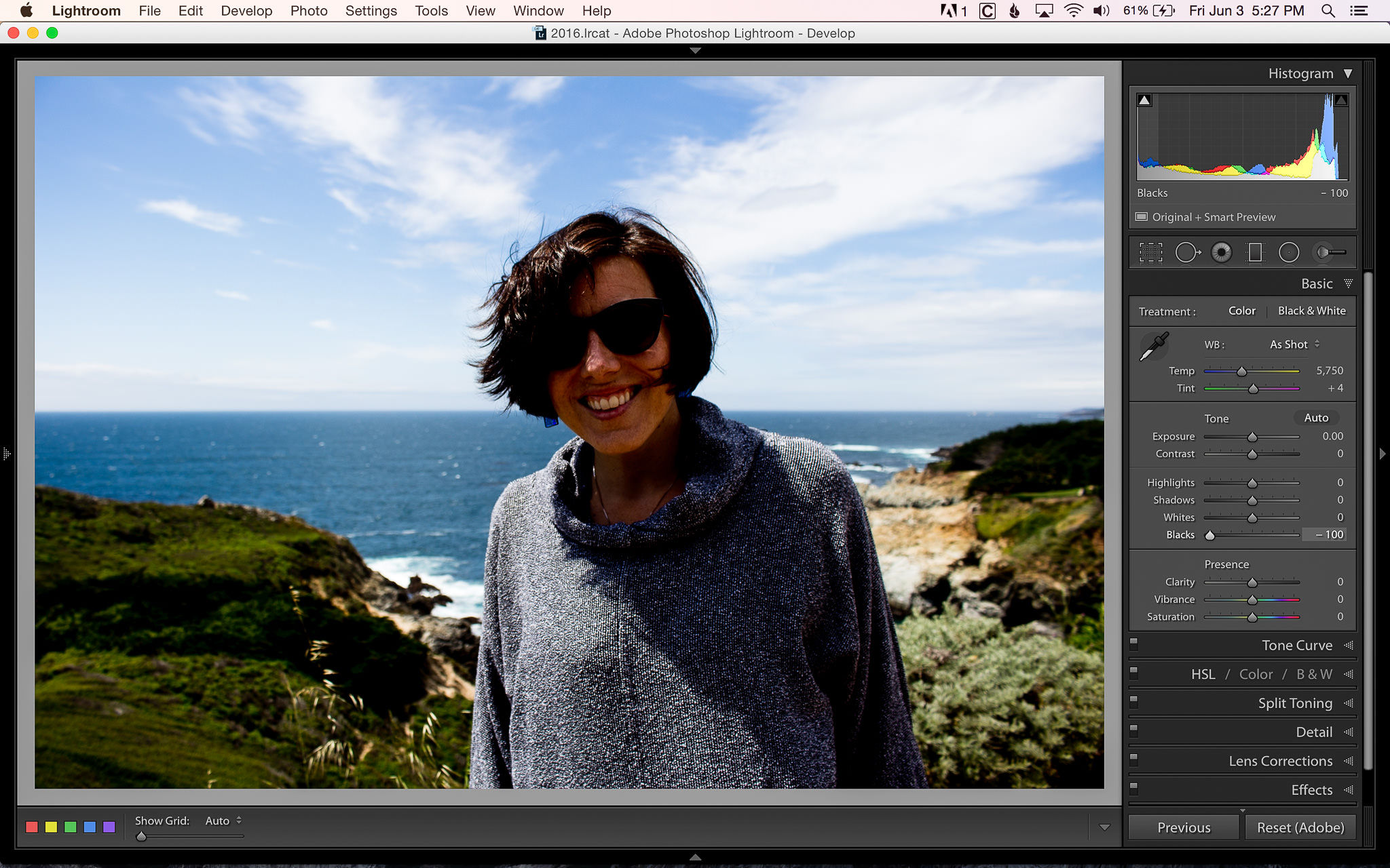
Black levels at -100
This time the effect is opposite of when we adjust the whites. When the black levels are increased (+100), the image looks flat and when the blacks are decreased (-100) the image has more contrast.
Now, compare this to adjusting the exposure by +1 and -1 stop:
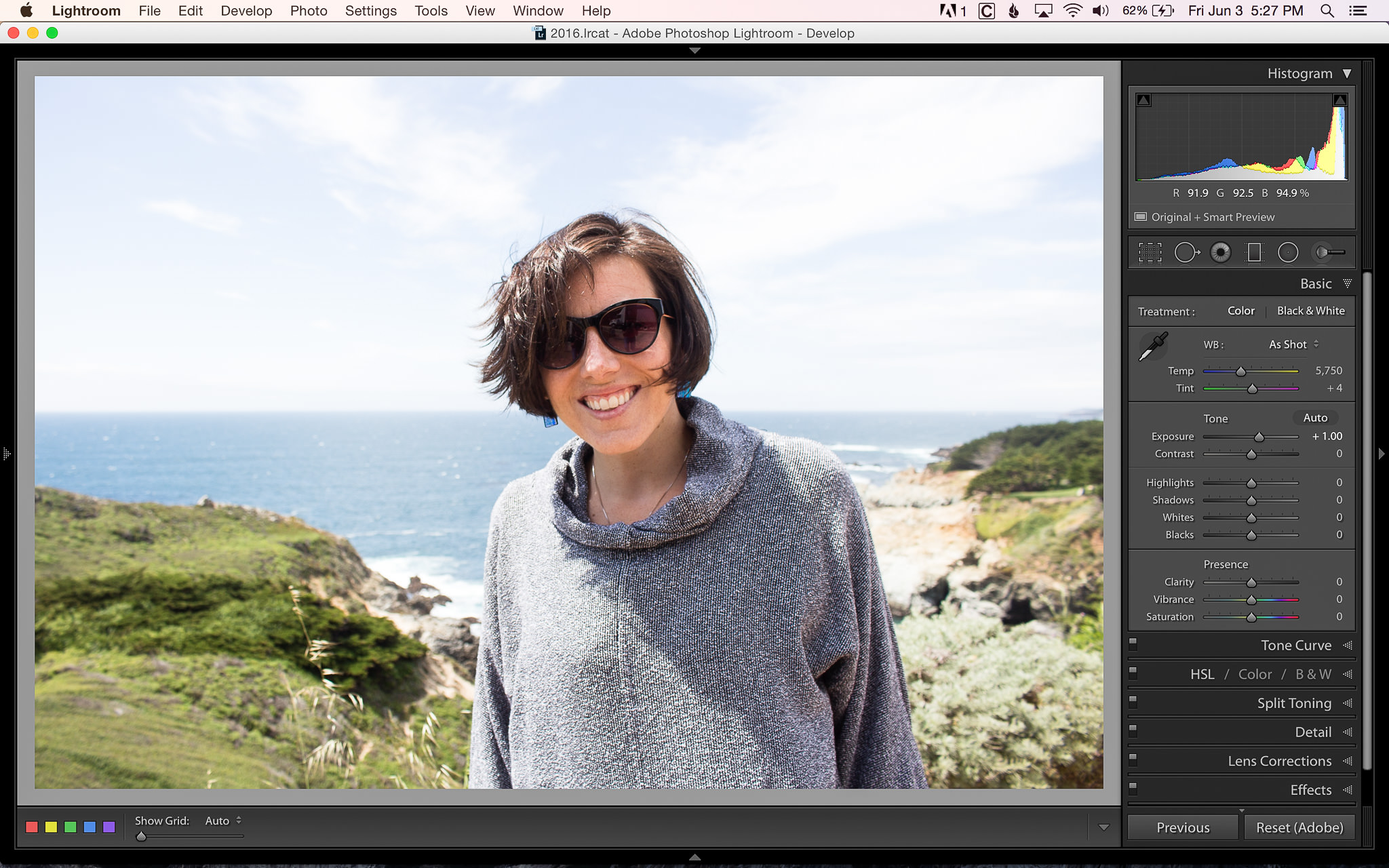
Exposure +1
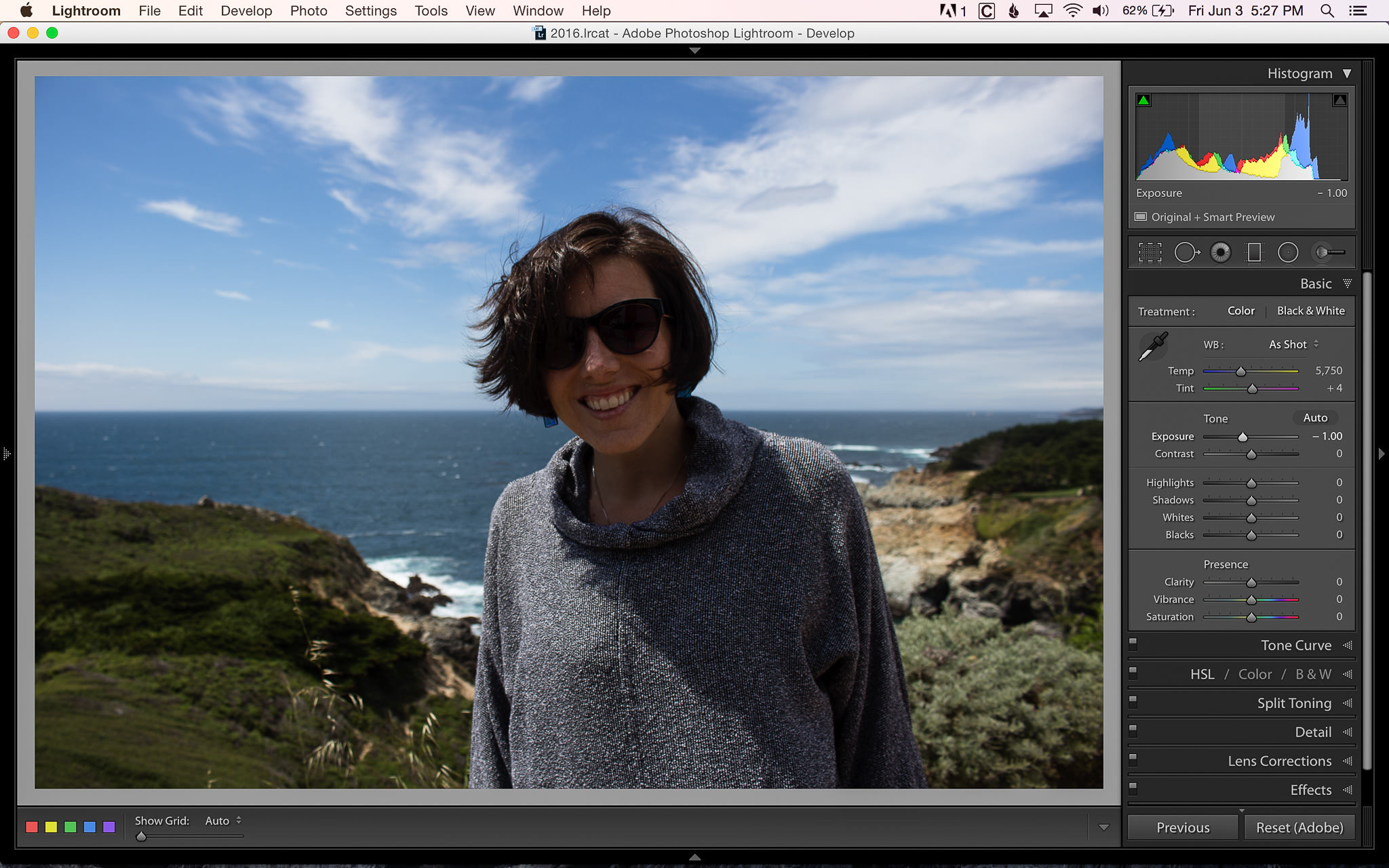
Exposure -1
You can see that everything is affected when we adjust the exposure. Both the highlights and the shadow levels (of the image, not the controls) increase or decrease depending on if we increase or decrease the exposure.
So now that you have an idea of how adjusting the Whites and Blacks tone sliders affects an image, let’s see how we can use them to adjust the brightness of an image during editing.
Here you can see an image that is slightly underexposed. You might notice that the Tone sliders have been slightly adjusted. By default, when I import images, slight adjustments are made to the image to give it a bit more pop. Let’s use this as a starting point and see what can be done to make this image look better.
As a reference for brightness and overall image exposure, keep an eye on the numbers below the histogram in each of the following images. These give you an exact RGB (Red Blue Green) percentage for specific areas in your image (which you can choose simply by moving your cursor to any part of the image). In this first image, you can see the values listed as “R 65.8 G 64.6 B 49.2%”. While adjusting the brightness in each image, my goal was to get the “R” values as similar as possible. Although you can’t see my cursor, I had it in the same spot for each screenshot (part of the yellow on the part of the plant closest to the camera).
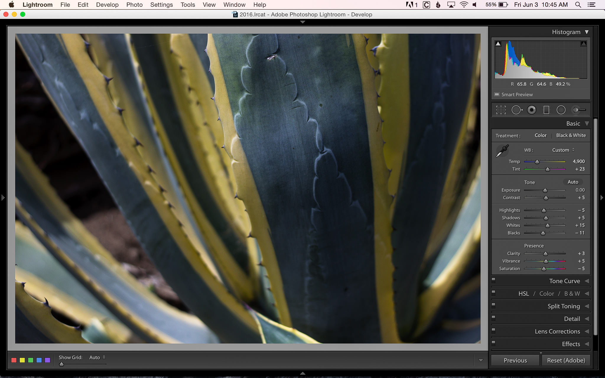
Image with default adjustments
Let’s see what happens if I simply increase the exposure so that the image looks properly exposed. Things are looking much better now! My target value is R 88.3. To my eye, this image still doesn’t look quite right. The shadows aren’t dark enough and the image looks a bit washed out.
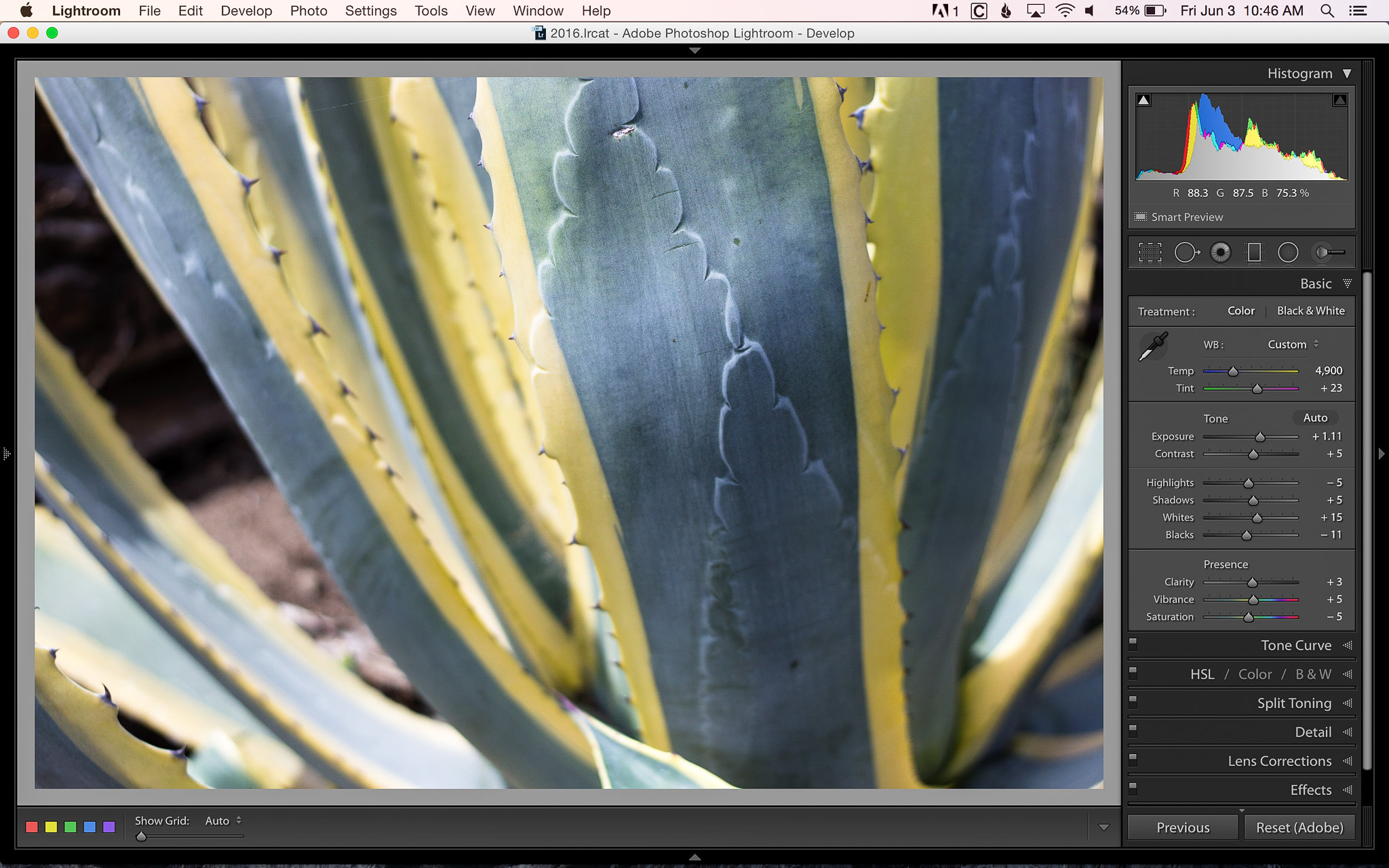
Image with only exposure adjusted
Let’s see how resetting the exposure and only adjusting the Whites affects the image. Here you can see my target value is R 88.4 and the yellow parts of the plant do look similar, but the rest of the image has changed drastically. It has a much darker feel and too much contrast for me.
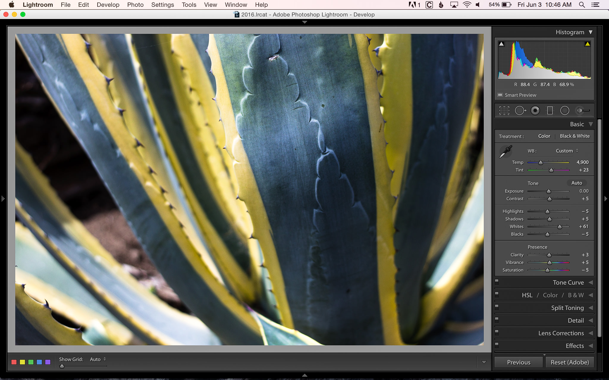
Image with only whites adjusted
Now let’s combine both exposure and white/black tone level adjustments and see what happens. In this image my target value is R 87.8. The lighter parts of the image are looking good, while the shadows remain darker. The entire image has contrast and, to me, is much more visually appealing than the previous two images.
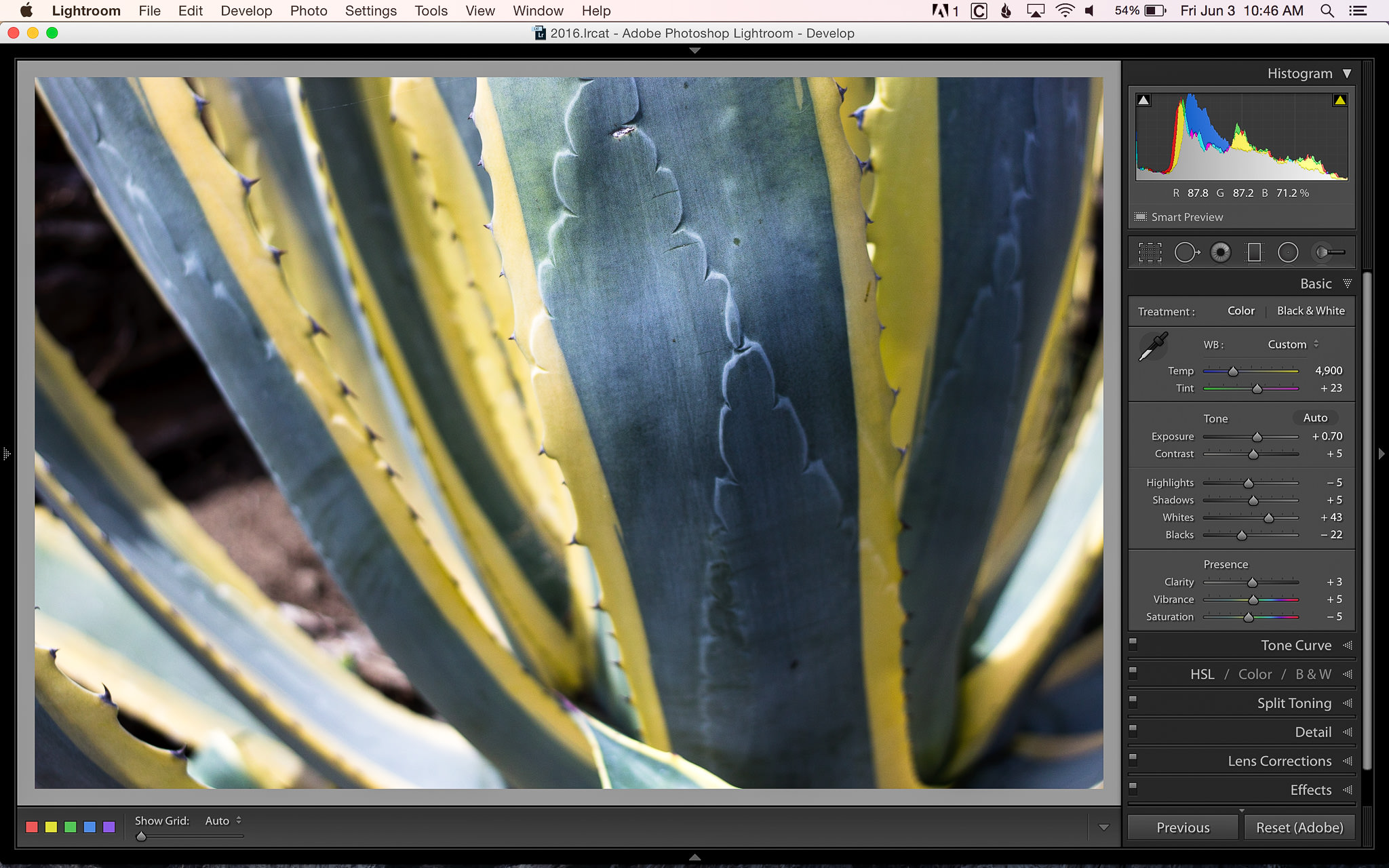
Image with both exposure and white/black levels adjusted
You might notice that although I adjusted both the exposure and the white/black tone levels, I didn’t have to adjust either one as much as when that was the only adjustment I was making to the image.
How about one final example? Here’s an image from a recent wedding I photographed that has a bit more dynamic range and a better starting exposure than the plant example above. Without going into too much detail, I’ll let you look at two different final edits that I did… one done with only the white/black tone sliders and one with a combination of both white/black tone sliders and exposure:

Image with only white/black levels adjusted
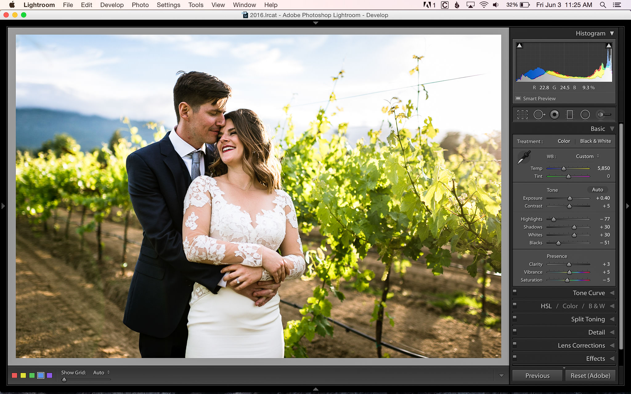
Image with both exposure and white levels adjusted
Both of these images look very similar. It’s amazing how practically the same edit can be done with two entirely different methods. For my wedding photos, I prefer the slightly less contrasty look of the second image (w/b+exposure). If this were more of a fashion type of image, a bit more contrast might be preferred.
I hope that you’ve found this both interesting and helpful. Realizing that there’s more than one way to affect the brightness of an image can open up post processing options you might not have explored before. Every image is different and you’ll have to experiment with a variety of different types of images before you get a feel for which method works best for any given situation.
If you’re interested in learning more about post processing your images, keep an eye out for our upcoming video: Level 1 – Workflow and Post Processing.
The post A Few Different Ways to Adjust Image Brightness appeared first on Photography Life.


